added 474 characters in body
Source Link
John
  • 23.6k
  • 9
  • 59
  • 93

I should note that I really didn't put an effort into making this as nice as I could and instead of making that first dummy graph I could have just set enough space in the first frame. Unfortunately the mar() setting try to fill the frame and the top margin influences the distance that the label above the graph is away so I'd have to go and make all my labels with mtext() or text() instead of just using the main setting within plot and I didn't feel like doing that

I should note that I really didn't put an effort into making this as nice as I could and instead of making that first dummy graph I could have just set enough space in the first frame. Unfortunately the mar() setting try to fill the frame and the top margin influences the distance that the label above the graph is away so I'd have to go and make all my labels with mtext() or text() instead of just using the main setting within plot and I didn't feel like doing that

deleted 56 characters in body
Source Link
John
  • 23.6k
  • 9
  • 59
  • 93

If you want to stick with something like the method you've been using then you might want to learn the layout() command. A few other detail changes and you can get the graphs much closer together. You could also put the unique things that change between graphs in a list (like the data and margins) and then go through a loop. Also, you'll note I made the bottom axis with the direct axis() command so that you can control where the items go.

layout(matrix(1:5, ncol = 1), widths = 1,
        heights = c(1,5,5,5,7), respect = FALSE)
par(mar=c(0, 4, 0, 0))
plot(1, type = 'n', axes = FALSE, bty = 'n', ylab = '')
legend('left', , c("X","Y"), bty="n", horiz=T, cex=1.5, col=c("red1","darkblue"), text.col=c("red1","darkblue"), pch=c(1,3), lty=c(2,3), x.intersp=0.4,adj=0.2)
par(mar=c(0, 4, 2, 1), bty = 'o')
plot(a1, type="b", ylim=c(0,14.5), xlab="Time (secs)", ylab="", xaxt = 'n', cex.axis=1.4, cex.lab=1.3,cex=1.2, lwd=2.5, col="red1", lty=2, pch=1, main="A")
lines(a2,type="b",pch=3,lty=3,col="darkblue",lwd=2.5,cex=1.2)
par(xpd=T)
par(mar=c(0, 4, 2, 1))
plot(b1, type="b", ylim=c(0,14.5), xlab="Time (secs)", ylab="", xaxt = 'n', cex.axis=1.4, cex.lab=1.3,cex=1.2,lwd=2.5,col="red1",lty=2,pch=1, main="B")
lines(b2,type="b",pch=3,lty=3,col="darkblue",lwd=2.5,cex=1.2)
par(mar=c(0, 4, 2, 1))
plot(c1, type="b", ylim=c(0,14.5), xlab="Time (secs)", ylab="", xaxt = 'n', cex.axis=1.4, cex.lab=1.3,cex=1.2,lwd=2.5,col="red1",lty=2,pch=1, main="C")
lines(c2,type="b",pch=3,lty=3,col="darkblue",lwd=2.5,cex=1.2)
par(mar=c(4, 4, 2, 1))
plot(d1/1000, type="b", ylim=c(0,14.5), xlab="Time (secs)", ylab="", xaxt = 'n', cex.axis=1.4, cex.lab=1.3,cex=1.2,lwd=2.5,col="red1",lty=2,pch=1, main="D")
lines(d2,type="b",pch=3,lty=3,col="darkblue",lwd=2.5,cex=1.2)
mtext("Price", side=2, at=40,line=2.5,cex=1.1)
axis(1, 1:10, cex.axis = 1.4)
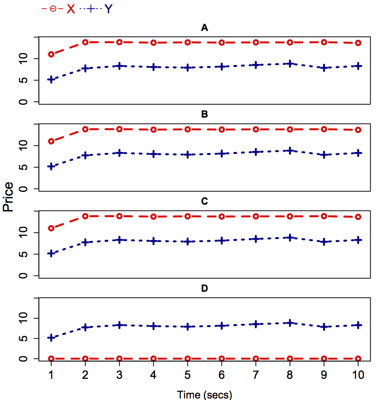
theplot

If you want to stick with something like the method you've been using then you might want to learn the layout() command. A few other detail changes and you can get the graphs much closer together. You could also put the unique things that change between graphs in a list (like the data and margins) and then go through a loop. Also, you'll note I made the bottom axis with the direct axis() command so that you can control where the items go.

layout(matrix(1:5, ncol = 1), widths = 1,
        heights = c(1,5,5,5,7), respect = FALSE)
par(mar=c(0, 4, 0, 0))
plot(1, type = 'n', axes = FALSE, bty = 'n', ylab = '')
legend('left', , c("X","Y"), bty="n", horiz=T, cex=1.5, col=c("red1","darkblue"), text.col=c("red1","darkblue"), pch=c(1,3), lty=c(2,3), x.intersp=0.4,adj=0.2)
par(mar=c(0, 4, 2, 1), bty = 'o')
plot(a1, type="b", ylim=c(0,14.5), xlab="Time (secs)", ylab="", xaxt = 'n', cex.axis=1.4, cex.lab=1.3,cex=1.2, lwd=2.5, col="red1", lty=2, pch=1, main="A")
lines(a2,type="b",pch=3,lty=3,col="darkblue",lwd=2.5,cex=1.2)
par(xpd=T)
par(mar=c(0, 4, 2, 1))
plot(b1, type="b", ylim=c(0,14.5), xlab="Time (secs)", ylab="", xaxt = 'n', cex.axis=1.4, cex.lab=1.3,cex=1.2,lwd=2.5,col="red1",lty=2,pch=1, main="B")
lines(b2,type="b",pch=3,lty=3,col="darkblue",lwd=2.5,cex=1.2)
par(mar=c(0, 4, 2, 1))
plot(c1, type="b", ylim=c(0,14.5), xlab="Time (secs)", ylab="", xaxt = 'n', cex.axis=1.4, cex.lab=1.3,cex=1.2,lwd=2.5,col="red1",lty=2,pch=1, main="C")
lines(c2,type="b",pch=3,lty=3,col="darkblue",lwd=2.5,cex=1.2)
par(mar=c(4, 4, 2, 1))
plot(d1/1000, type="b", ylim=c(0,14.5), xlab="Time (secs)", ylab="", xaxt = 'n', cex.axis=1.4, cex.lab=1.3,cex=1.2,lwd=2.5,col="red1",lty=2,pch=1, main="D")
lines(d2,type="b",pch=3,lty=3,col="darkblue",lwd=2.5,cex=1.2)
mtext("Price", side=2, at=40,line=2.5,cex=1.1)
axis(1, 1:10, cex.axis = 1.4)

theplot

If you want to stick with something like the method you've been using then you might want to learn the layout() command. A few other detail changes and you can get the graphs much closer together. You could also put the unique things that change between graphs in a list (like the data and margins) and then go through a loop. Also, you'll note I made the bottom axis with the direct axis() command so that you can control where the items go.

layout(matrix(1:5, ncol = 1), widths = 1,
        heights = c(1,5,5,5,7), respect = FALSE)
par(mar=c(0, 4, 0, 0))
plot(1, type = 'n', axes = FALSE, bty = 'n', ylab = '')
legend('left', , c("X","Y"), bty="n", horiz=T, cex=1.5, col=c("red1","darkblue"), text.col=c("red1","darkblue"), pch=c(1,3), lty=c(2,3), x.intersp=0.4,adj=0.2)
par(mar=c(0, 4, 2, 1), bty = 'o')
plot(a1, type="b", ylim=c(0,14.5), xlab="Time (secs)", ylab="", xaxt = 'n', cex.axis=1.4, cex.lab=1.3,cex=1.2, lwd=2.5, col="red1", lty=2, pch=1, main="A")
lines(a2,type="b",pch=3,lty=3,col="darkblue",lwd=2.5,cex=1.2)
par(xpd=T)
plot(b1, type="b", ylim=c(0,14.5), xlab="Time (secs)", ylab="", xaxt = 'n', cex.axis=1.4, cex.lab=1.3,cex=1.2,lwd=2.5,col="red1",lty=2,pch=1, main="B")
lines(b2,type="b",pch=3,lty=3,col="darkblue",lwd=2.5,cex=1.2)
plot(c1, type="b", ylim=c(0,14.5), xlab="Time (secs)", ylab="", xaxt = 'n', cex.axis=1.4, cex.lab=1.3,cex=1.2,lwd=2.5,col="red1",lty=2,pch=1, main="C")
lines(c2,type="b",pch=3,lty=3,col="darkblue",lwd=2.5,cex=1.2)
par(mar=c(4, 4, 2, 1))
plot(d1/1000, type="b", ylim=c(0,14.5), xlab="Time (secs)", ylab="", xaxt = 'n', cex.axis=1.4, cex.lab=1.3,cex=1.2,lwd=2.5,col="red1",lty=2,pch=1, main="D")
lines(d2,type="b",pch=3,lty=3,col="darkblue",lwd=2.5,cex=1.2)
mtext("Price", side=2, at=40,line=2.5,cex=1.1)
axis(1, 1:10, cex.axis = 1.4)

theplot

Source Link
John
  • 23.6k
  • 9
  • 59
  • 93

If you want to stick with something like the method you've been using then you might want to learn the layout() command. A few other detail changes and you can get the graphs much closer together. You could also put the unique things that change between graphs in a list (like the data and margins) and then go through a loop. Also, you'll note I made the bottom axis with the direct axis() command so that you can control where the items go.

layout(matrix(1:5, ncol = 1), widths = 1,
        heights = c(1,5,5,5,7), respect = FALSE)
par(mar=c(0, 4, 0, 0))
plot(1, type = 'n', axes = FALSE, bty = 'n', ylab = '')
legend('left', , c("X","Y"), bty="n", horiz=T, cex=1.5, col=c("red1","darkblue"), text.col=c("red1","darkblue"), pch=c(1,3), lty=c(2,3), x.intersp=0.4,adj=0.2)
par(mar=c(0, 4, 2, 1), bty = 'o')
plot(a1, type="b", ylim=c(0,14.5), xlab="Time (secs)", ylab="", xaxt = 'n', cex.axis=1.4, cex.lab=1.3,cex=1.2, lwd=2.5, col="red1", lty=2, pch=1, main="A")
lines(a2,type="b",pch=3,lty=3,col="darkblue",lwd=2.5,cex=1.2)
par(xpd=T)
par(mar=c(0, 4, 2, 1))
plot(b1, type="b", ylim=c(0,14.5), xlab="Time (secs)", ylab="", xaxt = 'n', cex.axis=1.4, cex.lab=1.3,cex=1.2,lwd=2.5,col="red1",lty=2,pch=1, main="B")
lines(b2,type="b",pch=3,lty=3,col="darkblue",lwd=2.5,cex=1.2)
par(mar=c(0, 4, 2, 1))
plot(c1, type="b", ylim=c(0,14.5), xlab="Time (secs)", ylab="", xaxt = 'n', cex.axis=1.4, cex.lab=1.3,cex=1.2,lwd=2.5,col="red1",lty=2,pch=1, main="C")
lines(c2,type="b",pch=3,lty=3,col="darkblue",lwd=2.5,cex=1.2)
par(mar=c(4, 4, 2, 1))
plot(d1/1000, type="b", ylim=c(0,14.5), xlab="Time (secs)", ylab="", xaxt = 'n', cex.axis=1.4, cex.lab=1.3,cex=1.2,lwd=2.5,col="red1",lty=2,pch=1, main="D")
lines(d2,type="b",pch=3,lty=3,col="darkblue",lwd=2.5,cex=1.2)
mtext("Price", side=2, at=40,line=2.5,cex=1.1)
axis(1, 1:10, cex.axis = 1.4)

theplot