edited body
Source Link
Glen_b
  • 290.5k
  • 37
  • 652
  • 1.1k

enter image description hereenter image description here

enter image description here

enter image description here

added 344 characters in body
Source Link
Glen_b
  • 290.5k
  • 37
  • 652
  • 1.1k

One of the chief benefits of such a diagram to my mind is that you instantly see the relative effect of changes in the different predictor variables (IV) on the response (DV). Even when you don't need the diagram for any calculations, it can have great value in terms of simply displaying the relative effects of the variables.

One of the chief benefits of such a diagram to my mind is that you instantly see the relative effect of changes in the different predictor variables (IV) on the response (DV). Even when you don't need the diagram for any calculations, it can have great value in terms of simply displaying the relative effects of the variables.

added 430 characters in body
Source Link
Glen_b
  • 290.5k
  • 37
  • 652
  • 1.1k

For cases where $E(Y)$ is nonlinear in some predictors, some minor - and perhaps obvious - modifications are needed. Imagine that we have $\hat{y} = b0+b x_1+f(x_2)$$\hat{y} = b_0+b x_1+f(x_2)$

-- here the function $f(x)$ has a minimum somewhere around $x=2.23$

It's possible for such functions to have several turning points, where scales would break and flip over multiple times - but the axis line only has two sides.

With points-type nomograms this presents no difficulty, since one may move additional scale-sections up or down (or more generally, orthogonally to the direction of the axis) a little until no overlap occurs.

(More than one turning point can be a problem for alignment-type nomograms; one solution shown in Harrell's book is to offset all the scales slightly from a reference line, on which the value's position is actually taken.)

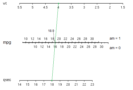
In this case you simply find the wt and qsec values on their scales and join them with a line; where they cross the mpg axis, we read off the value (while the am variable determines which side of the mpg axis you read). In a simple case like this, these kind of nomograms are faster and simpler to use, but can be less easy to generalize to many predictors, where they can become unwieldy. The points-style nomogram in your question (as implemented in Regression Modeling Strategies and in the rms package in R) can add more variables seamlessly. This can be quite an advantage when dealing with interactions.

For cases where $E(Y)$ is nonlinear in some predictors, some minor - and perhaps obvious - modifications are needed. Imagine that we have $\hat{y} = b0+b x_1+f(x_2)$

-- here the function $f(x)$ has a minimum somewhere around $x=2.23$

In this case you simply find the wt and qsec values on their scales and join them with a line; where they cross the mpg axis, we read off the value (while the am variable determines which side of the mpg axis you read). In a simple case like this, these kind of nomograms are faster and simpler to use, but can be less easy to generalize to many predictors, where they can become unwieldy. The points-style nomogram in your question (as implemented in Regression Modeling Strategies and in the rms package in R) can add more variables seamlessly.

For cases where $E(Y)$ is nonlinear in some predictors, some minor - and perhaps obvious - modifications are needed. Imagine that we have $\hat{y} = b_0+b x_1+f(x_2)$

-- here the function $f(x)$ has a minimum somewhere around $x=2.23$

It's possible for such functions to have several turning points, where scales would break and flip over multiple times - but the axis line only has two sides.

With points-type nomograms this presents no difficulty, since one may move additional scale-sections up or down (or more generally, orthogonally to the direction of the axis) a little until no overlap occurs.

(More than one turning point can be a problem for alignment-type nomograms; one solution shown in Harrell's book is to offset all the scales slightly from a reference line, on which the value's position is actually taken.)

In this case you simply find the wt and qsec values on their scales and join them with a line; where they cross the mpg axis, we read off the value (while the am variable determines which side of the mpg axis you read). In a simple case like this, these kind of nomograms are faster and simpler to use, but can be less easy to generalize to many predictors, where they can become unwieldy. The points-style nomogram in your question (as implemented in Regression Modeling Strategies and in the rms package in R) can add more variables seamlessly. This can be quite an advantage when dealing with interactions.

added 430 characters in body
Source Link
Glen_b
  • 290.5k
  • 37
  • 652
  • 1.1k
Loading
added 797 characters in body
Source Link
Glen_b
  • 290.5k
  • 37
  • 652
  • 1.1k
Loading
added 1208 characters in body
Source Link
Glen_b
  • 290.5k
  • 37
  • 652
  • 1.1k
Loading
added 346 characters in body
Source Link
Glen_b
  • 290.5k
  • 37
  • 652
  • 1.1k
Loading
added 127 characters in body
Source Link
Glen_b
  • 290.5k
  • 37
  • 652
  • 1.1k
Loading
Source Link
Glen_b
  • 290.5k
  • 37
  • 652
  • 1.1k
Loading