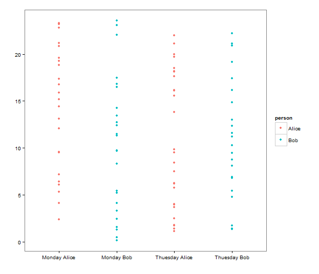
The plot you are describing is just a scatter plot with day-person pairs on x-axis. Below I provide an example code in R with ggplot2 library and the plot.
library(ggplot2)

set.seed(123)

data <- data.frame(
  person = sample(c("Alice", "Bob"), 100, replace = TRUE),
  day = sample(c("Monday", "Thuesday"), 100, replace = TRUE),
  hour = runif(100, 0, 24)
)

ggplot(data, aes(x = paste(day, person), y = hour, color = person)) +
  geom_point()

