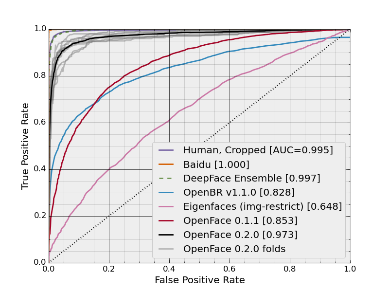
What is the name of this type of chart and how is it generated?
ThisThe image below shows a continuous curve of false positive rates vs. true positive rates.:
However, what I don't immediately get is how these rates are being calculated. If a method is applied to a dataset, it has a certain FP rate and a certain FN rate. Doesn't that mean that each method should have a single point rather than a curve? Of course there's multiple ways to configure a method, producing multiple different points, but it's not clear to me how there is this continuum of rates or how it's generated.

