The reasons that come to my mind:
- Such plots are unreadable for color-blind people.
- There are multiple different color palettes used for plotting -- it is not always instantly obvious what colors indicate "high" and what colors indicate "low" values. Moreover, my experience suggests it is very subjective what palettes are "intuitive" for different people.
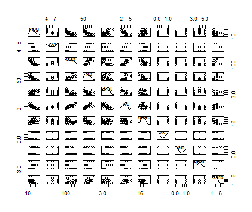
- If you plot multiple such plots on a single page they easily become totally unreadable, while with scatter plots at least some amount of readability is preserved (example below).
- It is much more complicated to choose appropriate color palette and appropriate scaling for numbers-to-colors mapping (so not to end up with unreadable blob) -- often it needs multiple tries until finding the right scaling.
- Choosing sizes of the bins is even more crucial than in simple histograms, because you can easily end up with colorful "white noise" for small bins, or just a few big rectangles that resemble rather abstract art, than say anything about your data.
- If you want to publish it, often you need to provide the plots in black-and-white, or grayscale, so such plots can be risky. If you didn't know about such editorial policy, you could easily end up with an almost-uniformly gray rectangle instead of your beautiful, colorful plot.
- Plot that looks good on your screen, does not have to look good on another monitor, with different settings.
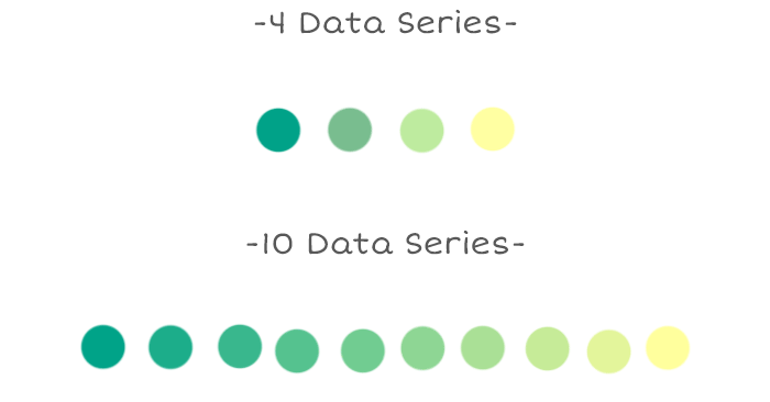
- There is limited number of colors that we can distinguish, so only a limited variability of data can be appropriately visualized. This is nicely illustrated on the picture from medium.com site:


