added 844 characters in body
Source Link
VLC
  • 399
  • 2
  • 6
EllipsoidQuantile[dataellPar=EllipsoidQuantile[data, {0.9}]
Show[{ListPlot[data, PlotRange -> {{0, 100}, {0, 100}}, AspectRatio -> 1],  Graphics[EllipsoidQuantile[data, 0.9]]}]

The general parametric form of the ellipse is:

ell[t_, xc_, yc_, a_, b_, angle_] := {xc + a Cos[t] Cos[angle] - b Sin[t] Sin[angle],
    yc + a Cos[t] Sin[angle] + b Sin[t] Cos[angle]}

And you can plot it in this way:

ParametricPlot[
    ell[t, ellPar[[1, 1, 1]], ellPar[[1, 1, 2]], ellPar[[1, 2, 1]], ellPar[[1, 2, 2]],
    ArcTan[ellPar[[1, 3, 1, 2]]/ellPar[[1, 3, 1, 1]]]], {t, 0, 2 \[Pi]},
    PlotRange -> {{0, 100}, {0, 100}}]

You could perform a check based on pure geometric information: if the Euclidean distance between the center of the ellipse (ellPar[[1,1]]) and your data point is larger than the distance between the center of the ellipse and the border of the ellipse (obviously, in the same direction in which your point is located), then that data point is outside the ellipse.

EllipsoidQuantile[data, {0.9}]
Show[{ListPlot[data, PlotRange -> {{0, 100}, {0, 100}}, AspectRatio -> 1],  Graphics[EllipsoidQuantile[data, 0.9]]}]
ellPar=EllipsoidQuantile[data, {0.9}]
Show[{ListPlot[data, PlotRange -> {{0, 100}, {0, 100}}, AspectRatio -> 1],  Graphics[EllipsoidQuantile[data, 0.9]]}]

The general parametric form of the ellipse is:

ell[t_, xc_, yc_, a_, b_, angle_] := {xc + a Cos[t] Cos[angle] - b Sin[t] Sin[angle],
    yc + a Cos[t] Sin[angle] + b Sin[t] Cos[angle]}

And you can plot it in this way:

ParametricPlot[
    ell[t, ellPar[[1, 1, 1]], ellPar[[1, 1, 2]], ellPar[[1, 2, 1]], ellPar[[1, 2, 2]],
    ArcTan[ellPar[[1, 3, 1, 2]]/ellPar[[1, 3, 1, 1]]]], {t, 0, 2 \[Pi]},
    PlotRange -> {{0, 100}, {0, 100}}]

You could perform a check based on pure geometric information: if the Euclidean distance between the center of the ellipse (ellPar[[1,1]]) and your data point is larger than the distance between the center of the ellipse and the border of the ellipse (obviously, in the same direction in which your point is located), then that data point is outside the ellipse.

added 14 characters in body
Source Link
VLC
  • 399
  • 2
  • 6

First approach

You might try this approach in Mathematica.

Let's generate some bivariate data:

data = Table[RandomVariate[BinormalDistribution[{50, 50}, {5, 10}, .8]], {1000}];

Then we need to load this package:

Needs["MultivariateStatistics`"]

And, now:

EllipsoidQuantile[data, {0.9}]

gives an output that defines a 90% confidence ellipse. The values you obtain from this output are in the following format:

{Ellipsoid[{x1, x2}, {r1, r2}, {{d1, d2}, {d3, d4}}]}

x1 and x2 specify the point at which the ellipse in centered, r1 and r2 specify the semi-axis radii, and d1, d2, d3 and d4 specify the alignment direction.

You can also plot this:

Show[{ListPlot[data, PlotRange -> {{0, 100}, {0, 100}}, AspectRatio -> 1],  Graphics[EllipsoidQuantile[data, 0.9]]}]

Second approach

This approach is based on the smooth kernel distribution.

These are some data distributed in a similar way to your data:

data1 = RandomVariate[BinormalDistribution[{.3, .7}, {.2, .3}, .8], 500];
data2 = RandomVariate[BinormalDistribution[{.6, .3}, {.4, .15}, .8], 500];
data = Partition[Flatten[Join[{data1, data2}]], 2];

We obtain a smooth kernel distribution on these data values:

skd = SmoothKernelDistribution[data];

We obtain a numeric result for each data point:

eval = Table[{data[[i]], PDF[skd, data[[i]]]}, {i, Length[data]}];

We fix a threshold and we select all the data that are higher than this threshold:

threshold = 1.2;
dataIn = Select[eval, #1[[2]] > threshold &][[All, 1]];

Here we get the data that fall outside the region:

dataOut = Complement[data, dataIn];

And now we can plot all the data:

Show[ContourPlot[Evaluate@PDF[skd, {x, y}], {x, 0, 1}, {y, 0, 1}, PlotRange -> {{0, 1}, {0, 1}}, PlotPoints -> 50],
ListPlot[dataIn, PlotStyle -> Darker[Green]],
ListPlot[dataOut, PlotStyle -> Red]]

The green colored points are those above the threshold and the red colored points are those below the threshold. Unfortunately, I don't have enough reputation to upload the image.

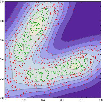
enter image description here

First approach

You might try this approach in Mathematica.

Let's generate some bivariate data:

data = Table[RandomVariate[BinormalDistribution[{50, 50}, {5, 10}, .8]], {1000}];

Then we need to load this package:

Needs["MultivariateStatistics`"]

And, now:

EllipsoidQuantile[data, {0.9}]

gives an output that defines a 90% confidence ellipse. The values you obtain from this output are in the following format:

{Ellipsoid[{x1, x2}, {r1, r2}, {{d1, d2}, {d3, d4}}]}

x1 and x2 specify the point at which the ellipse in centered, r1 and r2 specify the semi-axis radii, and d1, d2, d3 and d4 specify the alignment direction.

You can also plot this:

Show[{ListPlot[data, PlotRange -> {{0, 100}, {0, 100}}, AspectRatio -> 1],  Graphics[EllipsoidQuantile[data, 0.9]]}]

Second approach

This approach is based on the smooth kernel distribution.

These are some data distributed in a similar way to your data:

data1 = RandomVariate[BinormalDistribution[{.3, .7}, {.2, .3}, .8], 500];
data2 = RandomVariate[BinormalDistribution[{.6, .3}, {.4, .15}, .8], 500];
data = Partition[Flatten[Join[{data1, data2}]], 2];

We obtain a smooth kernel distribution on these data values:

skd = SmoothKernelDistribution[data];

We obtain a numeric result for each data point:

eval = Table[{data[[i]], PDF[skd, data[[i]]]}, {i, Length[data]}];

We fix a threshold and we select all the data that are higher than this threshold:

threshold = 1.2;
dataIn = Select[eval, #1[[2]] > threshold &][[All, 1]];

Here we get the data that fall outside the region:

dataOut = Complement[data, dataIn];

And now we can plot all the data:

Show[ContourPlot[Evaluate@PDF[skd, {x, y}], {x, 0, 1}, {y, 0, 1}, PlotRange -> {{0, 1}, {0, 1}}, PlotPoints -> 50],
ListPlot[dataIn, PlotStyle -> Darker[Green]],
ListPlot[dataOut, PlotStyle -> Red]]

The green colored points are those above the threshold and the red colored points are those below the threshold. Unfortunately, I don't have enough reputation to upload the image.

First approach

You might try this approach in Mathematica.

Let's generate some bivariate data:

data = Table[RandomVariate[BinormalDistribution[{50, 50}, {5, 10}, .8]], {1000}];

Then we need to load this package:

Needs["MultivariateStatistics`"]

And, now:

EllipsoidQuantile[data, {0.9}]

gives an output that defines a 90% confidence ellipse. The values you obtain from this output are in the following format:

{Ellipsoid[{x1, x2}, {r1, r2}, {{d1, d2}, {d3, d4}}]}

x1 and x2 specify the point at which the ellipse in centered, r1 and r2 specify the semi-axis radii, and d1, d2, d3 and d4 specify the alignment direction.

You can also plot this:

Show[{ListPlot[data, PlotRange -> {{0, 100}, {0, 100}}, AspectRatio -> 1],  Graphics[EllipsoidQuantile[data, 0.9]]}]

Second approach

This approach is based on the smooth kernel distribution.

These are some data distributed in a similar way to your data:

data1 = RandomVariate[BinormalDistribution[{.3, .7}, {.2, .3}, .8], 500];
data2 = RandomVariate[BinormalDistribution[{.6, .3}, {.4, .15}, .8], 500];
data = Partition[Flatten[Join[{data1, data2}]], 2];

We obtain a smooth kernel distribution on these data values:

skd = SmoothKernelDistribution[data];

We obtain a numeric result for each data point:

eval = Table[{data[[i]], PDF[skd, data[[i]]]}, {i, Length[data]}];

We fix a threshold and we select all the data that are higher than this threshold:

threshold = 1.2;
dataIn = Select[eval, #1[[2]] > threshold &][[All, 1]];

Here we get the data that fall outside the region:

dataOut = Complement[data, dataIn];

And now we can plot all the data:

Show[ContourPlot[Evaluate@PDF[skd, {x, y}], {x, 0, 1}, {y, 0, 1}, PlotRange -> {{0, 1}, {0, 1}}, PlotPoints -> 50],
ListPlot[dataIn, PlotStyle -> Darker[Green]],
ListPlot[dataOut, PlotStyle -> Red]]

The green colored points are those above the threshold and the red colored points are those below the threshold.

enter image description here

added 1 characters in body
Source Link
VLC
  • 399
  • 2
  • 6

First approach

You might try this approach in Mathematica.

Let's generate some bivariate data:

data = Table[RandomVariate[BinormalDistribution[{50, 50}, {5, 10}, .8]], {1000}];

Then we need to load this package:

Needs["MultivariateStatistics`"]

And, now:

EllipsoidQuantile[data, {0.9}]

gives an output that defines a 90% confidence ellipse. The values you obtain from this output are in the following format:

{Ellipsoid[{x1, x2}, {r1, r2}, {{d1, d2}, {d3, d4}}]}

x1 and x2 specify the point at which the ellipse in centered, r1 and r2 specify the semi-axis radii, and d1, d2, d3 and d4 specify the alignment direction.

You can also plot this:

Show[{ListPlot[data, PlotRange -> {{0, 100}, {0, 100}}, AspectRatio -> 1],  Graphics[EllipsoidQuantile[data, 0.9]]}]

Second approach

This approach is based on the smooth kernel distribution.

ThisThese are some data distributed in a similar way to your data:

data1 = RandomVariate[BinormalDistribution[{.3, .7}, {.2, .3}, .8], 500];
data2 = RandomVariate[BinormalDistribution[{.6, .3}, {.4, .15}, .8], 500];
data = Partition[Flatten[Join[{data1, data2}]], 2];

We obtain a smooth kernel distribution on these data values:

skd = SmoothKernelDistribution[data];

We obtain a numeric result for each data point:

eval = Table[{data[[i]], PDF[skd, data[[i]]]}, {i, Length[data]}];

We fix a threshold and we select all the data that are higher than this threshold:

threshold = 1.2;
dataIn = Select[eval, #1[[2]] > threshold &][[All, 1]];

Here we get the data that fall outside the region:

dataOut = Complement[data, dataIn];

And now we can plot all the data:

Show[ContourPlot[Evaluate@PDF[skd, {x, y}], {x, 0, 1}, {y, 0, 1}, PlotRange -> {{0, 1}, {0, 1}}, PlotPoints -> 50],
ListPlot[dataIn, PlotStyle -> Darker[Green]],
ListPlot[dataOut, PlotStyle -> Red]]

The green colored points are those above the threshold and the red colored points are those below the threshold. Unfortunately, I don't have enough reputation to upload the image.

First approach

You might try this approach in Mathematica.

Let's generate some bivariate data:

data = Table[RandomVariate[BinormalDistribution[{50, 50}, {5, 10}, .8]], {1000}];

Then we need to load this package:

Needs["MultivariateStatistics`"]

And, now:

EllipsoidQuantile[data, {0.9}]

gives an output that defines a 90% confidence ellipse. The values you obtain from this output are in the following format:

{Ellipsoid[{x1, x2}, {r1, r2}, {{d1, d2}, {d3, d4}}]}

x1 and x2 specify the point at which the ellipse in centered, r1 and r2 specify the semi-axis radii, and d1, d2, d3 and d4 specify the alignment direction.

You can also plot this:

Show[{ListPlot[data, PlotRange -> {{0, 100}, {0, 100}}, AspectRatio -> 1],  Graphics[EllipsoidQuantile[data, 0.9]]}]

Second approach

This approach is based on the smooth kernel distribution.

This are some data distributed in a similar way to your data:

data1 = RandomVariate[BinormalDistribution[{.3, .7}, {.2, .3}, .8], 500];
data2 = RandomVariate[BinormalDistribution[{.6, .3}, {.4, .15}, .8], 500];
data = Partition[Flatten[Join[{data1, data2}]], 2];

We obtain a smooth kernel distribution on these data values:

skd = SmoothKernelDistribution[data];

We obtain a numeric result for each data point:

eval = Table[{data[[i]], PDF[skd, data[[i]]]}, {i, Length[data]}];

We fix a threshold and we select all the data that are higher than this threshold:

threshold = 1.2;
dataIn = Select[eval, #1[[2]] > threshold &][[All, 1]];

Here we get the data that fall outside the region:

dataOut = Complement[data, dataIn];

And now we can plot all the data:

Show[ContourPlot[Evaluate@PDF[skd, {x, y}], {x, 0, 1}, {y, 0, 1}, PlotRange -> {{0, 1}, {0, 1}}, PlotPoints -> 50],
ListPlot[dataIn, PlotStyle -> Darker[Green]],
ListPlot[dataOut, PlotStyle -> Red]]

The green colored points are those above the threshold and the red colored points are those below the threshold. Unfortunately, I don't have enough reputation to upload the image.

First approach

You might try this approach in Mathematica.

Let's generate some bivariate data:

data = Table[RandomVariate[BinormalDistribution[{50, 50}, {5, 10}, .8]], {1000}];

Then we need to load this package:

Needs["MultivariateStatistics`"]

And, now:

EllipsoidQuantile[data, {0.9}]

gives an output that defines a 90% confidence ellipse. The values you obtain from this output are in the following format:

{Ellipsoid[{x1, x2}, {r1, r2}, {{d1, d2}, {d3, d4}}]}

x1 and x2 specify the point at which the ellipse in centered, r1 and r2 specify the semi-axis radii, and d1, d2, d3 and d4 specify the alignment direction.

You can also plot this:

Show[{ListPlot[data, PlotRange -> {{0, 100}, {0, 100}}, AspectRatio -> 1],  Graphics[EllipsoidQuantile[data, 0.9]]}]

Second approach

This approach is based on the smooth kernel distribution.

These are some data distributed in a similar way to your data:

data1 = RandomVariate[BinormalDistribution[{.3, .7}, {.2, .3}, .8], 500];
data2 = RandomVariate[BinormalDistribution[{.6, .3}, {.4, .15}, .8], 500];
data = Partition[Flatten[Join[{data1, data2}]], 2];

We obtain a smooth kernel distribution on these data values:

skd = SmoothKernelDistribution[data];

We obtain a numeric result for each data point:

eval = Table[{data[[i]], PDF[skd, data[[i]]]}, {i, Length[data]}];

We fix a threshold and we select all the data that are higher than this threshold:

threshold = 1.2;
dataIn = Select[eval, #1[[2]] > threshold &][[All, 1]];

Here we get the data that fall outside the region:

dataOut = Complement[data, dataIn];

And now we can plot all the data:

Show[ContourPlot[Evaluate@PDF[skd, {x, y}], {x, 0, 1}, {y, 0, 1}, PlotRange -> {{0, 1}, {0, 1}}, PlotPoints -> 50],
ListPlot[dataIn, PlotStyle -> Darker[Green]],
ListPlot[dataOut, PlotStyle -> Red]]

The green colored points are those above the threshold and the red colored points are those below the threshold. Unfortunately, I don't have enough reputation to upload the image.

added 1325 characters in body
Source Link
VLC
  • 399
  • 2
  • 6
Loading
Source Link
VLC
  • 399
  • 2
  • 6
Loading