added 432 characters in body
Source Link
Jon
  • 2.4k
  • 2
  • 15
  • 31

To answer your question, here is an example:

set.seed(123)
x = arima.sim(model=list(0.2, 0, 0.5), n = 100)
y = arima.sim(model=list(0.4, 0, 0.4), n = 100)
ccf(x, y, type="correlation")

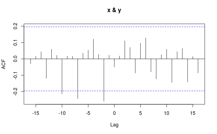
There are two time series, x and y. The correlation between the two occurs at $y_t$ and $x_{t \pm k}$ where $\pm k$ is a lag. In this example, at $k$ = -2, -7, -10, $x_{t + k}$ is significantly $negatively$ correlated with $y_t$.

The interpretation can be that x leads y at lags 2, 7 and 10. This is random data so the leads are meaningless.

Here are a few useful references for interpretation (my TS knowledge is a bit rusty): http://homepage.univie.ac.at/robert.kunst/prognos4.pdf

https://onlinecourses.science.psu.edu/stat510/node/74

Cross Correlation Plot

To add more detail regarding your situation, it appears that your y_t lags x_{t+k}. The sinusoidal pattern you see in the CCF/ACF is typical for certain time series structures. How familiar are you with AR and MA models?

Regarding your hypothesis, it's unclear what data you have, and what the nature of that data may be, but if your time series have a nonstationary pattern, that will result odd ACF/PACF/CCF plots.

To answer your question, here is an example:

set.seed(123)
x = arima.sim(model=list(0.2, 0, 0.5), n = 100)
y = arima.sim(model=list(0.4, 0, 0.4), n = 100)
ccf(x, y, type="correlation")

There are two time series, x and y. The correlation between the two occurs at $y_t$ and $x_{t \pm k}$ where $\pm k$ is a lag. In this example, at $k$ = -2, -7, -10, $x_{t + k}$ is significantly $negatively$ correlated with $y_t$.

The interpretation can be that x leads y at lags 2, 7 and 10. This is random data so the leads are meaningless.

Here are a few useful references for interpretation (my TS knowledge is a bit rusty): http://homepage.univie.ac.at/robert.kunst/prognos4.pdf

https://onlinecourses.science.psu.edu/stat510/node/74

Cross Correlation Plot

To add more detail regarding your situation, it appears that your y_t lags x_{t+k}. The sinusoidal pattern you see in the CCF/ACF is typical for certain time series structures. How familiar are you with AR and MA models?

Regarding your hypothesis, it's unclear what data you have, and what the nature of that data may be, but if your time series have a nonstationary pattern, that will result odd ACF/PACF/CCF plots.

Source Link
Jon
  • 2.4k
  • 2
  • 15
  • 31

To answer your question, here is an example:

set.seed(123)
x = arima.sim(model=list(0.2, 0, 0.5), n = 100)
y = arima.sim(model=list(0.4, 0, 0.4), n = 100)
ccf(x, y, type="correlation")

There are two time series, x and y. The correlation between the two occurs at $y_t$ and $x_{t \pm k}$ where $\pm k$ is a lag. In this example, at $k$ = -2, -7, -10, $x_{t + k}$ is significantly $negatively$ correlated with $y_t$.

The interpretation can be that x leads y at lags 2, 7 and 10. This is random data so the leads are meaningless.

Here are a few useful references for interpretation (my TS knowledge is a bit rusty): http://homepage.univie.ac.at/robert.kunst/prognos4.pdf

https://onlinecourses.science.psu.edu/stat510/node/74

Cross Correlation Plot