replaced http://stats.stackexchange.com/ with https://stats.stackexchange.com/
Source Link

This is one of the classic problems for the 'Iris' data set. This is a link to a whole set of plotting projects based on that data set with R code, which you may be able to adapt to your problem.

Here is an approach that uses with base R rather than an add-on package.

plot(iris$Petal.Length, iris$Petal.Width, pch=21, 
     bg=c("red","green3","blue")[unclass(iris$Species)], 
     main="Edgar Anderson's Iris Data")

which produces this figure:
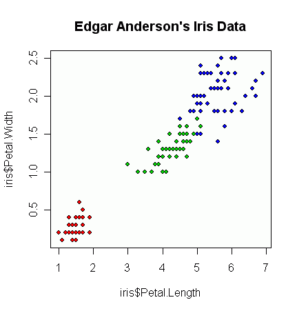
enter image description here

From there, depending on your plot, you can start messing about with alpha/transparency levels to allow for overplotting, etc. but I would build up from a very basic graph first.

While there are many reasons to stick with base R, other packages simplify plotting. Separating out data by a distinguishing feature is one of the strengths of the ggplot2 and lattice packages. ggplot2 makes particularly visually appealing plots. Both packages are demonstrated in the answerdemonstrated in the answer by @cbeleites.

This is one of the classic problems for the 'Iris' data set. This is a link to a whole set of plotting projects based on that data set with R code, which you may be able to adapt to your problem.

Here is an approach that uses with base R rather than an add-on package.

plot(iris$Petal.Length, iris$Petal.Width, pch=21, 
     bg=c("red","green3","blue")[unclass(iris$Species)], 
     main="Edgar Anderson's Iris Data")

which produces this figure:

enter image description here

From there, depending on your plot, you can start messing about with alpha/transparency levels to allow for overplotting, etc. but I would build up from a very basic graph first.

While there are many reasons to stick with base R, other packages simplify plotting. Separating out data by a distinguishing feature is one of the strengths of the ggplot2 and lattice packages. ggplot2 makes particularly visually appealing plots. Both packages are demonstrated in the answer by @cbeleites.

edited an otherwise excellent answer to emphasize that the current answer uses base, and to link to another answer that uses ggplot. plus some other edits for clarity.
Source Link

Separating out data by a distinguishing featureThis is one of the strengths of the ggplot2 package. In one of the online discussions or code examples for that package you should find what you need.

It's also one of the classic problems for the 'Iris' data set. This is a link to a whole set of plotting projects based on that data set with R code, which you may be able to adapt to your problem, if you'd prefer to stick.

Here is an approach that uses with a a strategy using base R rather than an add-on package.

Particularly look at this code:

plot(iris$Petal.Length, iris$Petal.Width, pch=21, 
     bg=c("red","green3","blue")[unclass(iris$Species)], 
     main="Edgar Anderson's Iris Data")

which produces this figure:

enter image description here

From there, depending on your plot, you can start messing about with alpha/transparency levels to allow for overplotting, etc. but I would build up from a very basic graph first.

While there are many reasons to stick with base R, other packages simplify plotting. Separating out data by a distinguishing feature is one of the strengths of the ggplot2 and lattice packages. ggplot2 makes particularly visually appealing plots. Both packages are demonstrated in the answer by @cbeleites.

Separating out data by a distinguishing feature is one of the strengths of the ggplot2 package. In one of the online discussions or code examples for that package you should find what you need.

It's also one of the classic problems for the 'Iris' data set. This is a link to a whole set of plotting projects based on that data set with R code, which you may be able to adapt to your problem, if you'd prefer to stick with a a strategy using base R rather than an add-on package.

Particularly look at this code:

plot(iris$Petal.Length, iris$Petal.Width, pch=21, 
bg=c("red","green3","blue")[unclass(iris$Species)], main="Edgar Anderson's Iris Data")

which produces this figure:

enter image description here

From there, depending on your plot, you can start messing about with alpha/transparency levels to allow for overplotting, etc. but I would build up from a very basic graph first.

This is one of the classic problems for the 'Iris' data set. This is a link to a whole set of plotting projects based on that data set with R code, which you may be able to adapt to your problem.

Here is an approach that uses with base R rather than an add-on package.

plot(iris$Petal.Length, iris$Petal.Width, pch=21, 
     bg=c("red","green3","blue")[unclass(iris$Species)], 
     main="Edgar Anderson's Iris Data")

which produces this figure:

enter image description here

From there, depending on your plot, you can start messing about with alpha/transparency levels to allow for overplotting, etc. but I would build up from a very basic graph first.

While there are many reasons to stick with base R, other packages simplify plotting. Separating out data by a distinguishing feature is one of the strengths of the ggplot2 and lattice packages. ggplot2 makes particularly visually appealing plots. Both packages are demonstrated in the answer by @cbeleites.

added 52 characters in body
Source Link
Fomite
  • 23.7k
  • 13
  • 88
  • 147

Separating out data by a distinguishing feature is one of the strengths of the ggplot2 package. In one of the online discussions or code examples for that package you should find what you need.

It's also one of the classic problems for the 'Iris' data set. This is a link to a whole set of plotting projects based on that data set with R code, which you may be able to adapt to your problem, if you'd prefer to stick with a a strategy using base R rather than an add-on package.

Particularly look at this code:

plot(iris$Petal.Length, iris$Petal.Width, pch=21, 
bg=c("red","green3","blue")[unclass(iris$Species)], main="Edgar Anderson's Iris Data")

which produces this figure:

enter image description here

From there, depending on your plot, you can start messing about with alpha/transparency levels to allow for overplotting, etc. but I would build up from a very basic graph first.

Separating out data by a distinguishing feature is one of the strengths of the ggplot2 package. In one of the online discussions or code examples for that package you should find what you need.

It's also one of the classic problems for the 'Iris' data set. This is a link to a whole set of plotting projects based on that data set with R code, which you may be able to adapt to your problem, if you'd prefer to stick with a a strategy using base R rather than an add-on package.

Particularly look at this code:

plot(iris$Petal.Length, iris$Petal.Width, pch=21, 
bg=c("red","green3","blue")[unclass(iris$Species)], main="Edgar Anderson's Iris Data")

which produces this figure:

enter image description here

From there, depending on your plot, you can start messing about with alpha/transparency levels to allow for overplotting, etc.

Separating out data by a distinguishing feature is one of the strengths of the ggplot2 package. In one of the online discussions or code examples for that package you should find what you need.

It's also one of the classic problems for the 'Iris' data set. This is a link to a whole set of plotting projects based on that data set with R code, which you may be able to adapt to your problem, if you'd prefer to stick with a a strategy using base R rather than an add-on package.

Particularly look at this code:

plot(iris$Petal.Length, iris$Petal.Width, pch=21, 
bg=c("red","green3","blue")[unclass(iris$Species)], main="Edgar Anderson's Iris Data")

which produces this figure:

enter image description here

From there, depending on your plot, you can start messing about with alpha/transparency levels to allow for overplotting, etc. but I would build up from a very basic graph first.

Source Link
Fomite
  • 23.7k
  • 13
  • 88
  • 147
Loading