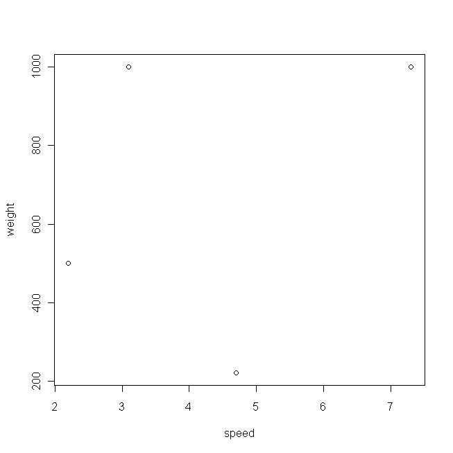
 This plot doesn't look very exciting, mainly because you only have 4 data points. Another
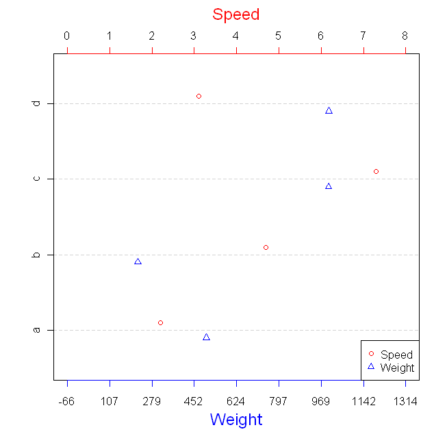
Another way to visualize data is to use a dotplotdotplot. This is an especially good way to look at data that represent simple magnitudes, which is what would you have, if you were looking at only oneone of your variables. Note that this is the same thing a bar chart provides, it's just that dotplots have been shown to be easier for people to extract the information. The question is, can you look at two variables at the same time in such a way that you could perhaps see relationships, but without redundancy?
One way to deal with this general problem is to plot two variables on the same plot (in this case, the same dotplot). This sort of thing is very commonly done with time series data in economics (here's one I found through Googling). The trick is to find a way to get two different scales on the same plot. This can be done by rescaling one of the variables in terms of the other; in addition, you must rescale the axis values of the other variable into the terms of the first. These 'rescalings' must be linear transformations so as not to change the data in a meaningful way. The following is some R code that does this in a way which is incredibly kluge-y, but that I hope will be easy to follow:

