added 97 characters in body
Source Link
Nick Cox
  • 59.5k
  • 8
  • 136
  • 212

There are many good ideas here in other answers, but they don't exhaust the good solutions that are possible. ThisThe first graph in this answer takes it that different levels of death rate can be discussed and explained separately. In allowing each series to fill much of the space available, it focuses readers' attention on patterns of relative change.

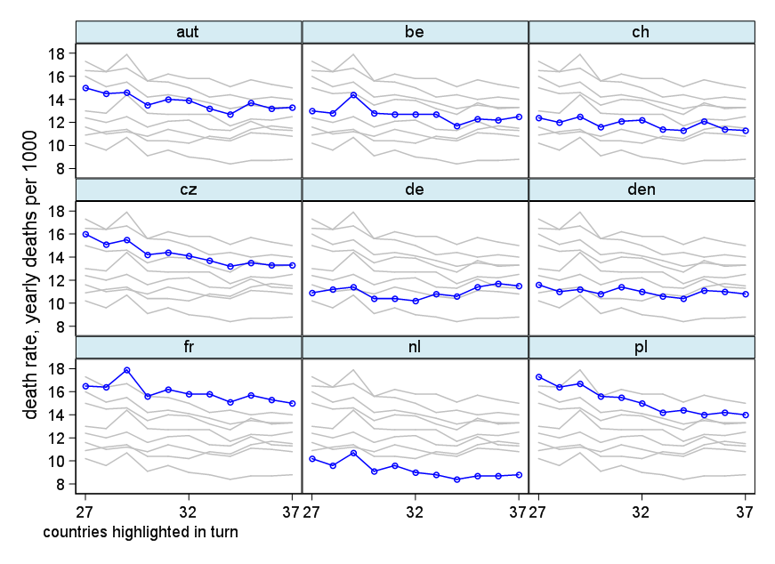
ThisAlternatively, this next design shows each series separately, but each time with the other series as backdrop. The general idea is discussed within this related thread.

fabplot is to be understood as front or foreground and backdrop or background plot, not as some echo of 1960s slang for "fabulous".

There are many good ideas here in other answers, but they don't exhaust the good solutions that are possible. This graph takes it that different levels of death rate can be discussed and explained separately. In allowing each series to fill much of the space available, it focuses readers' attention on patterns of change.

This design shows each series separately, but each time with the other series as backdrop. The general idea is discussed within this related thread.

fabplot is to be understood as front or foreground and backdrop or background plot.

There are many good ideas here in other answers, but they don't exhaust the good solutions that are possible. The first graph in this answer takes it that different levels of death rate can be discussed and explained separately. In allowing each series to fill much of the space available, it focuses readers' attention on patterns of relative change.

Alternatively, this next design shows each series separately, but each time with the other series as backdrop. The general idea is discussed within this related thread.

fabplot is to be understood as front or foreground and backdrop or background plot, not as some echo of 1960s slang for "fabulous".

deleted 277 characters in body
Source Link
Nick Cox
  • 59.5k
  • 8
  • 136
  • 212
clear
input int year double(de fr be nl den ch aut cz pl)
1927 10.9 16.5   13 10.2 11.6 12.4   15   16 17.3
1928 11.2 16.4 12.8  9.6   11   12 14.5 15.1 16.4
1929 11.4 17.9 14.4 10.7 11.2 12.5 14.6 15.5 16.7
1930 10.4 15.6 12.8  9.1 10.8 11.6 13.5 14.2 15.6
1931 10.4 16.2 12.7  9.6 11.4 12.1   14 14.4 15.5
1932 10.2 15.8 12.7    9   11 12.2 13.9 14.1   15
1933 10.8 15.8 12.7  8.8 10.6 11.4 13.2 13.7 14.2
1934 10.6 15.1 11.7  8.4 10.4 11.3 12.7 13.2 14.4
1935 11.4 15.7 12.3  8.7 11.1 12.1 13.7 13.5   14
1936 11.7 15.3 12.2  8.7   11 11.4 13.2 13.3 14.2
1937 11.5   15 12.5  8.8 10.8 11.3 13.3 13.3   14
end

rename (de-pl) (death=)
reshape long death, i(year) j(country) string
set scheme s1color 
line death year, by(country, yrescale note("")) xtitle("") xla(1927(5)1937)

EDIT 2 (revised to show simpler code):

Stata code for the record (this is trickier, but Stata users should note an inclination on my part to generalise the code as a program):

egen where = group(country), label 
gen long id = _n
expand 9
bysort id : gen group = _n
label val group where 
separate death, by(group == where)

local note "countries highlighted in turn"
set scheme* s1colortype 
sort"ssc groupinst countryfabplot" yearto 
 install
twoway fabplot line death0death year, lc(gs12) by(groupcountry, compact note("`note'") legend(off))"countries ///
subtitle(,highlighted fcolor(ltblue*0.5))in c(Lturn") xtitle("") ///
ytitle("death rate, yearly deaths per 1000") yla(8(2)18, ang(h)) ///
xla(1927(5)1937, format(%tyY)) ///
|| connected death1 year, lcxtitle(blue"") mcfront(blueconnected) ms(oh)

fabplot is to be understood as front or foreground and backdrop or background plot.

clear
input int year double(de fr be nl den ch aut cz pl)
1927 10.9 16.5   13 10.2 11.6 12.4   15   16 17.3
1928 11.2 16.4 12.8  9.6   11   12 14.5 15.1 16.4
1929 11.4 17.9 14.4 10.7 11.2 12.5 14.6 15.5 16.7
1930 10.4 15.6 12.8  9.1 10.8 11.6 13.5 14.2 15.6
1931 10.4 16.2 12.7  9.6 11.4 12.1   14 14.4 15.5
1932 10.2 15.8 12.7    9   11 12.2 13.9 14.1   15
1933 10.8 15.8 12.7  8.8 10.6 11.4 13.2 13.7 14.2
1934 10.6 15.1 11.7  8.4 10.4 11.3 12.7 13.2 14.4
1935 11.4 15.7 12.3  8.7 11.1 12.1 13.7 13.5   14
1936 11.7 15.3 12.2  8.7   11 11.4 13.2 13.3 14.2
1937 11.5   15 12.5  8.8 10.8 11.3 13.3 13.3   14
end

rename (de-pl) (death=)
reshape long death, i(year) j(country) string
line death year, by(country, yrescale note("")) xtitle("") xla(1927(5)1937)

EDIT 2:

Stata code for the record (this is trickier, but Stata users should note an inclination on my part to generalise the code as a program):

egen where = group(country), label 
gen long id = _n
expand 9
bysort id : gen group = _n
label val group where 
separate death, by(group == where)

local note "countries highlighted in turn"
set scheme s1color 
sort group country year 
 
twoway  line death0 year, lc(gs12) by(group, compact note("`note'") legend(off)) ///
subtitle(, fcolor(ltblue*0.5)) c(L) xtitle("") ///
ytitle("death rate, yearly deaths per 1000") yla(8(2)18, ang(h)) xla(1927(5)1937, format(%tyY)) ///
|| connected death1 year, lc(blue) mc(blue) ms(oh)
clear
input int year double(de fr be nl den ch aut cz pl)
1927 10.9 16.5   13 10.2 11.6 12.4   15   16 17.3
1928 11.2 16.4 12.8  9.6   11   12 14.5 15.1 16.4
1929 11.4 17.9 14.4 10.7 11.2 12.5 14.6 15.5 16.7
1930 10.4 15.6 12.8  9.1 10.8 11.6 13.5 14.2 15.6
1931 10.4 16.2 12.7  9.6 11.4 12.1   14 14.4 15.5
1932 10.2 15.8 12.7    9   11 12.2 13.9 14.1   15
1933 10.8 15.8 12.7  8.8 10.6 11.4 13.2 13.7 14.2
1934 10.6 15.1 11.7  8.4 10.4 11.3 12.7 13.2 14.4
1935 11.4 15.7 12.3  8.7 11.1 12.1 13.7 13.5   14
1936 11.7 15.3 12.2  8.7   11 11.4 13.2 13.3 14.2
1937 11.5   15 12.5  8.8 10.8 11.3 13.3 13.3   14
end

rename (de-pl) (death=)
reshape long death, i(year) j(country) string
set scheme s1color 
line death year, by(country, yrescale note("")) xtitle("") xla(1927(5)1937)

EDIT 2 (revised to show simpler code):

Stata code for the record:

* type "ssc inst fabplot" to install
fabplot line death year, by(country, compact note("countries highlighted in turn")) ///
ytitle("death rate, yearly deaths per 1000") yla(8(2)18, ang(h)) ///
xla(1927(5)1937, format(%tyY)) xtitle("") front(connected) 

fabplot is to be understood as front or foreground and backdrop or background plot.
added 1300 characters in body
Source Link
Nick Cox
  • 59.5k
  • 8
  • 136
  • 212

EDIT 2:

This design shows each series separately, but each time with the other series as backdrop. The general idea is discussed within this related thread.

enter image description here

There is loss as well as gain here. While each series can more easily be seen in the context of others, space is lost by repetition.

Stata code for the record (this is trickier, but Stata users should note an inclination on my part to generalise the code as a program):

(Code to input, reshape, rename as above in this answer)

egen where = group(country), label 
gen long id = _n
expand 9
bysort id : gen group = _n
label val group where 
separate death, by(group == where)

local note "countries highlighted in turn"
set scheme s1color 
sort group country year 

twoway  line death0 year, lc(gs12) by(group, compact note("`note'") legend(off)) ///
subtitle(, fcolor(ltblue*0.5)) c(L) xtitle("") ///
ytitle("death rate, yearly deaths per 1000") yla(8(2)18, ang(h)) xla(1927(5)1937, format(%tyY)) ///
|| connected death1 year, lc(blue) mc(blue) ms(oh)
added 436 characters in body
Source Link
Nick Cox
  • 59.5k
  • 8
  • 136
  • 212
Loading
edited body
Source Link
Nick Cox
  • 59.5k
  • 8
  • 136
  • 212
Loading
Source Link
Nick Cox
  • 59.5k
  • 8
  • 136
  • 212
Loading