added 1604 characters in body
Source Link
Ben
  • 132.9k
  • 7
  • 255
  • 588

What is happening here is essentially just Simpson's "paradox". In this particular case you have observed positive marginal correlation between yield and x1, but the relationship turns negative after you condition on x2 and year in theyour linear model. You can also see from your plots that x1 and x2 have strong positive correlation, so this is giving you strong multicollinearity which would explain the phenomenon in this case.

This type of phenomenon is not unusual when examining relationships between multiple variables, especially when there is strong collinearity. For this reason it is generally misleading to plot crude pairwise comparisons between variables when doing analysis with many variables. If you want to look at the conditional relationship between yield and x1 then this would usually be illustrated with an partial regression plot (also called an added variable plot).


Implementation in R: The effects package has functionality to automatically produce residuals that absorb the lower-order terms marginal to the model variable of interest. This allows you to construct what are effectively partial regression plots for a range of models including lme models. This can be implemented to produce a partial regression plot in R using the code below. (Note that the data file you have linked to does not exactly match with the model output you have presented in your question. I have included the model output from the linked data.)

#Read data (need to put it in working directory first)
DATA <- read.csv('my.data.csv');

#Fit your model
library(lme4);
MODEL <- lmer(log(yield) ~ x1 + x2 + year + (year |admin1/admin2),
              REML = FALSE, data = DATA);

#Show model output
summary(MODEL);

...
Fixed effects:
            Estimate Std. Error t value
(Intercept)  8.41434    0.08585  98.008
x1          -0.07381    0.01558  -4.736
x2           0.13214    0.01521   8.687
year         0.11642    0.02994   3.888
....

#Generate partial regression plot using effects package
library(effects);
PARTIAL_MODEL <- Effect('x1', partial.residuals = TRUE, mod = MODEL);
plot(PARTIAL_MODEL, main = 'Partial Regression Plot',
     xlab = 'x1', ylab = 'Log-Yield');

enter image description here

What is happening here is essentially just Simpson's "paradox". In this particular case you have observed positive marginal correlation between yield and x1, but the relationship turns negative after you condition on x2 in the linear model. You can also see from your plots that x1 and x2 have strong positive correlation, so this is giving you strong multicollinearity which would explain the phenomenon in this case.

This type of phenomenon is not unusual when examining relationships between multiple variables, especially when there is strong collinearity. For this reason it is generally misleading to plot crude pairwise comparisons between variables when doing analysis with many variables. If you want to look at the conditional relationship between yield and x1 then this would usually be illustrated with an partial regression plot (also called an added variable plot).

What is happening here is essentially just Simpson's "paradox". In this particular case you have observed positive marginal correlation between yield and x1, but the relationship turns negative after you condition on x2 and year in your linear model. You can also see from your plots that x1 and x2 have strong positive correlation, so this is giving you strong multicollinearity which would explain the phenomenon in this case.

This type of phenomenon is not unusual when examining relationships between multiple variables, especially when there is strong collinearity. For this reason it is generally misleading to plot crude pairwise comparisons between variables when doing analysis with many variables. If you want to look at the conditional relationship between yield and x1 then this would usually be illustrated with an partial regression plot (also called an added variable plot).


Implementation in R: The effects package has functionality to automatically produce residuals that absorb the lower-order terms marginal to the model variable of interest. This allows you to construct what are effectively partial regression plots for a range of models including lme models. This can be implemented to produce a partial regression plot in R using the code below. (Note that the data file you have linked to does not exactly match with the model output you have presented in your question. I have included the model output from the linked data.)

#Read data (need to put it in working directory first)
DATA <- read.csv('my.data.csv');

#Fit your model
library(lme4);
MODEL <- lmer(log(yield) ~ x1 + x2 + year + (year |admin1/admin2),
              REML = FALSE, data = DATA);

#Show model output
summary(MODEL);

...
Fixed effects:
            Estimate Std. Error t value
(Intercept)  8.41434    0.08585  98.008
x1          -0.07381    0.01558  -4.736
x2           0.13214    0.01521   8.687
year         0.11642    0.02994   3.888
....

#Generate partial regression plot using effects package
library(effects);
PARTIAL_MODEL <- Effect('x1', partial.residuals = TRUE, mod = MODEL);
plot(PARTIAL_MODEL, main = 'Partial Regression Plot',
     xlab = 'x1', ylab = 'Log-Yield');
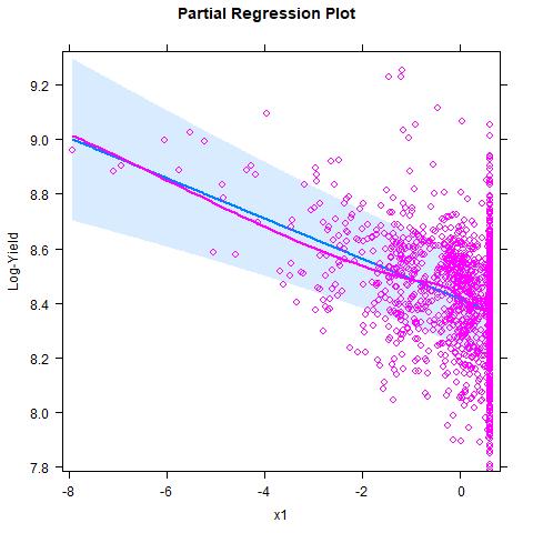
enter image description here

Source Link
Ben
  • 132.9k
  • 7
  • 255
  • 588

What is happening here is essentially just Simpson's "paradox". In this particular case you have observed positive marginal correlation between yield and x1, but the relationship turns negative after you condition on x2 in the linear model. You can also see from your plots that x1 and x2 have strong positive correlation, so this is giving you strong multicollinearity which would explain the phenomenon in this case.

This type of phenomenon is not unusual when examining relationships between multiple variables, especially when there is strong collinearity. For this reason it is generally misleading to plot crude pairwise comparisons between variables when doing analysis with many variables. If you want to look at the conditional relationship between yield and x1 then this would usually be illustrated with an partial regression plot (also called an added variable plot).