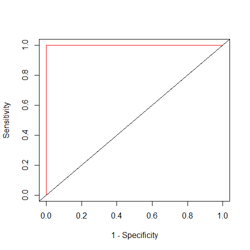
The problem arises because of the assumption that there can not be different $y$ values for one $x$ value. You seem to (implicitly?) mix up the ROC curve with a graph that depicts a function of the form $y = f(x) = x + ...$ where indeed each $x$ value can be connected to a single $y$ value. This is not the case for a ROC curve. In fact the website you linked says further below that A classifier with the perfect performance level shows a combination of two straight lines – from the origin (0.0, 0.0) to the top left corner (0.0, 1.0) and further to the top right corner (1.0, 1.0).
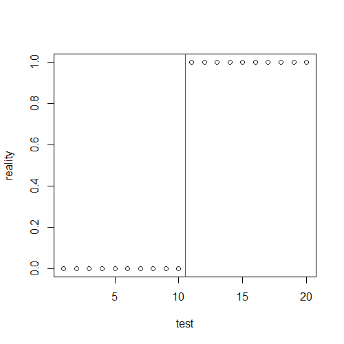
Let's consider an example. Here is some data where test values can seperate perfectly the occurence of some entity in the reality with the perfect treshold in red:

The ROC curve (red line) for this data looks as the description in the quote before suggests:

As you can see, for $x= 0$ there is not only $y= 0$ and $y= 1$ but in fact we actually get for every treshold with $x= 0$ a point in the interval $[0, 1]$ on the $y$ axis, hence there can be many more different $y$ values for $x= 0$ than only $2$.
You can reproduce this with the following R code:
# data
# sample size
n <- 20
# test values
test <- 1:n
# actual diagnosis
reality <- factor(rep(c(FALSE, TRUE), each= n/2), levels= c(TRUE, FALSE))
# vector of tresholds
treshold <- c(-Inf, seq(min(test), max(test), 0.5), Inf)

# calculate sensitivity and specifiticity per treshold
results <- sapply(treshold, function(treshold_i){
  # what cases are over the treshold?
  test_results <- factor(test  >= treshold_i, levels=c(TRUE, FALSE))
  # create a table
  table_results <- table(test_results, reality)
  # estimate sensitivity
  sens <- table_results[1, 1]/ sum(table_results[ , 1])
  # estimate specifiticity
  spec <- table_results[2, 2]/ sum(table_results[ , 2])
  # save both and the used treshold in a matrix
  m <- matrix(c(treshold_i, sens, spec), ncol= 3)
  # return matrix
  return(m)
})

# organize the data
# flip matrix
results <- t(results)
# name columns
colnames(results) <- c("treshold", "sens", "spec")

# ROC curve (2nd plot)
plot(1 - results[ , "spec"], results[ , "sens"], type= "l", col= "red",
     xlab= "1 - Specificity", ylab= "Sensitivity")
# diagonal line
abline(0, 1)

# first plot: test values vs reality
plot(test, as.logical(reality), ylab= "reality")
# line for treshold with just correct classification
# in the roc curve this is the point (0, 1)
abline(v= 10.5, col= "red")
# table with the results
results


