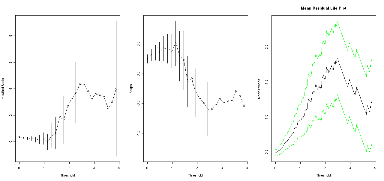
I'm using the POT Package in R for fitting a Generalized Pareto distribution to my data. For choosing an approximate threshold I'm using the tcplot() and mrlplot() the following way(x is the data containing vector)
tcplot(x,u.range=c(0,quantile(x,probs=0.995)))
mrlplot(x,u.range=c(0,quantile(x,probs=0.995)),col=c("green","black","green"),nt=200 )
But I get a bit confused sometimes as what value I'll choose as threshold. Particularly as mentioned in this sitethis site that
interpretation of these plots often requires a good deal of subjective judgement
http://www.bioss.ac.uk/people/adam/teaching/OR_EVT/2007/node23.html
For example what would be the threshold given the following plot?

