Based on actual data, given below is the distribution of the languages spoken in India by nearly $1.4$ billion people. There are more than $1600$ active languages in India which have been classified into $122$ broad languages. Out of these there are about $30$ major languages with more than a million speakers each. The country is divided into $35$ states, states are divided into $640$ districts and districts are divided into $5923$ sub-districts. Some sub-districts have only one community and have only $1$ language while the most heterogeneous sub-district has as many as $105$ languages.
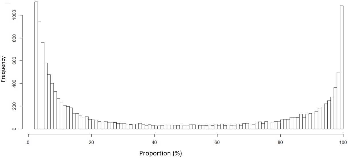
For each language which is spoken in sub-district, divide the number of native speakers of a language in a sub-district by the total population of the sub-district to get the proportion of native speakers of that language in that sub-district. When we do this for all sub-districts and language combinations, this gives us $105961$ data points. The histogram of the distribution of these proportions is shown below which resembles an arcsine distribution.
The same shape appears even if we plot of the larger states instead of the whole country. Similarly, even if we plot at a district level, the same arcsine like shape appears.
Question 1: Why do we have this distribution that roughly resembles an arcsine like distribution. Note that I am not saying that it is necessarily a perfect arcsine in the theoretical sense but rather in an engineering application sense where it is good enough to assume the nearest matching distribution in order get the job done. I know that random Brownian motion results in an arcsine distribution but I am not sure if that is the underlying reason here.
Question 2: What would be the best way to interpret this observation? For example does such a shape indicates that a few major/dominant language will eventually cannibalize the numerous minor languages?
Note: Question was initially posted in mathematics.SE by posting in CV since it is more appropriate here

