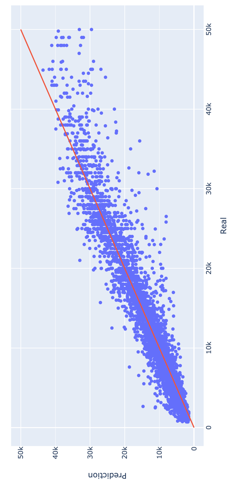
This curve looks less bad when you switch the axes.

For each given predicted value (currently on the y-axis), you see more or less as many true values above and below (right and left on the x-axis).
So the model is not so much biased.
Related is this example of linear regression from this question/answer
You can fit X versus Y or Y versus X.
Due to regression dilution you get that the regression lines are a bit flat (less steep). The one curve represents E(X|Y) and the other curve represents E(Y|X). If you switch their roles then the curves will be biased for high/low values.
This switching of roles is what also happens in your image. Your curve gives an estimate of the expected true value conditional on the regressor. The true values (on the horizontal/x-axis) seem to be more or less evenly distributed around the predicted mean (you have to compare left/right for this and not up/down).

