added example
Source Link
Greg Snow
  • 52.9k
  • 2
  • 112
  • 190

A kernel density or logspline plot may be a better option compared to a histogram. There are still some options that can be set with these methods, but they are less fickle than histograms. There are qqplots as well. A nice tool for seeing if data is close enough to a theoretical distribution is detailed in:

 Buja, A., Cook, D. Hofmann, H., Lawrence, M. Lee, E.-K., Swayne,
 D.F and Wickham, H. (2009) Statistical Inference for exploratory
 data analysis and model diagnostics Phil. Trans. R. Soc. A 2009
 367, 4361-4383 doi: 10.1098/rsta.2009.0120

The short version of the idea (still read the paper for details) is that you generate data from the null distribution and create several plots one of which is the original/real data and the rest are simulated from the theoretical distribution. You then present the plots to someone (possibly yourself) that has not seen the original data and see if they can pick out the real data. If they cannot identify the real data then you don't have evidence against the null.

The vis.test function in the TeachingDemos package for R help implement a form of this test.

Here is a quick example. One of the plots below is 25 points generated from a t distribution with 10 degrees of freedom, the other 8 are generated from a normal distribution with the same mean and variance.
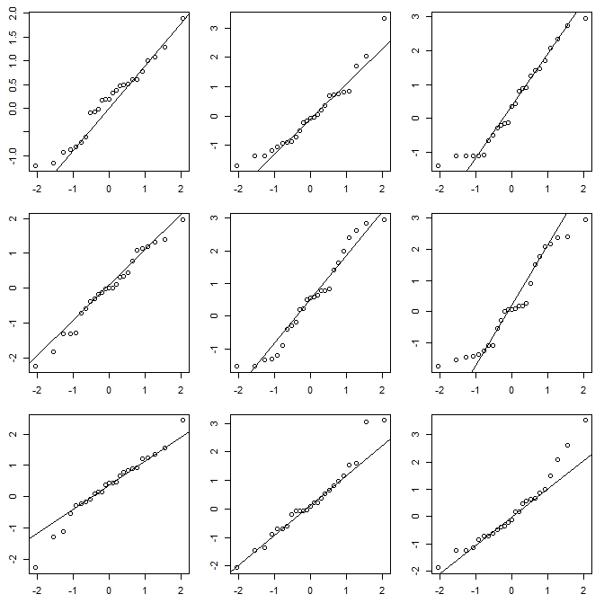
enter image description here

The vis.test function created this plot and then prompts the user to choose which of the plots they think is different, then repeats the process 2 more times (3 total).

A kernel density or logspline plot may be a better option compared to a histogram. There are still some options that can be set with these methods, but they are less fickle than histograms. There are qqplots as well. A nice tool for seeing if data is close enough to a theoretical distribution is detailed in:

 Buja, A., Cook, D. Hofmann, H., Lawrence, M. Lee, E.-K., Swayne,
 D.F and Wickham, H. (2009) Statistical Inference for exploratory
 data analysis and model diagnostics Phil. Trans. R. Soc. A 2009
 367, 4361-4383 doi: 10.1098/rsta.2009.0120

The short version of the idea (still read the paper for details) is that you generate data from the null distribution and create several plots one of which is the original/real data and the rest are simulated from the theoretical distribution. You then present the plots to someone (possibly yourself) that has not seen the original data and see if they can pick out the real data. If they cannot identify the real data then you don't have evidence against the null.

The vis.test function in the TeachingDemos package for R help implement a form of this test.

Here is a quick example. One of the plots below is 25 points generated from a t distribution with 10 degrees of freedom, the other 8 are generated from a normal distribution with the same mean and variance.

enter image description here

The vis.test function created this plot and then prompts the user to choose which of the plots they think is different, then repeats the process 2 more times (3 total).

Source Link
Greg Snow
  • 52.9k
  • 2
  • 112
  • 190

A kernel density or logspline plot may be a better option compared to a histogram. There are still some options that can be set with these methods, but they are less fickle than histograms. There are qqplots as well. A nice tool for seeing if data is close enough to a theoretical distribution is detailed in:

 Buja, A., Cook, D. Hofmann, H., Lawrence, M. Lee, E.-K., Swayne,
 D.F and Wickham, H. (2009) Statistical Inference for exploratory
 data analysis and model diagnostics Phil. Trans. R. Soc. A 2009
 367, 4361-4383 doi: 10.1098/rsta.2009.0120

The short version of the idea (still read the paper for details) is that you generate data from the null distribution and create several plots one of which is the original/real data and the rest are simulated from the theoretical distribution. You then present the plots to someone (possibly yourself) that has not seen the original data and see if they can pick out the real data. If they cannot identify the real data then you don't have evidence against the null.

The vis.test function in the TeachingDemos package for R help implement a form of this test.