replaced http://stats.stackexchange.com/ with https://stats.stackexchange.com/
Source Link

Cumulative distribution plots [MATLAB, R] – where you plot the fraction of data values less than or equal to a range of values – are by far the best way to look at distributions of empirical data. Here, for example, are the ECDFs of this datathis data, produced in R:
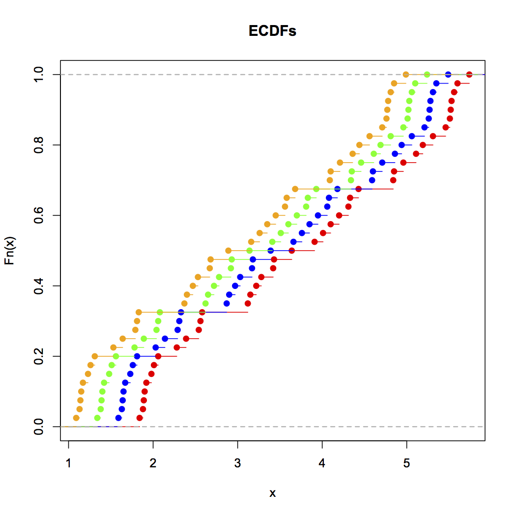
Alice, Brian, Chris and Zoe's ECDF plots

This can be generated with the following R input (with the above data):

plot(ecdf(Annie),xlim=c(min(Zoe),max(Annie)),col="red",main="ECDFs")
lines(ecdf(Brian),col="blue")
lines(ecdf(Chris),col="green")
lines(ecdf(Zoe),col="orange")

As you can see, it's visually obvious that these four distributions are simply translations of each other. In general, the benefits of ECDFs for visualizing empirical distributions of data are:

  1. They simply present the data as it actually occurs with no transformation other than accumulation, so there's no possibility of accidentally deceiving yourself, as there is with histograms and kernel density estimates, because of how you're processing the data.
  2. They give a clear visual sense of the distribution of the data since each point is buffered by all the data before and after it. Compare this with non-cumulative density visualizations, where the accuracy of each density is naturally unbuffered, and thus must be estimated either by binning (histograms) or smoothing (KDEs).
  3. They work equally well regardless of whether the data follows a nice parametric distribution, some mixture, or a messy non-parametric distribution.

The only trick is learning how to read ECDFs properly: shallow sloped areas mean sparse distribution, steep sloped areas mean dense distribution. Once you get the hang of reading them, however, they're a wonderful tool for looking at distributions of empirical data.

Cumulative distribution plots [MATLAB, R] – where you plot the fraction of data values less than or equal to a range of values – are by far the best way to look at distributions of empirical data. Here, for example, are the ECDFs of this data, produced in R:

Alice, Brian, Chris and Zoe's ECDF plots

This can be generated with the following R input (with the above data):

plot(ecdf(Annie),xlim=c(min(Zoe),max(Annie)),col="red",main="ECDFs")
lines(ecdf(Brian),col="blue")
lines(ecdf(Chris),col="green")
lines(ecdf(Zoe),col="orange")

As you can see, it's visually obvious that these four distributions are simply translations of each other. In general, the benefits of ECDFs for visualizing empirical distributions of data are:

  1. They simply present the data as it actually occurs with no transformation other than accumulation, so there's no possibility of accidentally deceiving yourself, as there is with histograms and kernel density estimates, because of how you're processing the data.
  2. They give a clear visual sense of the distribution of the data since each point is buffered by all the data before and after it. Compare this with non-cumulative density visualizations, where the accuracy of each density is naturally unbuffered, and thus must be estimated either by binning (histograms) or smoothing (KDEs).
  3. They work equally well regardless of whether the data follows a nice parametric distribution, some mixture, or a messy non-parametric distribution.

The only trick is learning how to read ECDFs properly: shallow sloped areas mean sparse distribution, steep sloped areas mean dense distribution. Once you get the hang of reading them, however, they're a wonderful tool for looking at distributions of empirical data.

link to the data from the other answer
Source Link

Cumulative distribution plots [MATLAB, R] – where you plot the fraction of data values less than or equal to a range of values – are by far the best way to look at distributions of empirical data. Here, for example, are the ECDFs of this data, produced in R:

Alice, Brian, Chris and Zoe's ECDF plots

This can be generated with the following R input (with the above data):

plot(ecdf(Annie),xlim=c(min(Zoe),max(Annie)),col="red",main="ECDFs")
lines(ecdf(Brian),col="blue")
lines(ecdf(Chris),col="green")
lines(ecdf(Zoe),col="orange")

As you can see, it's visually obvious that these four distributions are simply translations of each other. In general, the benefits of ECDFs for visualizing empirical distributions of data are:

  1. They simply present the data as it actually occurs with no transformation other than accumulation, so there's no possibility of accidentally deceiving yourself, as there is with histograms and kernel density estimates, due tobecause of how you're processing the data.
  2. They give a clear visual sense of the distribution of the data. Since since each point is buffered by all the data before and after it, as opposed to. Compare this with non-cumulative density visualizations, where the accuracy of each density is naturally unbuffered, soand thus must be estimated locally either by binning (histograms) or smoothing (KDEs).
  3. They work equally well regardless of whether the data follows a nice parametric distribution, some mixture, or a messy non-parametric distribution.

The only trick is learning how to read ECDFs properly: shallow sloped areas mean sparse distribution, steep sloped areas mean dense distribution. Once you get the hang of reading them, however, they're a wonderful tool for looking at distributions of empirical data.

Cumulative distribution plots [MATLAB, R] – where you plot the fraction of data values less than or equal to a range of values – are by far the best way to look at distributions of empirical data.

  1. They simply present the data as it actually occurs with accumulation, so there's no possibility of accidentally deceiving yourself, as there is with histograms and kernel density estimates, due to how you're processing the data.
  2. They give a clear visual sense of the distribution of the data. Since each point is buffered by all the data before and after it, as opposed to non-cumulative density visualizations, where the accuracy of each density is naturally unbuffered, so must be estimated locally either by binning (histograms) or smoothing (KDEs).
  3. They work equally well regardless of whether the data follows a nice parametric distribution, some mixture, or a messy non-parametric distribution.

The only trick is learning how to read ECDFs properly: shallow sloped areas mean sparse distribution, steep sloped areas mean dense distribution. Once you get the hang of reading them, however, they're a wonderful tool for looking at distributions of empirical data.

Cumulative distribution plots [MATLAB, R] – where you plot the fraction of data values less than or equal to a range of values – are by far the best way to look at distributions of empirical data. Here, for example, are the ECDFs of this data, produced in R:

Alice, Brian, Chris and Zoe's ECDF plots

This can be generated with the following R input (with the above data):

plot(ecdf(Annie),xlim=c(min(Zoe),max(Annie)),col="red",main="ECDFs")
lines(ecdf(Brian),col="blue")
lines(ecdf(Chris),col="green")
lines(ecdf(Zoe),col="orange")

As you can see, it's visually obvious that these four distributions are simply translations of each other. In general, the benefits of ECDFs for visualizing empirical distributions of data are:

  1. They simply present the data as it actually occurs with no transformation other than accumulation, so there's no possibility of accidentally deceiving yourself, as there is with histograms and kernel density estimates, because of how you're processing the data.
  2. They give a clear visual sense of the distribution of the data since each point is buffered by all the data before and after it. Compare this with non-cumulative density visualizations, where the accuracy of each density is naturally unbuffered, and thus must be estimated either by binning (histograms) or smoothing (KDEs).
  3. They work equally well regardless of whether the data follows a nice parametric distribution, some mixture, or a messy non-parametric distribution.

The only trick is learning how to read ECDFs properly: shallow sloped areas mean sparse distribution, steep sloped areas mean dense distribution. Once you get the hang of reading them, however, they're a wonderful tool for looking at distributions of empirical data.

Source Link

Cumulative distribution plots [MATLAB, R] – where you plot the fraction of data values less than or equal to a range of values – are by far the best way to look at distributions of empirical data.

  1. They simply present the data as it actually occurs with accumulation, so there's no possibility of accidentally deceiving yourself, as there is with histograms and kernel density estimates, due to how you're processing the data.
  2. They give a clear visual sense of the distribution of the data. Since each point is buffered by all the data before and after it, as opposed to non-cumulative density visualizations, where the accuracy of each density is naturally unbuffered, so must be estimated locally either by binning (histograms) or smoothing (KDEs).
  3. They work equally well regardless of whether the data follows a nice parametric distribution, some mixture, or a messy non-parametric distribution.

The only trick is learning how to read ECDFs properly: shallow sloped areas mean sparse distribution, steep sloped areas mean dense distribution. Once you get the hang of reading them, however, they're a wonderful tool for looking at distributions of empirical data.