Compute and plot a local goodness of fit measure.
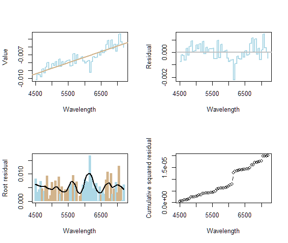
A quick and easy method, that should apply to many such settings, is to examine a local average absolute deviation between the data and their fit. An example appears in the top row of the next figure: the data are on the left and their residuals $r_i$ (deviations) are plotted on the right.

To obtain a local indication of how close the fit is, I recommend smoothing a transformed absolute residual plot of $|r_i|^{2/3}$ (loosely termed a "root residual") using a robust technique such as Loess, as was done here. Some judgement concerning how aggressively to smooth the residuals is needed. This ought to be informed by your objectives and knowledge of the data. I asked the smoother to focus on windows of data about one-quarter the total width. The root residuals and this smooth are shown at the bottom right. The colors indicate the signs of the original residuals (blue for negative, tan for positive). The smooth is the black curve.
The places where the smooth is relatively high, such as around 5600 and 6200, indicate wavelengths where the fit is not so good. (However, I wouldn't pay much attention to any peaks that are lower than about twice the average. The residuals in this example were randomly generated, and so the peaks and valleys you see here illustrate what you ought to expect for a good fit generally.)
The reason for using the two-thirds power of the absolute residuals is to help suppress the effects of individual outlying data (such as the low response near 6200). Another reason is that the squared residuals $r_i^2$ often will approximately have a chi-squared distribution and the cube root (corresponding to $(r_i^2)^{1/3} = |r_i|^{2/3}$) will tend to make it symmetrical, thereby favoring neither high nor low excursions around the average magnitude. (This is the Wilson-Hilferty transformation.)
Finally, you can simply accumulate a running total of squared residuals, as shown in the bottom right corner. Places where this plot is flatter indicate regions where the original fit is better. The utility of this plot in this example is lessened by the effect of that outlying value around 6200: the vertical axis must expand to accommodate its effect, suppressing the visual differences in slopes throughout the rest of the plot. That's why the smoothed representation of the slopes of this plot at the bottom left may be preferable.
The following is the R code used to generate the illustrations. You could use it as the start of a procedure to analyze any data set.
#
# Generate random data.
#
set.seed(17)
par(mfrow = c(2,2))

X <- data.frame(lambda = seq(4500, 7200, by = 50))
delta <- rnorm(nrow(X), 0, 6e-4)
X$amplitude <- -0.0075 + 4e-3 / 2700 * (X$lambda - 5900) + delta

plot(X, type = "s", col = "lightblue", lwd = 2,
     xlab = "Wavelength", ylab = "Value")
#
# Fit a model and overplot it.
#
fit <- lm(amplitude ~ lambda, X)
abline(fit, col = "tan", lwd = 2)
#
# Plot the residuals.
#
X$residual <- residuals(fit)
plot(X$lambda, X$residual, type = "s", col = "lightblue", lwd = 2,
 xlab = "Wavelength", ylab = "Residual")
abline (h = 0, col = "gray", lwd = 2)
#
# Plot the re-expressed absolute residuals as bars.
#
plot(X$lambda, (X$residual^2)^(1/3), type = "h", xlab = "Wavelength",
 ylab = "Root residual",
 col = ifelse(X$residual > 0, "tan", "lightblue"), lwd = 5, lend = 1)
#
# Smooth this plot.
#
p <- 2/3 # The power of the absolute residual to use
s <- loess(abs(residual)^p ~ lambda, X, span = 1/4)
Y <- data.frame(lambda = seq(min(X$lambda), max(X$lambda), length.out = 501))
Y$y.hat <- predict(s, Y)
with(Y, lines(lambda, y.hat, lwd = 2))
#
# Alternatively, plot the cumulative sum of squared residuals.
#
X$z <- cumsum(X$residual^2)
plot(X$lambda, X$z, type = "b", xlab = "Wavelength", ylab = "Cumulative squared residual")

par(mfrow = c(1,1))

