Commonmark migration
Source Link
set.seed(1234)

x1 <- rnorm(20, 1, 2)
x2 <- rnorm(20)

y <- sign(-1 - 2 * x1 + 4 * x2 )

y[ y == -1] <- 0

df <- cbind.data.frame( y, x1, x2)

mdl <- glm( y ~ . , data = df , family=binomial)

slope <- coef(mdl)[2]/(-coef(mdl)[3])
intercept <- coef(mdl)[1]/(-coef(mdl)[3]) 

library(lattice)
xyplot( x2 ~ x1 , data = df, groups = y,
   panel=function(...){
       panel.xyplot(...)
       panel.abline(intercept , slope)
       panel.grid(...)
       })

![alt text][1]alt text
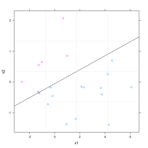
I must remark that perfect separation occurs here, therefore the glm function gives you a warning. But that is not important here as the purpose is to illustrate how to draw the linear boundary and the observations colored according to their covariates. [1]: https://i.sstatic.net/Pp8xK.png

set.seed(1234)

x1 <- rnorm(20, 1, 2)
x2 <- rnorm(20)

y <- sign(-1 - 2 * x1 + 4 * x2 )

y[ y == -1] <- 0

df <- cbind.data.frame( y, x1, x2)

mdl <- glm( y ~ . , data = df , family=binomial)

slope <- coef(mdl)[2]/(-coef(mdl)[3])
intercept <- coef(mdl)[1]/(-coef(mdl)[3]) 

library(lattice)
xyplot( x2 ~ x1 , data = df, groups = y,
   panel=function(...){
       panel.xyplot(...)
       panel.abline(intercept , slope)
       panel.grid(...)
       })

![alt text][1]

I must remark that perfect separation occurs here, therefore the glm function gives you a warning. But that is not important here as the purpose is to illustrate how to draw the linear boundary and the observations colored according to their covariates. [1]: https://i.sstatic.net/Pp8xK.png

set.seed(1234)

x1 <- rnorm(20, 1, 2)
x2 <- rnorm(20)

y <- sign(-1 - 2 * x1 + 4 * x2 )

y[ y == -1] <- 0

df <- cbind.data.frame( y, x1, x2)

mdl <- glm( y ~ . , data = df , family=binomial)

slope <- coef(mdl)[2]/(-coef(mdl)[3])
intercept <- coef(mdl)[1]/(-coef(mdl)[3]) 

library(lattice)
xyplot( x2 ~ x1 , data = df, groups = y,
   panel=function(...){
       panel.xyplot(...)
       panel.abline(intercept , slope)
       panel.grid(...)
       })

alt text

I must remark that perfect separation occurs here, therefore the glm function gives you a warning. But that is not important here as the purpose is to illustrate how to draw the linear boundary and the observations colored according to their covariates.

added the remark to the warnings of glm function
Source Link
suncoolsu
  • 6.7k
  • 1
  • 34
  • 46
set.seed(1234)

x1 <- rnorm(20, 1, 2)
x2 <- rnorm(20)

y <- sign(-1 - 2 * x1 + 4 * x2 )

y[ y == -1] <- 0

df <- cbind.data.frame( y, x1, x2)

mdl <- glm( y ~ . , data = df , family=binomial)

slope <- coef(mdl)[2]/(-coef(mdl)[3])
intercept <- coef(mdl)[1]/(-coef(mdl)[3]) 

library(lattice)
xyplot( x2 ~ x1 , data = df, groups = y,
   panel=function(...){
       panel.xyplot(...)
       panel.abline(intercept , slope)
       panel.grid(...)
       })

alt text![alt text][1]

I must remark that perfect separation occurs here, therefore the glm function gives you a warning. But that is not important here as the purpose is to illustrate how to draw the linear boundary and the observations colored according to their covariates. [1]: https://i.sstatic.net/Pp8xK.png

set.seed(1234)

x1 <- rnorm(20, 1, 2)
x2 <- rnorm(20)

y <- sign(-1 - 2 * x1 + 4 * x2 )

y[ y == -1] <- 0

df <- cbind.data.frame( y, x1, x2)

mdl <- glm( y ~ . , data = df , family=binomial)

slope <- coef(mdl)[2]/(-coef(mdl)[3])
intercept <- coef(mdl)[1]/(-coef(mdl)[3]) 

library(lattice)
xyplot( x2 ~ x1 , data = df, groups = y,
   panel=function(...){
       panel.xyplot(...)
       panel.abline(intercept , slope)
       panel.grid(...)
       })

alt text

set.seed(1234)

x1 <- rnorm(20, 1, 2)
x2 <- rnorm(20)

y <- sign(-1 - 2 * x1 + 4 * x2 )

y[ y == -1] <- 0

df <- cbind.data.frame( y, x1, x2)

mdl <- glm( y ~ . , data = df , family=binomial)

slope <- coef(mdl)[2]/(-coef(mdl)[3])
intercept <- coef(mdl)[1]/(-coef(mdl)[3]) 

library(lattice)
xyplot( x2 ~ x1 , data = df, groups = y,
   panel=function(...){
       panel.xyplot(...)
       panel.abline(intercept , slope)
       panel.grid(...)
       })

![alt text][1]

I must remark that perfect separation occurs here, therefore the glm function gives you a warning. But that is not important here as the purpose is to illustrate how to draw the linear boundary and the observations colored according to their covariates. [1]: https://i.sstatic.net/Pp8xK.png

Source Link
suncoolsu
  • 6.7k
  • 1
  • 34
  • 46

set.seed(1234)

x1 <- rnorm(20, 1, 2)
x2 <- rnorm(20)

y <- sign(-1 - 2 * x1 + 4 * x2 )

y[ y == -1] <- 0

df <- cbind.data.frame( y, x1, x2)

mdl <- glm( y ~ . , data = df , family=binomial)

slope <- coef(mdl)[2]/(-coef(mdl)[3])
intercept <- coef(mdl)[1]/(-coef(mdl)[3]) 

library(lattice)
xyplot( x2 ~ x1 , data = df, groups = y,
   panel=function(...){
       panel.xyplot(...)
       panel.abline(intercept , slope)
       panel.grid(...)
       })

alt text