added beeswarm
Source Link
TooTone
  • 3.8k
  • 27
  • 33

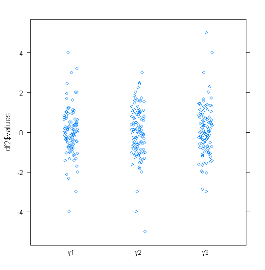
Personally I like to use a stripplot with jitter at least to get a feel for the data. The plot below is with lattice in R (sorry not ggplot2). I like these plots because they're very easy to interpret. As you say, one reason for this is that there isn't any transform.

df =<- data.frame(y1 = c(rnorm(100),-4:4), y2 = c(rnorm(100),-5:3), y3 = c(rnorm(100),-3:5))
df2=stackdf2 <- stack(df)
library(lattice)
stripplot(df2$values ~ df2$ind, jitter=T)
enter image description here

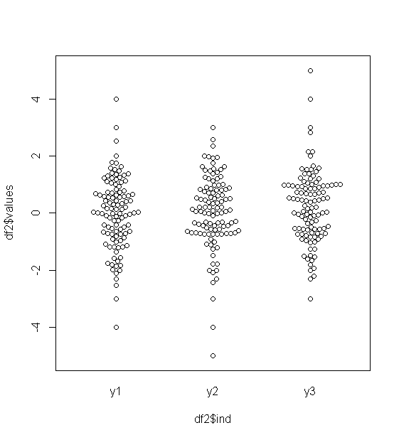
The beeswarm package offers a great alternative to stripplot (thanks to @January for the suggestion).

beeswarm(df2$values ~ df2$ind)
enter image description here

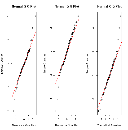
With your data, as it's approximately normally distributed, another thing to try might be a qqplot, qqnorm in this case.

par(mfrow=c(1,3))
for(i in 1:3) { qqnorm(df[,i]); abline(c(0,0),1,col="red") }
enter image description here

Personally I like to use a stripplot with jitter at least to get a feel for the data. The plot below is with lattice in R (sorry not ggplot2). I like these plots because they're very easy to interpret. As you say, one reason for this is that there isn't any transform.

df = data.frame(y1 = c(rnorm(100),-4:4), y2 = c(rnorm(100),-5:3), y3 = c(rnorm(100),-3:5))
df2=stack(df)
library(lattice)
stripplot(df2$values ~ df2$ind, jitter=T)

enter image description here

With your data, as it's approximately normally distributed, another thing to try might be a qqplot, qqnorm in this case.

par(mfrow=c(1,3))
for(i in 1:3) { qqnorm(df[,i]); abline(c(0,0),1,col="red") }

enter image description here

Personally I like to use a stripplot with jitter at least to get a feel for the data. The plot below is with lattice in R (sorry not ggplot2). I like these plots because they're very easy to interpret. As you say, one reason for this is that there isn't any transform.

df <- data.frame(y1 = c(rnorm(100),-4:4), y2 = c(rnorm(100),-5:3), y3 = c(rnorm(100),-3:5))
df2 <- stack(df)
library(lattice)
stripplot(df2$values ~ df2$ind, jitter=T)

enter image description here

The beeswarm package offers a great alternative to stripplot (thanks to @January for the suggestion).

beeswarm(df2$values ~ df2$ind)

enter image description here

With your data, as it's approximately normally distributed, another thing to try might be a qqplot, qqnorm in this case.

par(mfrow=c(1,3))
for(i in 1:3) { qqnorm(df[,i]); abline(c(0,0),1,col="red") }

enter image description here

Source Link
TooTone
  • 3.8k
  • 27
  • 33

Personally I like to use a stripplot with jitter at least to get a feel for the data. The plot below is with lattice in R (sorry not ggplot2). I like these plots because they're very easy to interpret. As you say, one reason for this is that there isn't any transform.

df = data.frame(y1 = c(rnorm(100),-4:4), y2 = c(rnorm(100),-5:3), y3 = c(rnorm(100),-3:5))
df2=stack(df)
library(lattice)
stripplot(df2$values ~ df2$ind, jitter=T)

enter image description here

With your data, as it's approximately normally distributed, another thing to try might be a qqplot, qqnorm in this case.

par(mfrow=c(1,3))
for(i in 1:3) { qqnorm(df[,i]); abline(c(0,0),1,col="red") }

enter image description here