[Heavily edited/extended in light of comments. This is my understanding of this area of statistics - given the comments so far, I suspect this may be disputed.]
Prediction and Forecasting
Calibration is an intuitively sensible requirement of an instrument, but it can also cause confusion. Notice, that even a well calibrated instrument will not be showing you the expected value of $Y$! To get $E[Y|X]$ you still need to do the Y-on-X regression, even with a well calibrated instrument. This estimate will generally look like a shrunk version of the instrument value (remember the $\gamma$ term that crept in). In particular, to get a really good estimate of $E[Y|X]$ you should include your prior knowledge of the distribution of $Y$. This then leads to concepts such as regression-to-the-mean and empirical bayes.
Example in R One way to get a feel for what is going on here is to make some data and try the methods out. The code below compares X-on-Y with Y-on-X for prediction and calibration and you can quickly see that X-on-Y is no good for the prediction model, but is the correct procedure for calibration.
library(data.table)
library(ggplot2)

N = 100
beta = 0.7
c = 4.4

DT = data.table(Y = rt(N, 5), epsilon = rt(N,8))
DT[, X := 0.7*Y + c + epsilon]

YonX = DT[, lm(Y~X)]   # Y = alpha_1 X + alpha_0 + eta
XonY = DT[, lm(X~Y)]   # X = beta_1 Y + beta_0 + epsilon


YonX.c = YonX$coef[1]   # c = alpha_0
YonX.m = YonX$coef[2]   # m = alpha_1

# For X on Y will need to rearrage after the fit.
# Fitting model X = beta_1 Y + beta_0
# Y = X/beta_1 - beta_0/beta_1

XonY.c = -XonY$coef[1]/XonY$coef[2]      # c = -beta_0/beta_1
XonY.m = 1.0/XonY$coef[2]  # m = 1/ beta_1

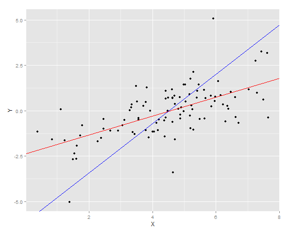
ggplot(DT, aes(x = X, y =Y)) + geom_point() +  geom_abline(intercept = YonX.c, slope = YonX.m, color = "red")  +  geom_abline(intercept = XonY.c, slope = XonY.m, color = "blue")

# Generate a fresh sample

DT2 = data.table(Y = rt(N, 5), epsilon = rt(N,8))
DT2[, X := 0.7*Y + c + epsilon]

DT2[, YonX.predict := YonX.c + YonX.m * X]
DT2[, XonY.predict := XonY.c + XonY.m * X]

cat("YonX sum of squares error for prediction: ", DT2[, sum((YonX.predict - Y)^2)])
cat("XonY sum of squares error for prediction: ", DT2[, sum((XonY.predict - Y)^2)])

# Generate lots of samples at the same Y

DT3 = data.table(Y = 4.0, epsilon = rt(N,8))
DT3[, X := 0.7*Y + c + epsilon]

DT3[, YonX.predict := YonX.c + YonX.m * X]
DT3[, XonY.predict := XonY.c + XonY.m * X]

cat("Expected value of X at a given Y (calibrated using YonX) should be close to 4: ", DT3[, mean(YonX.predict)])
cat("Expected value of X at a gievn Y (calibrated using XonY) should be close to 4: ", DT3[, mean(XonY.predict)])

ggplot(DT3) + geom_density(aes(x = YonX.predict), fill = "red", alpha = 0.5) + geom_density(aes(x = XonY.predict), fill = "blue", alpha = 0.5) + geom_vline(x = 4.0, size = 2) + ggtitle("Calibration at 4.0")
The two regression lines are plotted over the data

And then the sum of squares error for Y is measured for both fits on a new sample.
> cat("YonX sum of squares error for prediction: ", DT2[, sum((YonX.predict - Y)^2)])
YonX sum of squares error for prediction:  77.33448
> cat("XonY sum of squares error for prediction: ", DT2[, sum((XonY.predict - Y)^2)])
XonY sum of squares error for prediction:  183.0144
Alternatively a sample can be generated at a fixed Y (in this case 4) and then average of those estimates taken. You can now see that the Y-on-X predictor is not well calibrated having an expected value much lower than Y. The X-on-Y predictor, is well calibrated having an expected value close to Y.
> cat("Expected value of X at a given Y (calibrated using YonX) should be close to 4: ", DT3[, mean(YonX.predict)])
Expected value of X at a given Y (calibrated using YonX) should be close to 4:  1.305579
> cat("Expected value of X at a gievn Y (calibrated using XonY) should be close to 4: ", DT3[, mean(XonY.predict)])
Expected value of X at a gievn Y (calibrated using XonY) should be close to 4:  3.465205
The distribution of the two prediction can been seen in a density plot.

