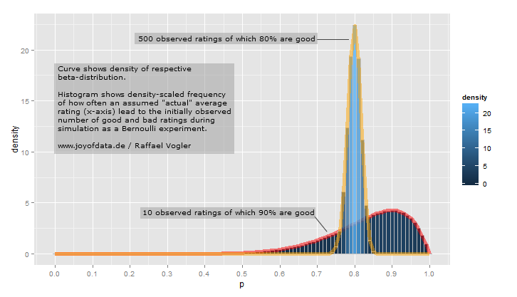
Let's assume a seller on some e-commerce web-site receives 500 ratings of which 400 are good and 100 are bad.
We think of this as the result of a Bernoulli experiment of length 500 which led to 400 successes (1 = good) while the underlying probability $p$ is unknown.
The naive quality in terms of ratings of the seller is 80% because 0.8 = 400 / 500. But the "true" quality in terms of ratings we don't know.
Theoretically also a seller with "true" quality of $p=77\%$ might have ended up with 400 good of 500 ratings.
The pointy bar plot in the picture represents the frequency of how often it happend in a simulation that for a given assumed "true" $p$ 400 of 500 ratings were good. The bar plot is the density of the histogram of the result of the simulation.
And as you can see - the density curve of the beta distribution for $\alpha=400+1$ and $\beta=100+1$ (orange) tightly surrounds the bar chart (the density of the histogram for the simulation).
So the beta distribution essentially defines the probability that a Bernoulli experiment's success probability is $p$ given the outcome of the experiment.
library(ggplot2)

# 90% positive of 10 ratings
o1 <- 9
o0 <- 1
M <- 100
N <- 100000

m <- sapply(0:M/M,function(prob)rbinom(N,o1+o0,prob))
v <- colSums(m==o1)
df_sim1 <- data.frame(p=rep(0:M/M,v))
df_beta1 <- data.frame(p=0:M/M, y=dbeta(0:M/M,o1+1,o0+1))

# 80% positive of 500 ratings
o1 <- 400
o0 <- 100
M <- 100
N <- 100000

m <- sapply(0:M/M,function(prob)rbinom(N,o1+o0,prob))
v <- colSums(m==o1)
df_sim2 <- data.frame(p=rep(0:M/M,v))
df_beta2 <- data.frame(p=0:M/M, y=dbeta(0:M/M,o1+1,o0+1))

ggplot(data=df_sim1,aes(p)) +
    scale_x_continuous(breaks=0:10/10) +

    geom_histogram(aes(y=..density..,fill=..density..),
        binwidth=0.01, origin=-.005, colour=I("gray")) +
    geom_line(data=df_beta1 ,aes(p,y),colour=I("red"),size=2,alpha=.5) +

    geom_histogram(data=df_sim2, aes(y=..density..,fill=..density..),
        binwidth=0.01, origin=-.005, colour=I("gray")) +
    geom_line(data=df_beta2,aes(p,y),colour=I("orange"),size=2,alpha=.5)
http://www.joyofdata.de/blog/an-intuitive-interpretation-of-the-beta-distribution/https://www.joyofdata.de/blog/an-intuitive-interpretation-of-the-beta-distribution/
