Info:
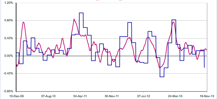
Blue line is the official inflation statistics by US Bureau of Labour Stats
Red line is by independent researchers who claim to have created better way to measure inflation
Blue line has been sampled once every month
Red line has been sampled daily
It can be seen that the red line is tracking inflation ahead of the blue line.
Basically these are two time series, with different sampling frequencies, that are tracking the same phenomenon, i.e. change in general price levels. I need advice on how I should go about analysing these processes. What are some possible hypothesis I could be testing for?
UPDATE: After mpiktas' suggestion, my current plan is to a MIDAS regression with some polynomial function for the weights and report the forecasting capabilities of the model. (and perhaps contrast this to a model using a simple-time-averaged red line)
Some of you might have done something similar to this, is there anything I should keep in mind or anything additional I could be doing that would complement this 6000 word project?
Additional:
If you can link me to some very relevant papers that have done similar analysis that would help.
This is my project idea for my undergraduate course
If you can link me to some very relevant papers that have done similar analysis that would help.
Any input will be apreciated
