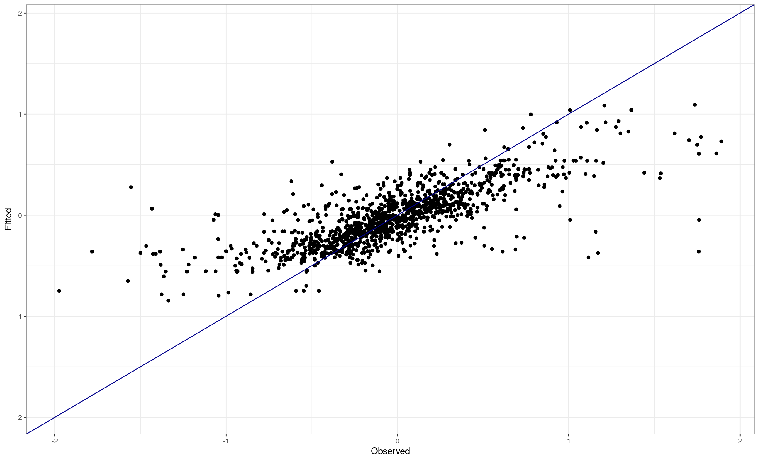
This is just an effect of a model which only partially explains the observations. In such a case, this sort of effect is common. Possible choices include accepting that some things are random or trying to find better explanations for the observations; it may be impossible to get a better result with the data you have.
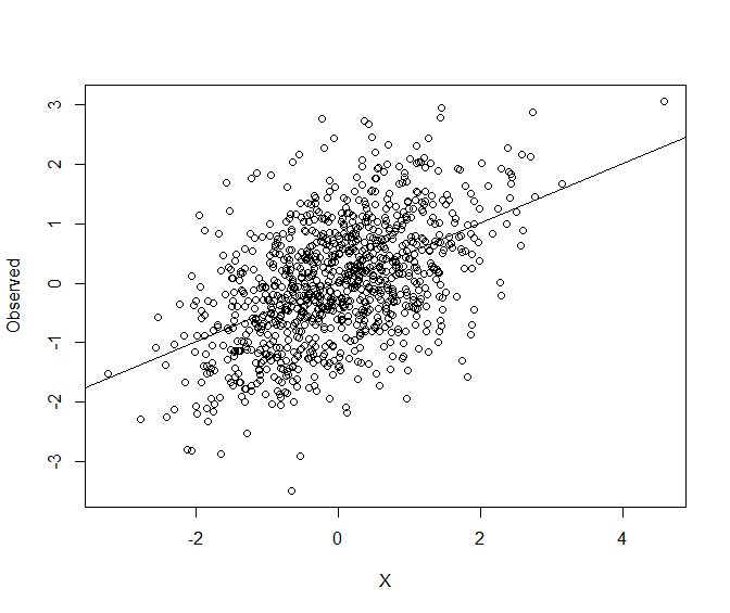
Here is an illustration of a linear model with a correlation between the observed variable and the explanatory variable of about $0.5$ (in some fields this is high, and in others low). The second chart is similar to yours. Generating some simulation data in R:
set.seed(2023)
X <- rnorm(1000)
Observed <- X*0.5 + rnorm(1000)*0.9
cor(X,Observed)
# 0.4996774
plot(X, Observed)
fit <- lm(Observed ~ X)
abline(fit)
you get a linear regression which looks like this, and you can see the positive correlation and noise. Nothing surprising here.

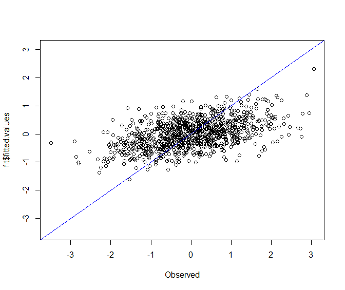
Now drawing the equivalent of your chart, you again get the obvious gap between the points and the blue diagonal. This is what happens with regression (and indeed is part of the etymology)
plot(Observed, fit$fitted.values, ylim=c(min(Observed),max(Observed)))
abline(0,1,col="blue")

This is in effect the same chart as previously with a reflection and some stretching and relocation. The point at the bottom the first chart has become the point at the far left of the second.
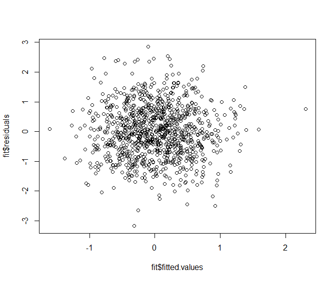
A better chart for seeing if there might be something wrong with the model, beyond a lot of noise, would be to plot residuals against fitted values and see whether there is a obvious pattern which could be addressed with a better model using the existing data. In this case there is no such obvious pattern. (The point I suggested looking at on the previous charts has now moved to the top and looks less special.)
plot(fit$fitted.values, fit$residuals)
