2
$\begingroup$

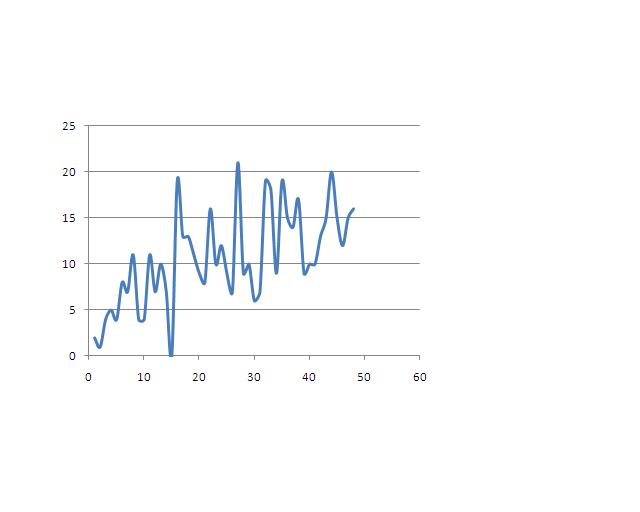
I am trying to fit a time series model to the following data. It seems to be seasonal. Would an ARIMA model be good?

enter image description here Here is the data:

Count

2 1 4 5 4 8 7 11 4 4 11 7 10 7 0 19 13 13 11 9 8 16 10 12 9 7 21 9 10 6 7 19 18 9 19 15 14 17 9 10 10 13 15 20 15 12 15 16

The numbers are separated by spaces.

$\endgroup$
9
  • 1
    $\begingroup$ The data do not appear to be the same as the plot. (Where is the 42 in the data on the plot? Where is the value of (28,0) on the plot shown in the data?) $\endgroup$
    – whuber
    Commented Jul 23, 2012 at 18:47
  • $\begingroup$ @whuber: The data starts at t=12. $\endgroup$
    – Damien
    Commented Jul 23, 2012 at 18:54
  • $\begingroup$ Usually time is the abscissa and the observed value is the ordinate. You have it switch which I think is what confused whuber. $\endgroup$ Commented Jul 23, 2012 at 19:45
  • $\begingroup$ @MichaelChernick: Isn't my data correct if we assume the x-axis is time? $\endgroup$
    – Damien
    Commented Jul 23, 2012 at 20:21
  • 1
    $\begingroup$ Damien, editing the data was a bad idea, because you have already received several detailed responses that used the data you originally posted. It's unfair of you in effect to pull the rug out from under those who have gone to that work to help you. $\endgroup$
    – whuber
    Commented Jul 23, 2012 at 20:43

3 Answers 3

2
$\begingroup$

I'm not sure the data you added to your post is the same you used to make the plot. At any rate, it doesn't really matter since we're trying to help with the underlying methodological aspect of the problem.

From whatever information we have, i would advise a simple median filter:

The idea is to circumvent the model-fitting procedure as much as possible, since we don't have enough information --and IMHO datapoints-- to build a complicated model.

Edit: Following Whuber's suggestion I've taken the square root transformation to symmetricize the residuals.

looking at the outliers, i don't really see a seasonality --below, for illustration, i'm carrying the analysis using R, the open source statistical software

library("robfilter")
dta<-c(2, 1, 4, 5, 4, 8, 7, 11, 4, 4, 11, 7, 10, 7, 42, 19, 13, 13, 11, 9, 8, 16, 10, 12, 9, 7, 21, 9, 10, 6, 7, 19, 18, 9, 19 ,15, 14, 17, 9, 10 ,10, 13, 15, 20, 15, 12, 15, 16 ,20, 17, 21 ,19, 8, 16, 11, 12, 16, 10, 5, 18, 13, 18, 16, 7, 12, 12, 17, 17, 7, 14, 15 ,10, 13, 15, 11, 13, 10, 9, 11, 11 ,10, 8, 24, 13, 18, 8, 8 ,13, 9 ,7, 6, 14, 17 ,7, 13, 9, 11, 19, 8 ,9, 13, 11, 14, 5, 8, 8, 13, 12 ,20, 9, 18 ,13, 13, 10 ,6 ,9, 8, 8)
mod4a<-robreg.filter(y=sqrt(dta),width=12,method="MED",h=7,minNonNAs=5,online=TRUE,extrapolate=FALSE)
resds<-abs(c(rep(sqrt(dta[1]),11),na.omit(mod4a$level[,1]))-sqrt(dta))
mod4b<-robreg.filter(y=resds,width=12,method="MED",h=7,minNonNAs=5,online=TRUE,extrapolate=FALSE)
otl<-which(resds/mod4b$level[,1]>3) #time of the outliers:
>otl
[1]  15  32  53  59  83  85 104 109
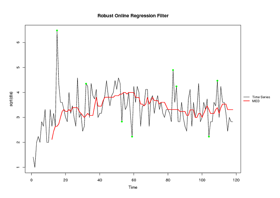
fit of the series, with outliers marked in green

$\endgroup$
22
  • 1
    $\begingroup$ This is the right idea, because (a) there is a trend but it's not easily characterized and (b) there are no significant serial correlations at any lag. However, loess will do a much better job than a median filter at characterizing these data. All this begs the question of why the OP is fitting the data: median filters or loess will do little for predicting future values, for instance. $\endgroup$
    – whuber
    Commented Jul 23, 2012 at 20:33
  • 1
    $\begingroup$ @whuber: --this is a one sided filter: as far as i understood the option "online" makes sure it doesn't use data from $t+i$, $i>0$ at time $t$. More generally, I agree with you: I also tough of asking the OP what was the end purpose (is he, for example, interested in the value of an ar coefficient for a given lag)? $\endgroup$
    – user603
    Commented Jul 23, 2012 at 20:38
  • $\begingroup$ @user602: I want to predict data $\endgroup$
    – Damien
    Commented Jul 23, 2012 at 20:41
  • 1
    $\begingroup$ Good point about the potential online nature (+1). Another mild improvement can be achieved by analyzing the square roots of the data (because these evidently are counts). Alternatively--for sophisticated analysts--a Poisson GLM with splines or changepoints would do a fine job. $\endgroup$
    – whuber
    Commented Jul 23, 2012 at 20:41
  • 1
    $\begingroup$ yes. But again, you are encouraged to go read the references quoted in the manual $\endgroup$
    – user603
    Commented Jul 23, 2012 at 22:32
2
$\begingroup$
  1. delete the leading zeroes as they can inflate the autocorrelation function
  2. a visual suggest possibly a level shift and then a slight upward trend
  3. a few anomalies , maybe just one , (pulses)
  4. no apparent seasonal structure.

An ARIMA model would be good just as long as the reflections above were considered.

If you want to post the data , I will be more specific as to the applicability of ARIMA.

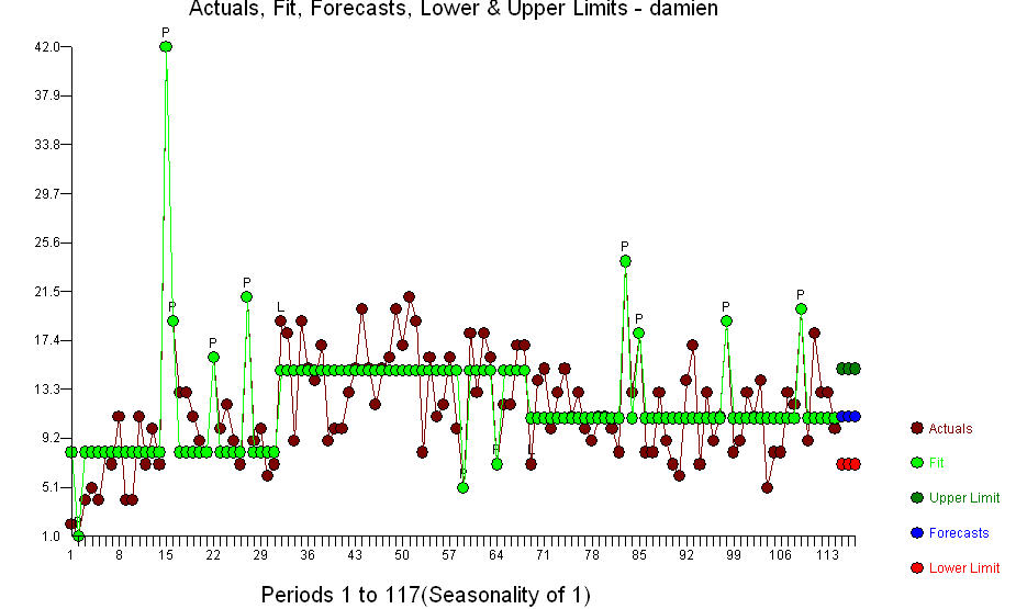
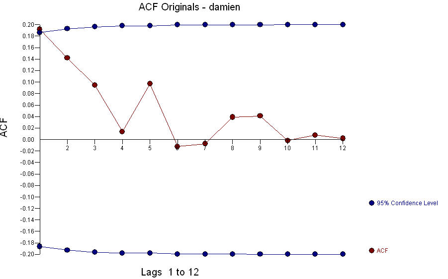
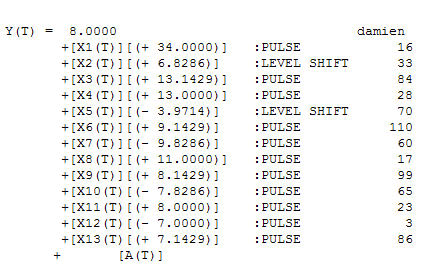
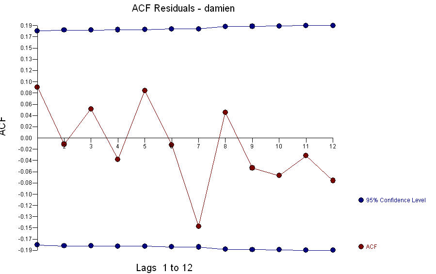
The 114 values you posted are quite different from your original plot. The actual-fit-forecast isenter image description here. The acf of the original series shows little structure enter image description here . The "best model" contains no ARIMA structure but evidences a few unusual data points and three distinct means or GROUPS [1-32 ; 33-69 ; 70-114 ] enter image description here with outliers enter image description here] .[4] . The acf of the residuals suggests randomness![enter image description here . What we have here are three arima models of the form (0,0,0)(0,0,0) with three different means or regimes XBAR1=8.0 ; XBAR2=14.826 and XBAR3=10.8572. One could consider this single-dimension cluster analysis (see Univariate clustering of time series )
$\endgroup$
6
  • $\begingroup$ Can I email you the data? $\endgroup$
    – Damien
    Commented Jul 23, 2012 at 18:23
  • 6
    $\begingroup$ Damien, because that kind of personal communication circumvents the purpose and mechanisms of this site it is strongly discouraged. $\endgroup$
    – whuber
    Commented Jul 23, 2012 at 18:36
  • 1
    $\begingroup$ @IrishStat I see from your plot that Huber was right. his data looks nothing like the original plot even if the labelling was corrected. It does look like two level shifts with no apparent trend at all. there is one very distinctive outlier in the first portion of the series and possbly another after the second shift. My suggestions wouldn't work for this plot. Mine only pertained as possibilities to the original plot. If there was an issue with the private communication i think it is resolved as you have exhibited the data and your modeling of it very nicely for CV. $\endgroup$ Commented Jul 24, 2012 at 0:26
  • 1
    $\begingroup$ @IrishStat it looks to me that the level shifts explain a lot of the variation, The remaining problems are the outliers and the job for the OP to come up with a sensible explanation for the apparent behavior. $\endgroup$ Commented Jul 24, 2012 at 0:28
  • 2
    $\begingroup$ The data are counts and ARMA models are not good choice to analyze them (even after transforming the data). It's better to use generalized ARMA (GLARMA) models. $\endgroup$ Commented Jul 24, 2012 at 11:24
0
$\begingroup$

It would also help if you set your data as a time-series such as:

1. Make a R timeseries out of the rawdata: specify frequency & startdate

gIIP <- ts(Trimmer, frequency=12, start=c(2005,11)) print(gIIP) plot.ts(gIIP, type="l", col="blue", ylab="Title of Chart", lwd=2, main="Full data") grid()

$\endgroup$
2
  • 2
    $\begingroup$ This seems to be code declaring a time series and plotting it. That's already been done. $\endgroup$
    – Nick Cox
    Commented Feb 10, 2015 at 17:43
  • $\begingroup$ Operating on time-series (ts) objects in R is useful advice, indeed, but this answer doesn't address the OP's question(s) at all. $\endgroup$ Commented Feb 10, 2015 at 18:53

Your Answer

By clicking “Post Your Answer”, you agree to our terms of service and acknowledge you have read our privacy policy.

Not the answer you're looking for? Browse other questions tagged or ask your own question.