1
$\begingroup$

After running iterations of lm() in R, I am now stuck with which components of the model's output to present and how to present them. I know that the $R^{2}$ value, coefficients plot and intercept are of central importance. Is there any free resource which shows: how to interpret output, and then visually represent of model outputs,especially output from R. I read Interpretation of R's lm() output but I find it difficult to translate that into what it means in my domain.

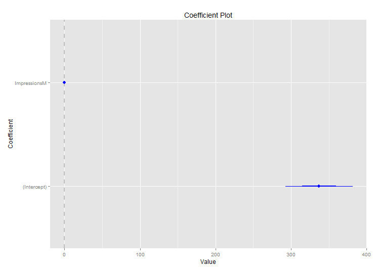
My domain is marketing. I am trying to model impact of TV advertising on lead generation. My $R^{2}$ value is high but when I plot my coefficients using coefplot in R, they are on the 0 Line. I don't know what to make of it. Happy to share more details & output.

Here is the model output & plots:

Call:
lm(formula = Leads.T ~ ImpressionsM, data = allmodelsetdaily)

Residuals:
Min      1Q  Median      3Q     Max 
-213.81  -60.69   11.81   71.74  178.02 

Coefficients:
Estimate Std. Error t value Pr(>|t|)    
(Intercept)  337.08397   22.22891   15.16   <2e-16 ***
ImpressionsM   0.06898    0.00427   16.15   <2e-16 ***
---
Signif. codes:  0 ‘***’ 0.001 ‘**’ 0.01 ‘*’ 0.05 ‘.’ 0.1 ‘ ’ 1

Residual standard error: 97.15 on 89 degrees of freedom
Multiple R-squared:  0.7457,    Adjusted R-squared:  0.7428 
F-statistic: 260.9 on 1 and 89 DF,  p-value: < 2.2e-16"

enter image description here

enter image description here

$\endgroup$
1
  • 1
    $\begingroup$ The domain is marketing. I am analyzing TV advertising's impact on lead generation. $\endgroup$
    – vagabond
    Commented Jul 24, 2014 at 15:12

1 Answer 1

1
$\begingroup$

Based on the question, it sounds like this might be one of your first uses of regression. My suggestions below assume that is the case.

In terms of understanding how to interpret regression output, I'd break down the question into: (a) what are the components and what do they mean (b) how do I map from those components to the output of lm()

for (a), a good free source is Khan Academy. https://www.khanacademy.org/math/probability/regression

for (b), in addition to lm, summary(your.model) or summary(lm(…)) produces more of the output components in a more readable form. ?summary

A non-free, but inexpensive alternative that answers both is A Handbook of Statistical Analyses Using R.

Regarding visual representation: If you are running univariate regression, you can plot in xy space using plot() and abline(your.model).

If you have multivariate regression, consider whether your audience be able to interpret a more complicated visualization.

$\endgroup$
2
  • $\begingroup$ Thanks for posting more info. Your coefficients aren't on the zero line; rather your intercept is estimated at 337 so the scale of the coefficient plot makes the coefficient for impressions look like zero. You can read the actual coefficient, 0.07, directly from the model output. The model is estimating that with no impressions, you'll get 337 leads; and that each additional impression will give you 0.07 more leads. The model is also giving you standard errors and p-values, which provide information around how good those estimates are.Try: plot(ImpressionsM, Leads.T) $\endgroup$ Commented Jul 24, 2014 at 21:42
  • $\begingroup$ Thanks Scott. Yes, I noticed it was 0.07 and started wondering if it is significant and I realized its about the scale and units or the impressions. For the sake of visual representation, can you tell me how I can scale the coef plot, so my intercept can be shown on y-axis? $\endgroup$
    – vagabond
    Commented Jul 25, 2014 at 13:30

Your Answer

By clicking “Post Your Answer”, you agree to our terms of service and acknowledge you have read our privacy policy.

Not the answer you're looking for? Browse other questions tagged or ask your own question.