7
$\begingroup$

I would like to know if there are ways to visualize the separating hyperplane in an SVM with more than 3 features/dimensions. Normally, classification plots are possible with 1,2 and 3 dimensions (see for e.g., Noble, Nature Biotechnology 2006. Fig 1 [1]). Certainly, I understand that with 4 or more dimensions visualization is hard if not impossible. However, for presentation purposes it would be nice if a separating hyperplane could be visualized in some way. Other visualizations that show the quality of the result other than plotting a ROC curve are also welcome!

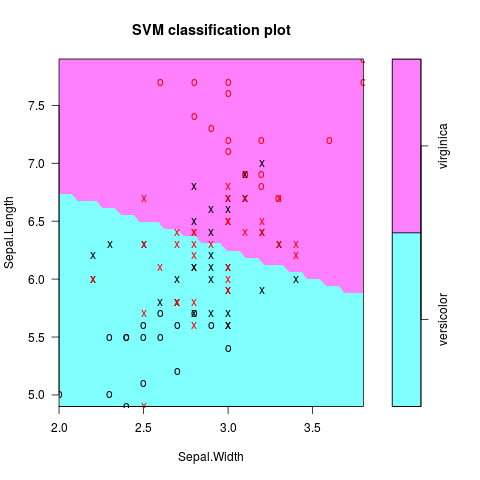
As example I took the Iris data from r, below reduced to two dimensions. The resulting fit can be plotted and are shown in the figure (code partly copied from [2]). However, how to do this if the four features, Sepal.Length, Sepal.Width, Petal.Length and Petal.Width were kept?

library(e1071)
iris.part = subset(iris, Species != 'setosa')
iris.part$Species = factor(iris.part$Species)
iris.part = iris.part[, c(1,2,5)]
fit = svm(Species ~ ., data=iris.part, type='C-classification', kernel='linear')
plot(fit, iris.part)
enter image description here

$\endgroup$

1 Answer 1

3
$\begingroup$

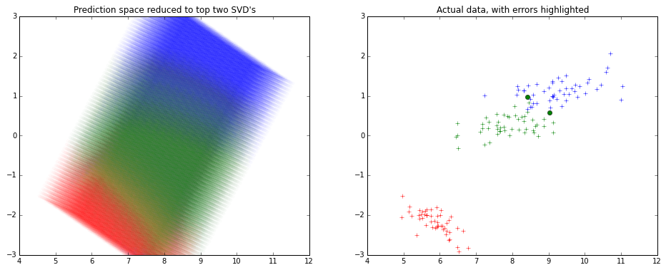
Usually a dimension reduction technique is employed to visualize fit on many variables.

Usually again SVD is used to reduce dimensions and keep 2 components, and visualize.

Here's how it might look like - enter image description here

Note that the x and y axes are the top 2 components of the SVD decomposition.

I haven't used R much lately, so I used python for creating the picture above.

from sklearn.decomposition import TruncatedSVD
from sklearn.svm import SVC
from sklearn.datasets import load_iris

# To visualize the actual data in top 2 dimensions
iris=load_iris()
x,y=iris.data,iris.target

model=SVC().fit(x,y)
predicted=model.predict(x)

svd=TruncatedSVD().fit_transform(x)

from matplotlib import pyplot as plt
plt.figure(figsize=(16,6))
plt.subplot(1,2,0)
plt.title('Actual data, with errors highlighted')
colors=['r','g','b']
for t in [0,1,2]:
    plt.plot(svd[y==t][:,0],svd[y==t][:,1],colors[t]+'+')

errX,errY=svd[predicted!=y],y[predicted!=y]
for t in [0,1,2]:
    plt.plot(errX[errY==t][:,0],errX[errY==t][:,1],colors[t]+'o')


# To visualize the SVM classifier across
import numpy as np
density=15
domain=[np.linspace(min(x[:,i]),max(x[:,i]),num=density*4 if i==2 else density) for i in range(4)]

from itertools import product
allxs=list(product(*domain))
allys=model.predict(allxs)

allxs_svd=TruncatedSVD().fit_transform(allxs)

plt.subplot(1,2,1)
plt.title('Prediction space reduced to top two SVD\'s')
plt.ylim(-3,3)
for t in [0,1,2]:
    plt.scatter(allxs_svd[allys==t][:,0],allxs_svd[allys==t][:,1],color=colors[t],alpha=0.2/density,edgecolor='None')
$\endgroup$
2
  • $\begingroup$ Thank you very much for this thorough answer! I read about using PCA to do this. I wonder if the obtained hyperplane with the resulting two components reliably represents the one of the original dimensions, or if it is simply a new data problem that one creates by reducing dimensions. Any ideas on this? $\endgroup$ Commented Jun 2, 2015 at 15:06
  • 1
    $\begingroup$ As long as the model learned in the full representation of the data, the reduced 2-dimensional view is simply a view - visualizing what happened. In other cases though, often where you have high dimensional feature-space, you do apply your models on the reduced space - there you do change the problem to a 'new' one. This is frequently done in text mining to reduce the term-document-matrix before any model is fitted. $\endgroup$
    – KalEl
    Commented Jun 2, 2015 at 15:12

Your Answer

By clicking “Post Your Answer”, you agree to our terms of service and acknowledge you have read our privacy policy.

Not the answer you're looking for? Browse other questions tagged or ask your own question.