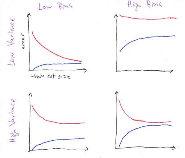
I came across Andrew Ng's Course of Machine Learning and he has the following plot below:
I am wondering how we can interpret this graph. The red and blue lines indicate the test and training errors, respectively. However, I am confused what quantifies as high or low bias. Is there a desired accuracy line missing? What also indicates low or high variance? Is it the width of the curves in relation to each other? Any help would be appreciated. Thanks!

