2
$\begingroup$

Related my earlier question here. Having "mastered" linear regression, I'm trying to learn everything I can about logistic regression and am having issues turning largely "useless" coefficients into meaningful information.

I asked in my previous question about graphing the probability curve for every permutation of a logit model. However, I was working on just plotting the main curve and was having some issues.

If I was running a logit with just one predictor, I'd run the following:

mod1 = glm(factor(won) ~ as.numeric(bid), data=mydat, 
           family=binomial(link="logit"))

all.x <- expand.grid(won=unique(won), bid=unique(bid))
y.hat.new <- predict(mod1, newdata=all.x, type="response")
  plot(bid <- 000:250, predict(mod1,newdata=data.frame(
    bid <- c(000:250)), type="response"), lwd=5, col="blue", 
             type="l")

However, what about with multiple predictors? I tried to use the mtcars data set to mess around and couldn't get it.

Any suggestion on how to plot the main probability curve for the logit model.

head(mtcars)

m1 = glm(vs ~ disp + wt, data=mtcars, 
     family=binomial(link="logit"))
summary(m1)

all.x <- expand.grid(vs=unique(mtcars$vs), 
         disp=unique(mtcars$disp), wt=unique(mtcars$wt))

y.hat.new <- predict(m1, newdata=all.x, type="response")
plot(disp <- 000:250, predict(m1, newdata=data.frame(
    disp <- c(000:250), wt <- c(0,250)), type="response"), 
    lwd=5, col="blue", type="l")

EDIT = OR is my previous question what I need to do. Since Y = B0 + B1X1 + B2X2, a one unit change in X1 is associated with a exp(B1) change in Y, regardless of the value of B2. Then would it be possible that my original question is really all that should be done.

My appologies on my stupidity if that is indeed the case.

$\endgroup$
3
  • $\begingroup$ What do you mean by the "main probability curve" for a logistic model? $\endgroup$
    – whuber
    Commented Jul 5, 2012 at 22:33
  • $\begingroup$ My "main probability curve," I was thinking there was a single curve similar to that where there is one predictor. I don't know if that is correct or if it'd actually be some weird dimensional surface plot. $\endgroup$
    – ATMathew
    Commented Jul 5, 2012 at 22:41
  • 2
    $\begingroup$ A curve, by definition, portrays how one quantity (the expected log odds in this case) depends on a single additional numerical value. To depict fully the variation of a dependent variable on $p$ independent variables requires a $p$-dimensional surface embedded in a $p+1$-dimensional space. $\endgroup$
    – whuber
    Commented Jul 6, 2012 at 13:16

1 Answer 1

1
$\begingroup$

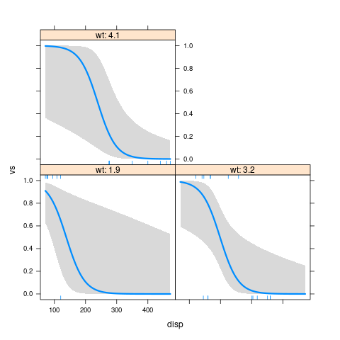
With two predictors, you can for instance show the predicted probabilities as a function of $x_1$, for various choosen values of the other variable $x_2$, shown as a panel of plots. Extend with three or more predictors ...

I will show this with your example, using the R package visreg. We use conditional plots, that is, with predictions "ceteribus paribus", all variables not shown directly in the plot kept at a fixed, chose, value.

m1 <- glm(vs ~ disp + wt, data=mtcars,
                  family=binomial(link="logit"))

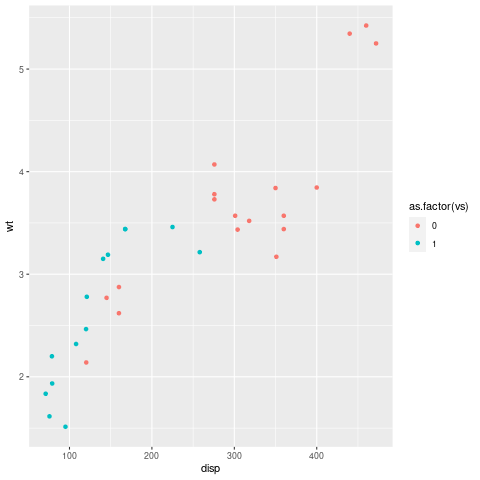
First, a plot of the variables used in the model:

library(ggplot2)  
ggplot(mtcars,  aes(disp, wt, color=as.factor(vs)))  +  geom_point() 

scatterplot of wt versus disp

Then the conditional plot:

library(visreg)

visreg(m1, "disp", by="wt",  scale="response")

visreg conditional plot of m1

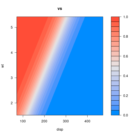
But we can also show it as a 2d plot:

visreg2d(m1, "disp", "wt", scale="response")

with the same interpretation:

enter image description here

Some similar posts where visreg was used:

$\endgroup$

Your Answer

By clicking “Post Your Answer”, you agree to our terms of service and acknowledge you have read our privacy policy.

Not the answer you're looking for? Browse other questions tagged or ask your own question.