2
$\begingroup$

I'm very unsure how to plot mixed-level data consisting of a mixture of categorical and continuous predictors, so any help would be appreciated.

This is the data

subject <- factor(rep(c(1,2,3,4,5,6),each=12))
dep <- c(0.3763244126,0.2185001692,0.4191841742,0.9812978664,0.7429273683,0.6254715486,0.6200958213,0.4693300191,0.1779032899,0.0035873980,0.8821949826,0.4818012617,0.0008013437,0.6280700732,0.7126500814,0.4984349359,0.2457996449,0.3085733312,0.5903398243,0.3704800352,0.8215325437,0.0445236221,0.1849731791,0.3670945817,0.0022268933,0.1630332691,0.9734050406,0.2638539758,0.8550054496,0.9413964085,0.4548943471,0.0440815873,0.5222098769,0.6553600784,0.6853486744,0.0571945074,0.0923124240,0.6976544929,0.9257440316,0.5658967043,0.0636543627,0.1038574059,0.0662497468,0.9165439918,0.5200087291,0.9528015053,0.5347318368,0.1848373057,0.9948602219,0.9633110918,0.1482162909,0.9000614029,0.0898618386,0.7975253051,0.8334557347,0.8629821099,0.0001795699,0.2488384889,0.6382902598,0.1103540359,0.2199716354,0.2737281912,0.5694398067,0.7940423761,0.4906677457,0.5191186895,0.4770589883,0.2823238128,0.2458788699,0.6363522802,0.0306954833,0.6979198116)

f1 <- factor(rep(c("Female","Male","Female","Male","Male","Female"), each=12))
f2 <- c(0.098788608,0.934606288,0.145045152,0.841969882,0.498234471,0.562897249,0.359740488,0.082046687,0.183987342,0.082418820,0.173424633,0.799291329,0.041450568,0.686708743,0.352092230,0.823550310,0.650857094,0.331705763,0.659111451,0.745187314,0.066165065,0.870759966,0.154977488,0.031703774,0.065251788,0.707452073,0.564604314,0.224798417,0.656363138,0.047954841,0.500513114,0.923316812,0.706629266,0.561530974,0.670860932,0.414969178,0.709973062,0.452946384,0.187624344,0.278656351,0.562138433,0.655193272,0.014868182,0.518697012,0.414113229,0.273464316,0.844080831,0.962636550,0.952739605,0.728627219,0.761122951,0.309977150,0.755239042,0.208627128,0.481429897,0.376021223,0.753871400,0.164842337,0.921081061,0.859677311,0.600462073,0.119193708,0.276722102,0.854752641,0.962710853,0.956277061,0.228313179,0.920405764,0.001594131,0.104930433,0.241548888,0.549643015)
f3 <- factor(rep(c("day1","day2","day3","day4"),each=3, times=6))

data <- data.frame(sub=subject, dep=dep, f1=f1, f2=f2, f3=f3)

m <- lmer(dep ~ f1*f2*f3 + (1|sub), data=data)

how can I plot the 3-way interaction f1*f2*f3?

I tried using ggplot2 like this

ggplot(aes(x=f2,y=dep,color=f1),data=data) + geom_smooth(method="lm") + facet_grid(".~f3")

but I don't think this is taking into account the fact that this is a mixed-model design, is it?

$\endgroup$
3
  • 3
    $\begingroup$ Because response variable dep is another dimension, so you need 4-D space to plot 3-way interaction. Maybe you can plot 2-way interaction (f2*f3) at the fixed selected points at another way(f1) such that you can it in 3-D. Do not need to concern about random effect, because all of them f1, f2, f3, are belong to fixed effect. $\endgroup$
    – user158565
    Commented Oct 18, 2018 at 20:39
  • $\begingroup$ Thanks @a_statistician. Sorry for the newbie question, but why don't I need to be concerned about random effects? If I fit an OLS line for each day (which is what my code is doing), this will not be an accurate representation of the mixed model. See my comment below $\endgroup$
    – locus
    Commented Oct 22, 2018 at 19:19
  • $\begingroup$ I mean in the graph do not need to concern random effect.For model, random intercept is needed. $\endgroup$
    – user158565
    Commented Oct 22, 2018 at 19:52

1 Answer 1

5
$\begingroup$

You can specify that you'd like a line for each interaction of f1 and f3 using the group aesthetic and interaction function in R:

ggplot(data, aes(x=f2, y=dep, group = interaction(f1, f3))) +
    geom_smooth(method="lm")

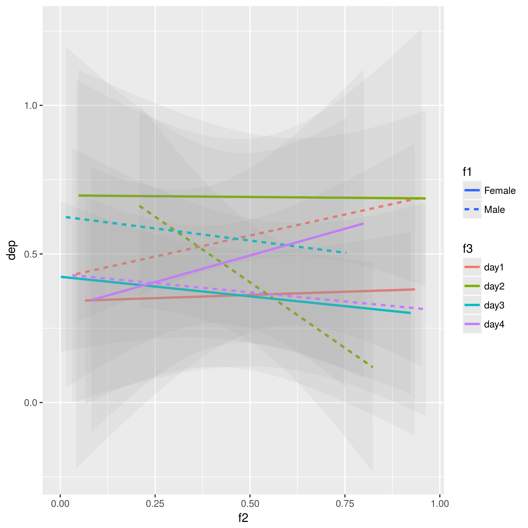
This will create a plot with (in your case 2 * 4 = 8 lines). Then you can use features other than color to distinguish between the factor levels. In your example, you facet, which is OK, but makes it a bit hard to compare the lines. You can also use shape (for points) or line weight / type. Here's an example that uses color for the day and line type for gender:

ggplot(aes(x=f2, y=dep, group = interaction(f1, f3))) + 
    geom_smooth(method="lm", alpha = 0.1, aes(lty=f1, color=f3))

Note that I added alpha = 0.1 to make it a bit easier on the eyes.

enter image description here

$\endgroup$
3
  • $\begingroup$ Nice post! See also Tom Housley's post: tomhouslay.com/2014/09/06/… . $\endgroup$ Commented Oct 19, 2018 at 14:33
  • $\begingroup$ Thanks @Gabe Vacaliuc, the plot looks great. However is this really an accurate depiction of the regression lines of my mixed model? I thought geom_smooth(method="lm") will fit an OLS line for each day, but this is not what the mixed model is doing. see this link and this one $\endgroup$
    – locus
    Commented Oct 22, 2018 at 19:17
  • $\begingroup$ You're right, geom_smooth(method="lm") does not fit a mixed model. I think you'll have to independently calculate the slopes / intercepts as suggested in your second link. $\endgroup$ Commented Oct 23, 2018 at 20:24

Your Answer

By clicking “Post Your Answer”, you agree to our terms of service and acknowledge you have read our privacy policy.

Not the answer you're looking for? Browse other questions tagged or ask your own question.