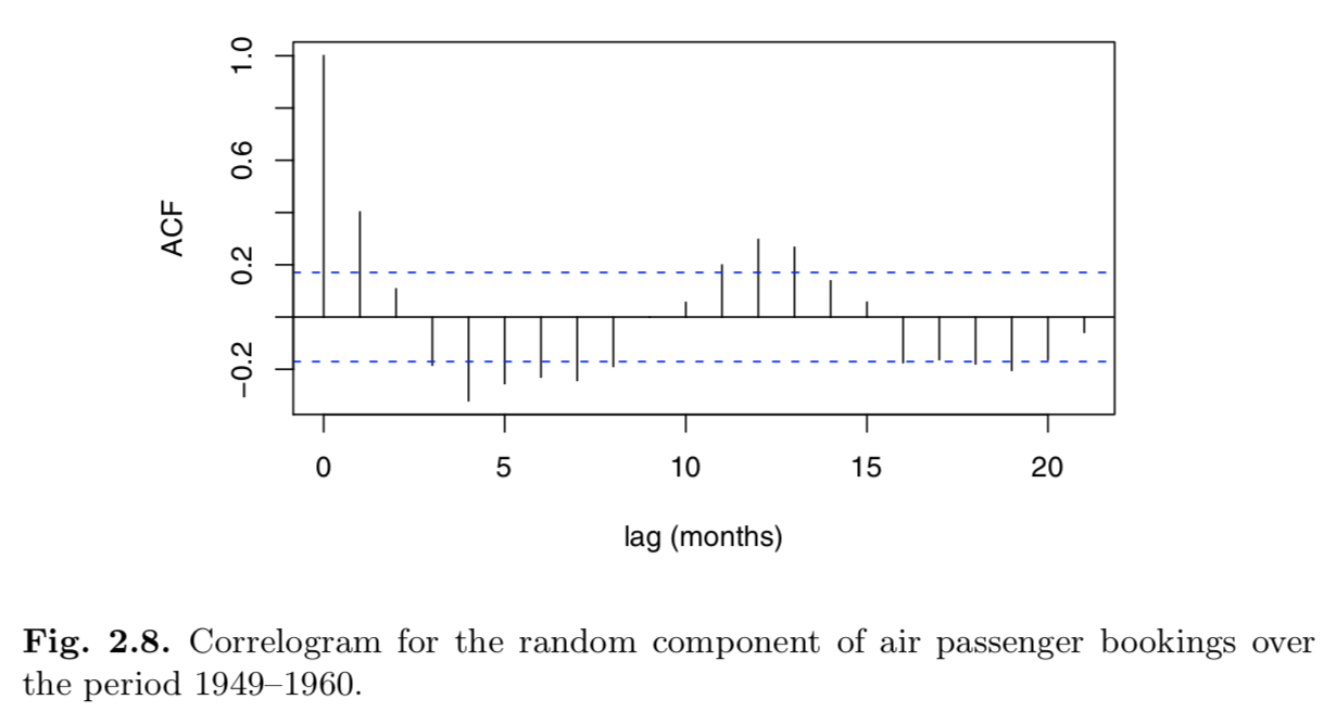
I'm reading the book Introductory Time Series with R where the following code is given:
 > data(AirPassengers)
 > AP <- AirPassengers
 > AP.decom <- decompose(AP, "multiplicative")
 > acf(AP.decom$random[7:138])
A screenshot of the ACF diagram from the book is shown below:
The book then states:
The correlogram in Figure 2.8 suggests either a damped cosine shape that is characteristic of an autoregressive model of order 2 (Chapter 4) or that the seasonal adjustment has not been entirely effective. The latter explanation is unlikely because the decomposition does estimate twelve independent monthly indices. ...
Question 1: The text says that it is unlikley that the seasonal adjustment has not been effective, however, if that is the case, why are seasonal patterns still visible in the ACF diagram?
The book then goes on to say ...
... If we investigate further, we see that the standard deviation of the original series from July until June is 109, the standard deviation of the series after subtracting the trend estimate is 41, and the standard deviation after seasonal adjustment is just 0.03.
 > sd(AP[7:138])
[1] 109

 > sd(AP[7:138] - AP.decom$trend[7:138])
[1] 41.1

 > sd(AP.decom$random[7:138])
[1] 0.0335
The reduction in the standard deviation shows that the seasonal adjustment has been very effective.
Question 2: Why does a reduction in SD show that the seasonal adjustment is effective?

