1
$\begingroup$

So, I have been wondering about an interesting observation. My data contains 1006 log-returns of the SP500-index and I've estimated a GARCH(1,1)-process with Gaussian quasi-maximum likelihood - eventhough the logreturns is fitted best by a Student's t-distribution.

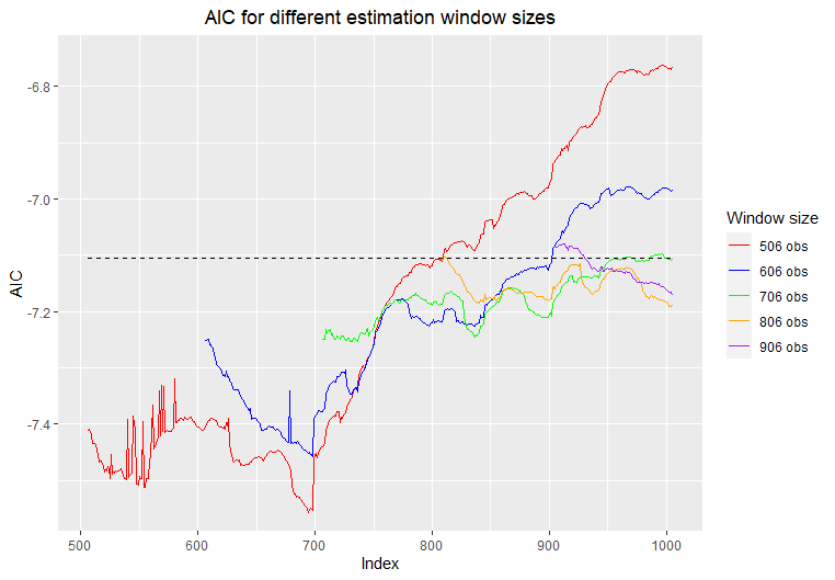
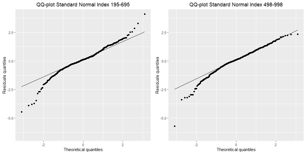
I was interested in some goodness of fit arguments and was wondering about different periods of my data and how the GARCH(1,1)-process fits the different periods. I found out the best AIC-value was produced by the indices 195-695 (500 observations fitted) $$\text{AIC}_{\text{best}}=-7.556248$$ and the worst produced by the indicies (498-998) $$\text{AIC}_{\text{worst}}=-6.763304.$$ But when I look at the densities of the standardized residuals from those two periods and QQ-plots against a standard normal distribution my result is quite disturbing and I cannot find the intuition behind it.

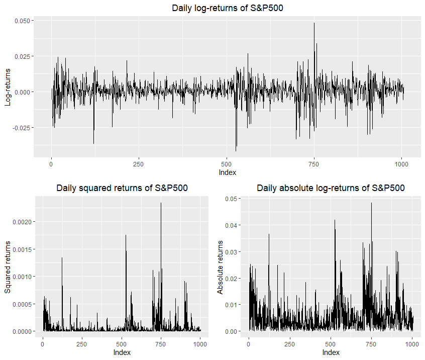
This is the log-returns plot I'm looking at: Returns
And these are the QQ-plots: QQplot

I was thinking that it might had something to do with the stationarity. It's clear that in the period of indicies 195-695 I have "more" stationarity in the period of indicies 468-998. But since I use Gaussian quasi-maximum likelihood (assuming the noise process is standard Gaussian), how do one explain the "bad" fit on the "good" standardized residuals? Thank you in advance.

AIC plot AIC

$\endgroup$
1
  • $\begingroup$ What do you think about my answer on your other question? If it is helpful and clear, you may accept it by clicking on the tick mark to the left. Otherwise, you may ask for further clarification. This is how Cross Validated works. $\endgroup$ Commented Jun 14, 2020 at 9:30

1 Answer 1

0
$\begingroup$

AIC is a measure of likelihood (more precisely, $-2n\ \times$ expected log-likelihood of a the model for a new observation from the same population).

For a fixed dataset, the better the assumed distribution matches the actual distribution, the higher the likelihood. Thus, if you were only looking at a single window of your dataset and had two models based on different distributional assumptions, you would expect the model with the higher likelihood to also have the assumed distribution of residuals matching the empirical distribution better.

For different datasets, however, the likelihoods will be incomparable. Hence, you need not expect to see a positive relationship between (1) size of the likelihood and (2) how well the distributional assumptions are matched when looking at different windows of your dataset.

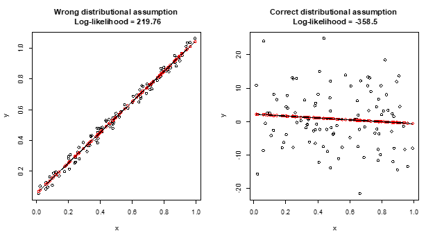
Below is an empirical example in R illustrating the point.

par(mfrow=c(1,2)) # plot two graphs in one

# True error distribution uniform, assumed distribution normal, high value of log-likelihood
n=1e2                       # set sample size
set.seed(1); x=runif(n)     # fix seed and generate regressor x
set.seed(0); u=runif(n)/10  # fix seed and generate true error term u
y=0+1*x+u                   # generate y from x and u
m=lm(y~x)                   # estimate a linear regresion y~x
e=m$resid                   # obain residuals
hat_sigma_e=sqrt(mean(e^2)) # MLE of sigma_e
loglik=sum(log(dnorm(e,mean=0,sd=hat_sigma_e))) # log-likelihood
# Alternatively, run logLik(m)
loglik                      # print log-likelihood
plot(y~x,main=paste("Wrong distributional assumption \n Log-likelihood =",round(loglik,2)))
points(m$fitted~x,col="red")
lines(m$fitted~x)

# True error distribution normal, assumed distribution normal, low value of log-likelihood
n=1e2 # set sample size
set.seed(1); x=runif(n)     # fix seed and generate regressor x
set.seed(0); u=rnorm(n)*10  # fix seed and generate true error term u
y=0+1*x+u                   # generate y from x and u
m=lm(y~x)                   # estimate a linear regresion y~x
e=m$resid                   # obain residuals
hat_sigma_e=sqrt(mean(e^2)) # MLE of sigma_e
loglik=sum(log(dnorm(e,mean=0,sd=hat_sigma_e))) # log-likelihood
# Alternatively, run logLik(m)
loglik                      # print log-likelihood
plot(y~x,main=paste("Correct distributional assumption \n Log-likelihood =",round(loglik,2)))
points(m$fitted~x,col="red")
lines(m$fitted~x)

enter image description here

$\endgroup$
8
  • $\begingroup$ That is counter intuitive to me. Could you elaborate how it can be that the likelihood is high when the distributional assumption offers poor approximations? Wouldn't that indicate a good fit? $\endgroup$
    – mas2
    Commented Jun 12, 2020 at 12:16
  • $\begingroup$ @mas2, I have updated my answer with a concrete example. $\endgroup$ Commented Jun 12, 2020 at 15:00
  • $\begingroup$ Thank you! I guess it make sense since the bigger errors. I updated my answer as well. Does it make sense looking at such a plot to say something about how the GARCH(1,1)-process fits different periods? $\endgroup$
    – mas2
    Commented Jun 12, 2020 at 15:55
  • $\begingroup$ Wait a minute. Don't you actually have what I want? The log-likelihood is high for the correct distributional assumption and low for the wrong. AIC is related to $-\log L$. Therefore the minimal AIC would be for the correct distributional assumption? $\endgroup$
    – mas2
    Commented Jun 12, 2020 at 16:16
  • $\begingroup$ @mas, sorry, false titles of the graphs! I will update soon. The high likelihood is for the wrong distributional assumption, you can check this by running the code yourself. The code is OK, just the picture I pasted is wrong. $\endgroup$ Commented Jun 12, 2020 at 16:23

Your Answer

By clicking “Post Your Answer”, you agree to our terms of service and acknowledge you have read our privacy policy.

Not the answer you're looking for? Browse other questions tagged or ask your own question.