0
$\begingroup$

In general, duplication of information without a justified reason is not considered good scientific practice. However, when it comes to representing a dataset in which there are several independent variables with several levels, is there any consensus in the scientific community on whether it is good practice (or not) to duplicate information for the sake of better visibility of the data?

For example, in the embedded graph, we have the x-axis information duplicated in the coloured legend.

Questions:

  1. Is it best practice to leave the information only on the x-axis?
  2. Is it best practice to leave information in the legend only?
  3. Is it acceptable practice to duplicate the information (legend plus x-axis)?
  4. What evidence or references support one decision or the other?

I have not found a duplicate of this question. But if there is a more appropriate forum for this question, let me know.

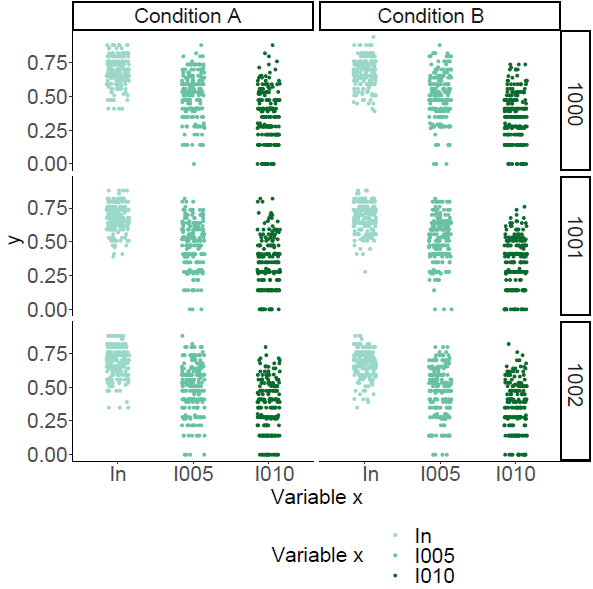
enter image description here

$\endgroup$
6
  • 1
    $\begingroup$ The legend seems pointless here. As you say the x axis conveys the same information. I don't think this needs detailed justification. People (should) read axes early. Different colour coding doesn't need explanation. It's a little too subtle for my taste. If different colours make sense as adding extra contrast, they could be more different. I don't know what ln l005 l010 mean, which could be relevant (e.g. if l005 and l010 are more like each other than ln). Direct labelling is a phrase in recent literature but goes way back (William Playfair used it), See Claus Wilke's book, among others. . $\endgroup$
    – Nick Cox
    Commented Feb 28, 2021 at 10:05
  • 1
    $\begingroup$ Naturally the anonymity of Y A B x doesn't help us help you. Just because a very few people steal results shouldn't put honest people off. $\endgroup$
    – Nick Cox
    Commented Feb 28, 2021 at 10:07
  • $\begingroup$ @Nick Cox thanks for your comments. I have edited the question (now we use "duplication"). These are simulation results. "Y" represents "entropy" and the rest of the variables stand for different initial conditions of the simulation (none necessarily more different from the others). I agree that duplicating information is pointless. But I still doubt whether removing the legend and maintaining the color contrast would be justified for the sake of clearer visualization. Many thanks for the references, didn't know them. $\endgroup$
    – pyring
    Commented Feb 28, 2021 at 10:40
  • $\begingroup$ There seems to be some banding due to granularity, i.e. some entropy values are more popular. $\endgroup$
    – Nick Cox
    Commented Feb 28, 2021 at 11:02
  • $\begingroup$ @Nick Cox Yes. We compute entropy from vectors containing a finite number of discrete values, so some results are more common than others. Any suggestions about this in this regard? I think removing the legend, keeping the colour contrast and adding the means will be the way to go. $\endgroup$
    – pyring
    Commented Feb 28, 2021 at 11:37

0

Your Answer

By clicking “Post Your Answer”, you agree to our terms of service and acknowledge you have read our privacy policy.

Browse other questions tagged or ask your own question.