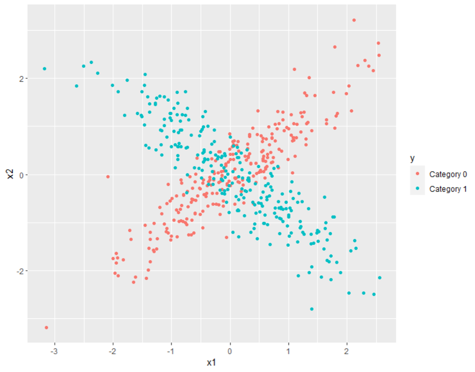
Let's look at an example where there are regions where one classification is obvious but also a region where there is overlap and ambiguity.

In this picture, the upper right and lower left are clearly dominated by red, while the upper left and lower right are clearly dominated by blue. Thus, if you have a point like $(2, 2)$, the prediction should be a high probability of the red category, while $(2, -2)$ should lead to a high probability of the blue category.
At a point like $(0, 0)$, the category to which the point belongs is not clear, and I would want my model to reflect this. Sure, it is desirable to get confident predictions, but the data in this case do not allow for such confidence. It really is the case that there is ambiguity, and to force a model to predict with confidence is to dismiss reality. Given how I generated this plot (code below), the probability that $(0,0)$ belongs to red is $1/2$, same as the probability that $(0,0)$ belongs to blue. If you force some other probability, you will be in a position to make mistakes.
I would say that, if you have overlapping classes like we do here, the way to proceed is to embrace the fact that there can be ambiguity. For instance, in this example, you really cannot accurately predict the category to which $(0,0)$ belongs.
library(MASS)
library(ggplot2)
set.seed(2023)
N <- 250
X0 <- MASS::mvrnorm(N, c(0, 0), matrix(c(
  1, 0.9,
  0.9, 1
), 2, 2))
X1 <- MASS::mvrnorm(N, c(0, 0), matrix(c(
  1, -0.9,
  -0.9, 1
), 2, 2))
d0 <- data.frame(
  x1 = X0[, 1],
  x2 = X0[, 2],
  y = "Category 0"
)
d1 <- data.frame(
  x1 = X1[, 1],
  x2 = X1[, 2],
  y = "Category 1"
)
d <- rbind(d0, d1)
ggplot(d, aes(x = x1, y = x2, col = y)) +
  geom_point()

