1
$\begingroup$

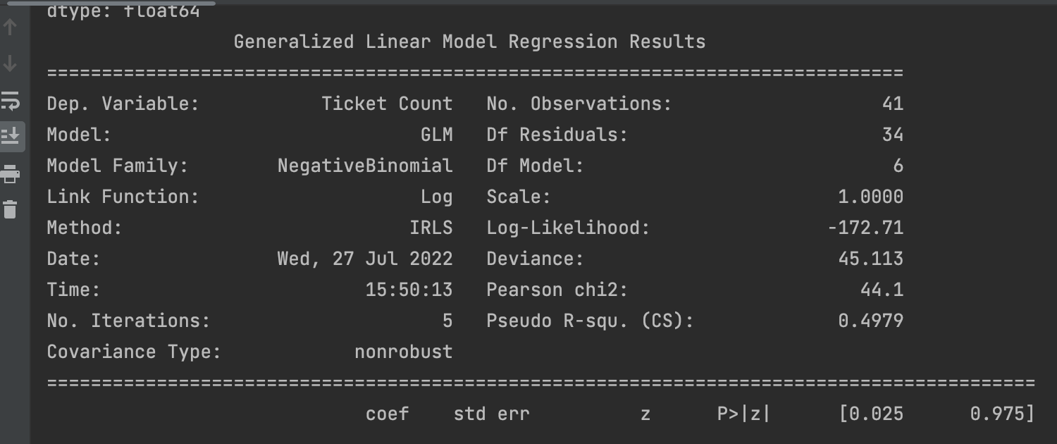
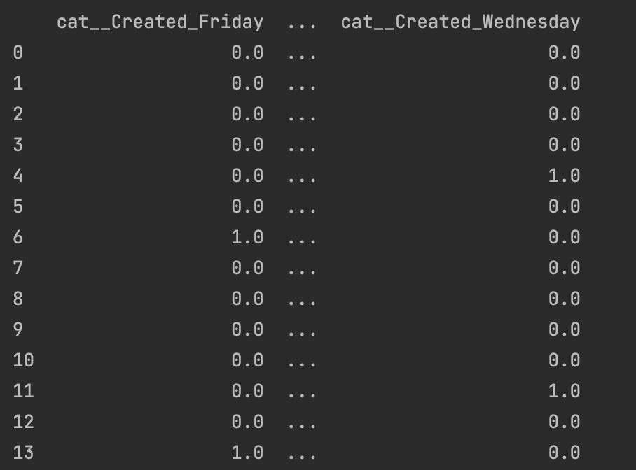
I am currently working with pandas and scikit-learn for Poisson Regression (now turned negbinom to address Overdispersion) to model count data of y (ticket count) with each day of the week serving as a predictor variable(s). I have used One-Hot-encoding for the days of the week to fit the regression model.

For the model, I have used the first 41 days as the training set, with the next 38 days to serve as the test set. (total dataset encompasses about 3 months)

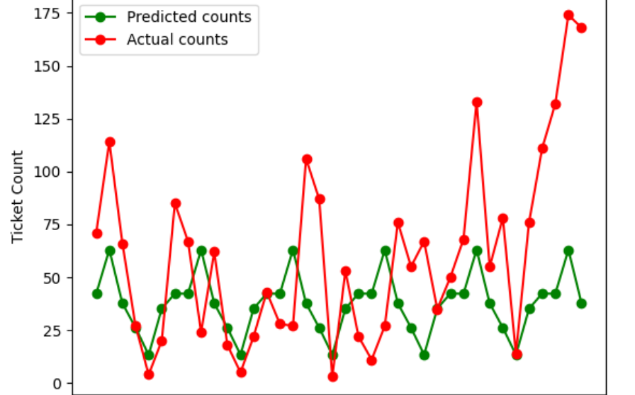
After running the training results table, and predictions, the predictions definitely do not align accurately enough, and I was hoping for some feedback from the community on tips to improve its accuracy. Should I implement more features from the original spreadsheet? The issue with that is the other columns would also be categorical variables, and most of these columns don't have much variability.

Are there ways to add weights to certain features? (for example, Fridays could receive more tickets for x reason)

Also, for the predictions, for each day, they sort of follow a pattern, with Mondays, Tuesdays, Wednesdays, etc having the same predicted values.

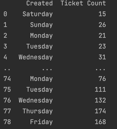
coef summary stats plot datatransformed df

$\endgroup$
6
  • $\begingroup$ Can you edit your post to include your data? $\endgroup$ Commented Jul 28, 2022 at 16:20
  • $\begingroup$ I've added two images: the first is reference to the ticket count (y) , and the second shows the independent variables transformed using OHE. $\endgroup$
    – ty101
    Commented Jul 28, 2022 at 16:29
  • $\begingroup$ ... in a form we can work with? $\endgroup$ Commented Jul 28, 2022 at 16:30
  • $\begingroup$ [ 15 26 21 23 31 61 27 35 2 27 37 30 26 13 19 11 27 30 55 103 23 59 72 57 23 53 60 46 100 31 15 8 20 92 49 29 60 16 10 63 12 71 114 66 27 4 20 85 67 24 62 18 5 22 43 28 27 106 87 3 53 22 11 27 76 55 67 35 50 68 133 55 78 14 76 111 132 174 168] for ticket count $\endgroup$
    – ty101
    Commented Jul 28, 2022 at 16:36
  • $\begingroup$ for the independent variables, it is essentially 78 observations with each column as a day of the week. day of the week that fits observation is encoded with binary value of 1, while the rest are 0. Sorry, I can't post the whole binary array in here $\endgroup$
    – ty101
    Commented Jul 28, 2022 at 16:40

1 Answer 1

2
$\begingroup$

I personally prefer working with R, which has much better facilities for time series forecasting. First off, your series has such high counts that count models are probably not going to give you much better results than straightforward time series methods. Yes, these typically assume normally distributed innovations, and your prediction intervals will go below zero, but they are much better tested and understood than count data models.

Let's first plot your data.

tickets <- ts(c(15, 26, 21, 23, 31, 61, 27, 35, 2, 27, 37, 30, 26,
    13, 19, 11, 27, 30, 55, 103, 23, 59, 72, 57, 23, 53, 60, 46,
    100, 31, 15, 8, 20, 92, 49, 29, 60, 16, 10, 63, 12, 71, 114, 66,
    27, 4, 20, 85, 67, 24, 62, 18, 5, 22, 43, 28, 27, 106, 87, 3, 53, 
    22, 11, 27, 76, 55, 67, 35, 50, 68, 133, 55, 78, 14, 76, 111, 132, 
    174, 168), frequency=7)

library(forecast)

training <- ts(tickets[1:41], frequency=7)
test <- ts(tickets[42:length(tickets)],start=c(6,7), frequency=7)

plot(tickets, las=1)
abline(v=end(training), col="red")
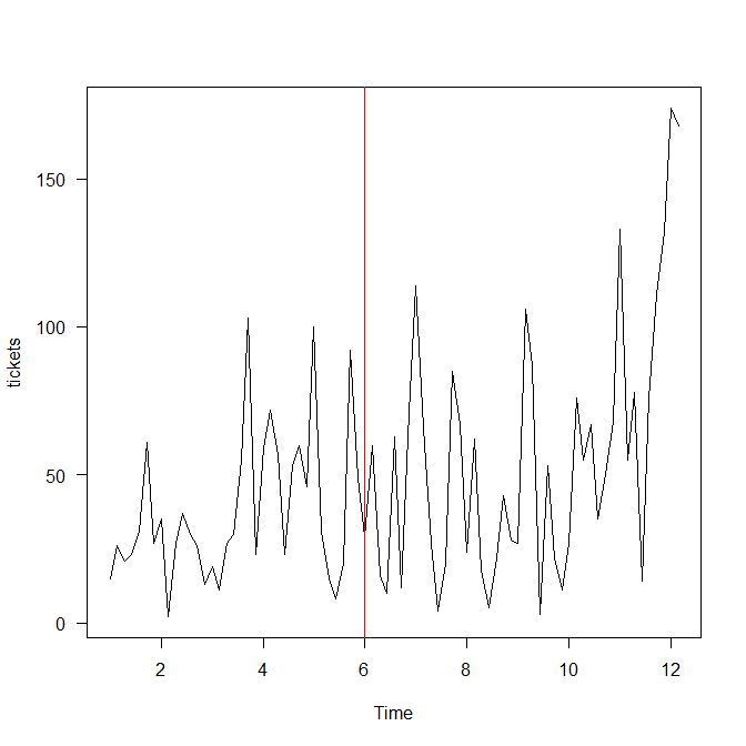
time series

"Time" on the horizontal axis refers to weeks. The red line shows the end of your training data. We already see the first problem: the variance is increasing. Compare the first three weeks to everything after, and then the last two data points. These will be very hard to forecast, because (a) we have never seen anything like this, and (b) there is no obvious trend we would be justified in extrapolating.

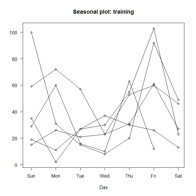
Here is a seasonplot of your training data:

seasonplot(training)
seasonplot

The day-of-week seasonality is not really obvious. The slump on Wednesday is really more driven by fewer large observations there than on other days, but especially with only six weeks of training data, it could just be coincidence that none of the high values happened to fall on a Wednesday. A forecasting algorithm may or may not believe this series is seasonal.

Let's fit an ARIMA model:

model_arima <- auto.arima(training)
summary(model_arima)
plot(forecast(model_arima,h=length(test)),ylim=c(0,max(tickets)), las=1)
lines(test,col="red")
ARIMA

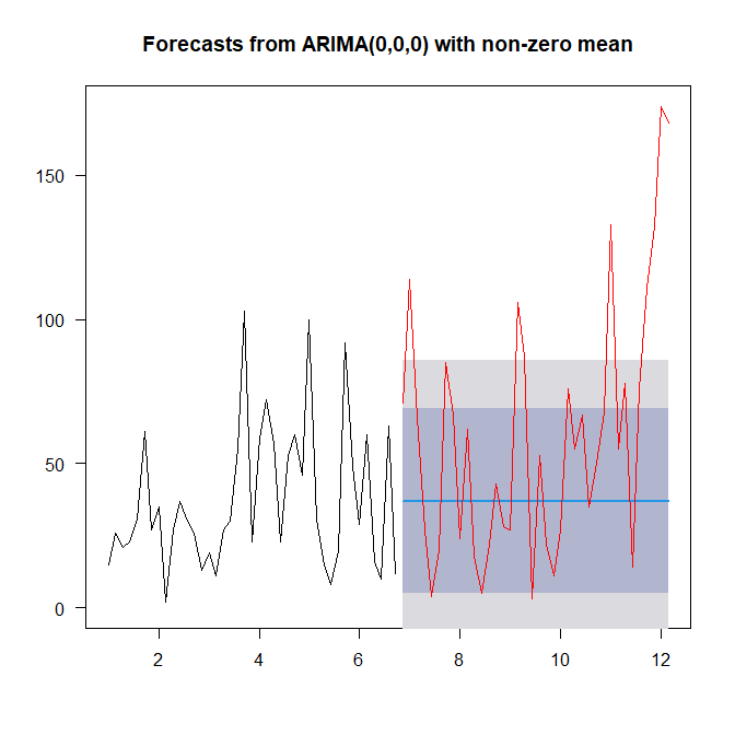
forecast::auto.arima() fits a simple mean model and extrapolates this out. This is often a very good idea. We see too many values fall outside the prediction interval, because of the increasing variance.

Let's also try an exponential smoothing model:

model_ets <- ets(training)
summary(model_ets)
plot(forecast(model_ets,h=length(test)),ylim=c(0,max(tickets)), las=1)
lines(test,col="red")
ETS

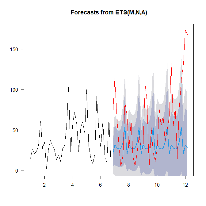
Here, forecast::ets() sees a multiplicative error (that's the M), no trend (the N) and additive seasonality (the A). The forecast looks much more sophisticated - but that is no guarantee of better performance (see the link above), and we see about as many actuals outside the prediction intervals.

In terms of test set accuracy, the ARIMA model (that is, the flat mean forecast) outperforms the ETS model on RMSE (which is the only error measure I would trust here):

> accuracy(forecast(model_arima,h=length(test)),test)
                        ME     RMSE      MAE       MPE     MAPE      MASE      ACF1 Theil's U
Training set -8.661690e-12 24.63984 20.09756 -88.22527 116.1325 0.7617805 0.1347019        NA
Test set      2.310526e+01 49.33345 37.21053 -62.02226 123.7165 1.4104324 0.4915275 0.5122738
> accuracy(forecast(model_ets,h=length(test)),test)
                     ME     RMSE      MAE       MPE     MAPE      MASE       ACF1 Theil's U
Training set  0.6067627 22.57793 17.95465 -69.08313 101.1897 0.6805555 0.07025731        NA
Test set     28.8387549 53.09292 38.89982 -28.61668 100.4135 1.4744635 0.50643194 0.5132892

I hasten to add that the forecast and the newer fable packages from the same author are the gold standard in automatic time series forecasting.

I don't think running a negbin or any other regression will give you better results. You have very little data, and fitting seven parameters with only 41 data points is a lot to expect.

The key problem is the increasing variance, and especially the very high two last values. Your best bet might be to try to figure out whether anything special happened there that you could model. If these were movie theater ticket sales, then it would be good to learn which movies opened in which week, and whether COVID restrictions were in place, or some such. This may be useful.

The forecasting tag wiki contains pointers to excellent resources on forecasting.

$\endgroup$
4
  • $\begingroup$ Thank you for such an informative response. Unfortunately, I am limited to just working with packages in Python at the moment. But I do understand there are limitations given the data. Do you think implementing more categorical features would help the accuracy of the predictions? $\endgroup$
    – ty101
    Commented Jul 28, 2022 at 21:10
  • $\begingroup$ If you have the kind of predictors that drive the large peak at the end, that might be useful. (But you probably haven't observed them in the past, so it will be hard to actually learn the relationship.) Alternatively, you could use auto_arima in the pmdarima package for Python and force it to use a seasonal model, which is close to using day of week predictors (essentially, this models the week-over-week increase as ARIMA). However, per above, it's dubious whether this will actually improve your forecasts. $\endgroup$ Commented Jul 28, 2022 at 21:20
  • $\begingroup$ I'll consider your recommendations for auto_arima and pmdarima. Actually, for the large peaks, these could be explained by features signifying if the particular day is a release day or weekendload. Release days tend to lead to larger ticket flow. I just don't know the exact relationship. I could encode these using binary (Y/N) columns, and potentially apply them to those days. $\endgroup$
    – ty101
    Commented Jul 28, 2022 at 21:42
  • $\begingroup$ That sounds like a good way forward. (Note that if this was "only" a weekend effect, it would lead to a seasonal time series, but the seasonplot does not really show that.) This may be helpful. $\endgroup$ Commented Jul 29, 2022 at 6:23

Your Answer

By clicking “Post Your Answer”, you agree to our terms of service and acknowledge you have read our privacy policy.

Not the answer you're looking for? Browse other questions tagged or ask your own question.