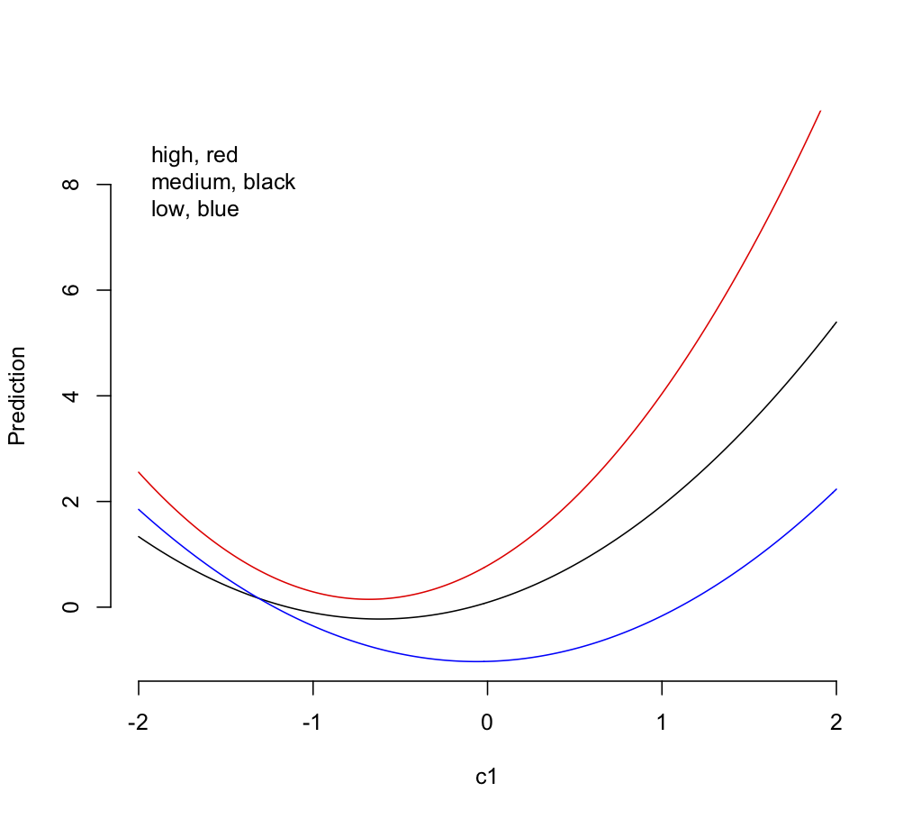
"Simple slopes" aren't always the simplest way to illustrate a model with interactions. Here's a synthetic data set in R, a quadratic association of outcome yq with a continuous predictor c1 interacting with a 3-level factor f1. The data are modeled with a polynomial for c1 and the interaction.
set.seed(101)
c1 <- rnorm(99)
x1 <- rep(c(-1,0,1),33)
yq <- x1 + c1 + c1**2 + x1*c1 + 0.3*x1*c1**2 + rnorm(99)
f1 <- rep(c("low","med","high"),33) ## give names to the numeric x1 values
fitq <- lm(yq~f1*poly(c1,2))
The R emmeans package provides a generally useful way to calculate and evaluate "simple slopes" via its emtrends() function, if that's what you want. It can numerically estimate the local slope with respect to a continuous predictor having a nonlinear association with outcome, at a grid of predictor values.
Here's its report over a range of c1 values, broken down by the levels of f1. It's similar to what you show, except that it's in long rather than wide format and it omits "significance stars."
library(emmeans)
emtrends(fitq,~f1|c1,var="c1",
          at=list(c1=c(-1,-0.5,0,0.5,1)))
# c1 = -1.0:
#  f1   c1.trend    SE df lower.CL upper.CL
#  high  -0.8783 0.401 90 -1.67538  -0.0812
#  low   -1.4351 0.303 90 -2.03761  -0.8327
#  med   -0.6190 0.377 90 -1.36778   0.1297
#
# c1 = -0.5:
#  f1   c1.trend    SE df lower.CL upper.CL
#  high   0.5015 0.257 90 -0.00885   1.0118
#  low   -0.6681 0.207 90 -1.07998  -0.2563
#  med    0.1996 0.233 90 -0.26371   0.6629
#
# c1 =  0.0:
#  f1   c1.trend    SE df lower.CL upper.CL
#  high   1.8812 0.188 90  1.50696   2.2554
#  low    0.0989 0.214 90 -0.32560   0.5233
#  med    1.0182 0.227 90  0.56731   1.4691
#
# c1 =  0.5:
#  f1   c1.trend    SE df lower.CL upper.CL
#  high   3.2609 0.264 90  2.73718   3.7847
#  low    0.8659 0.316 90  0.23768   1.4941
#  med    1.8368 0.365 90  1.11113   2.5625
#
# c1 =  1.0:
#  f1   c1.trend    SE df lower.CL upper.CL
#  high   4.6407 0.410 90  3.82631   5.4550
#  low    1.6329 0.454 90  0.73121   2.5345
#  med    2.6554 0.548 90  1.56704   3.7438
#
# Confidence level used: 0.95
Does that list of simple slopes describe the model better than this plot, as suggested in a comment from @mkt?

Code for the plot in base R; one could further overlay the observations, add confidence limits, etc.
plot(seq(-2,2,by=0.02), predict(fitq,newdata=data.frame(f1="high",c1= seq(-2,2,by=0.02))),type="l",col="red",ylim=c(-1,9),bty="n",xlab="c1",ylab="Prediction")
lines(seq(-2,2,by=0.02), predict(fitq,newdata=data.frame(f1="med",c1= seq(-2,2,by=0.02))))
lines(seq(-2,2,by=0.02), predict(fitq,newdata=data.frame(f1="low",c1= seq(-2,2,by=0.02))),col="blue")
legend("topleft","high, red\nmedium, black\nlow, blue",bty="n")


