A few comments are, I believe, in order.
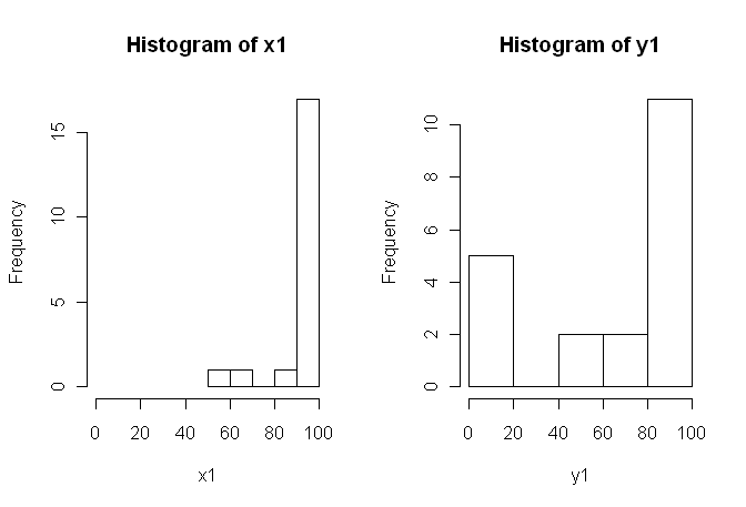
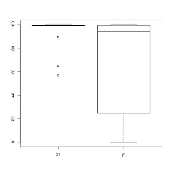
1) I would encourage you to try multiple visual displays of your data, because they can capture things that are lost by (graphs like) histograms, and I also strongly recommend that you plot on side-by-side axes. In this case, I do not believe the histograms do a very good job of communicating the salient features of your data. For example, take a look at side-by-side boxplots:
boxplot(x1, y1, names = c("x1", "y1"))

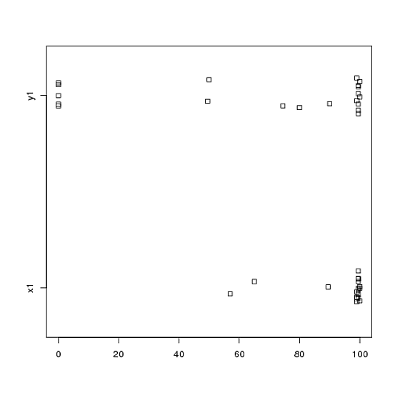
Or even side-by-side stripcharts:
stripchart(c(x1,y1) ~ rep(1:2, each = 20), method = "jitter", group.names = c("x1","y1"), xlab = "")

Look at the centers, spreads, and shapes of these! About three-quarters of the $x1$ data fall well above the median of the $y1$ data. The spread of $x1$ is tiny, while the spread of $y1$ is huge. Both $x1$ and $y1$ are highly left-skewed, but in different ways. For example, $y1$ has five (!) repeated values of zero.
2) You didn't explain in much detail where your data come from, nor how they were measured, but this information is very important when it comes time to select a statistical procedure. Are your two samples above independent? Are there any reasons to believe that the marginal distributions of the two samples should be the same (except for a difference in location, for example)? What were the considerations prior to the study that led you to look for evidence of a difference between the two groups?
3) The t-test is not appropriate for these data because the marginal distributions are markedly non-normal, with extreme values in both samples. If you like, you could appeal to the CLT (due to your moderately-sized sample) to use a $z$-test (which would be similar to a z-test for large samples), but given the skewness (in both variables) of your data I would not judge such an appeal very convincing. Sure, you can use it anyway to calculate a $p$-value, but what does that do for you? If the assumptions aren't satisfied then a $p$-value is just a statistic; it doesn't tell what you (presumably) want to know: whether there is evidence that the two samples come from different distributions.
4) A permutation test would also be inappropriate for these data. The single and often-overlooked assumption for permutation tests is that the two samples are exchangeable under the null hypothesis. That would mean that they have identical marginal distributions (under the null). But you are in trouble, because the graphs suggest that the distributions differ both in location and scale (and shape, too). So, you can't (validly) test for a difference in location because the scales are different, and you can't (validly) test for a difference in scale because the locations are different. Oops. Again, you can do the test anyway and get a $p$-value, but so what? What have you really accomplished?
5) In my opinion, these data are a perfect (?) example that a well chosen picture is worth 1000 hypothesis tests. We don't need statistics to tell the difference between a pencil and a barn. The appropriate statement in my view for these data would be "These data exhibit marked differences with respect to location, scale, and shape." You could follow up with (robust) descriptive statistics for each of those to quantify the differences, and explain what the differences mean in the context of your original study.
6) Your reviewer is probably (and sadly) going to insist on some sort of $p$-value as a precondition to publication. Sigh! If it were me, given the differences with respect to everything I would probably use a nonparametric Kolmogorov-Smirnov test to spit out a $p$-value that demonstrates that the distributions are different, and then proceed with descriptive statistics as above. You would need to add some noise to the two samples to get rid of ties. (And of course, this all assumes that your samples are independent which you didn't state explicitly.)
This answer is a lot longer than I originally intended it to be. Sorry about that.
