I've come across an issue while analyzing some data and haven't been able to find a similar question on the site.
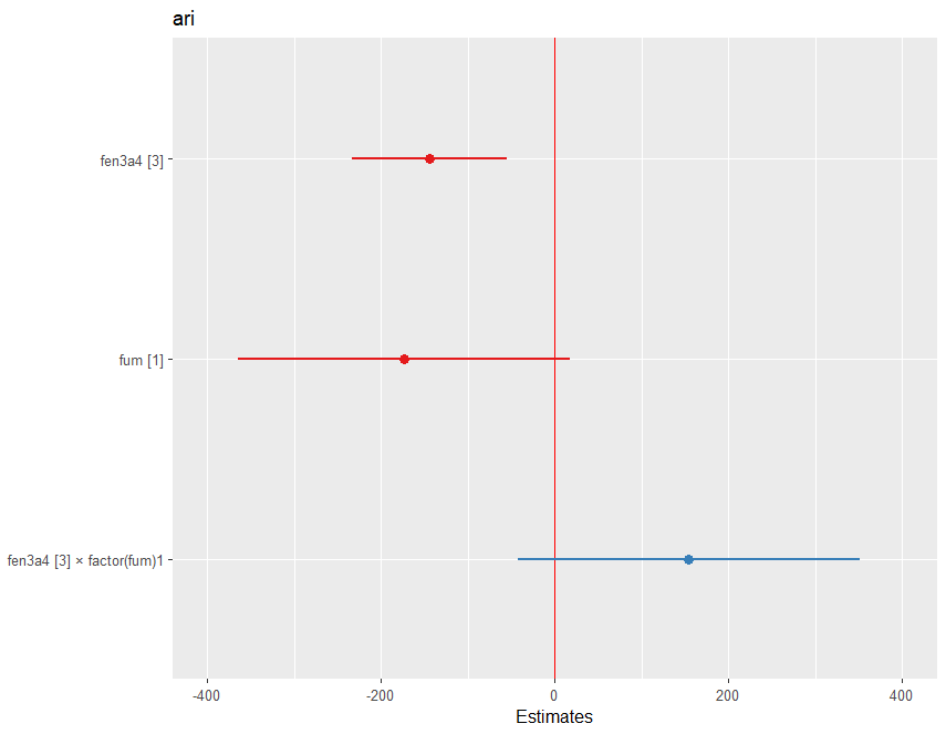
I'm working with data concerning the impact of certain genes and smoking on the concentration of a particular drug in the blood. My variables are dichotomous (gen1 = 1/0, gen2 = 1/0, smoking = 1/0). The genes, individually, as well as the act of smoking, all decrease the concentration of the drug in the blood. However, in my model, these estimates yield negative values, specifically around -14 and -17.
In an effort to better understand my data, I attempted to explore the interaction between gene1 and smoking. Upon executing this interaction in R, I ended up with the following:
gen1[1] = -14.4
smoke[1] = -17.3
gen1[1]:smoke[1] = 15.4
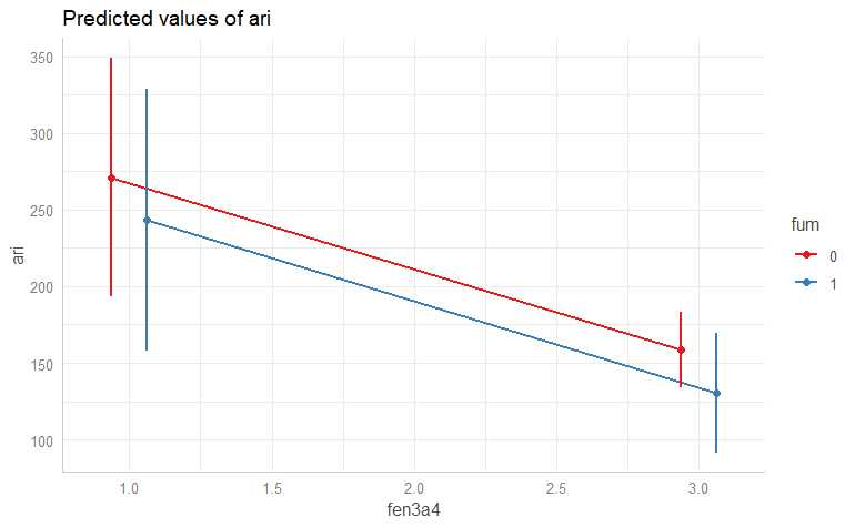
I'm finding it challenging to interpret these results. While it makes sense that the multiplication of two negative values yields a positive one, I'm struggling to understand how the interaction between two factors, which both individually decrease concentration, could lead to an increase in concentration when interacted.
There is a fantastic example by @Underminer of a case where it could be possible , but in my case it would be really costly to invest in researching without being completely sure.
Below is a snapshot of my data:
ID  gen1    smoke   drug_concentration
1   1.0     1.0     80
2   0.0     1.0     85
3   1.0     0.0     90
4   0.0     0.0     95
In some posts on the site I find that there are professionals who indicate that the data may have a large skew factor. In my case this is correct, it has -3.34669. But the solution they give is to center the data. Being dichotomous, I can't center them because it doesn't make sense in the application that someone has 0.30 of a gene... That is, either you have that allele or you don't.
I'm beginning to think I may be misunderstanding the statistical interpretation here and I would appreciate any assistance.


ggeffectspackage makes this quite easy. As a side note, this kind of plot would be useful to do with the raw data as well (violin plots, mean and confidence intervals, or even mean and all the raw data if you don't have many points). But since your question is about interpreting coefficients, plotting the model output would be most useful to you. $\endgroup$