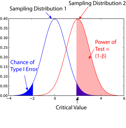
The graph is correct, but probably more confusing than it is helpful.
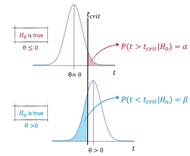
The 2 gaussians are meant to represent 2 different scenarios: the first, when $H_0$ is true (sampling distribution 1), the other, when $H_a$ is true (sampling distribution 2).
The term "sampling distribution" is properly used, referring for example to a single mean (for a 1-sample t test), a difference of means (for a 2-sample t-test), or to some other sampling distribution, for any given statistic $t$, which estimates a parameter $\theta$.
In the case of the figure, the null hypothesis is that the parameter in question is $0$ (a common, but not universal situation).
A better figure would be to stack the 2 scenarios as in the figures below:

How alpha and beta relate to the plots should be clearer:
- Alpha errors can only occur when $H_0$ is true, while beta errors can only occur when $H_a$ is true
- Alpha errors are when you incorrectly reject $H_0$ when it is in fact true (scenario 1), beta errors when you fail to reject $H_0$ when it is in fact false (scenario 2)
- If one increases alpha (at the cost of more chances of alpha errors), this will decreases beta (i.e. increase your power)
- Similarly, if one decreases alpha, this will increase beta, thus decreasing your power


