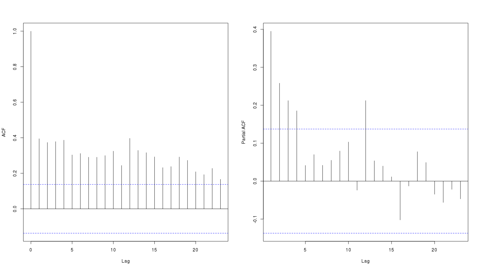
Following are acf and pacf plots of a monthly data series:

The persistence of high values in acf plot probably represent a long term positive trend. The question is if this represent seasonal variation?
I tried to see different sites on this topic but I am not sure if these plots show seasonality.
Help interpreting ACF- and PACF-plots
