Many thanks to Tim's answer, as this pointed me in the right direction to look for a scatter plot.
I started going down the route of learning R or using Python's matplotlib, but I think I'm going to settle on just using Highcharts with plain old HTML and javascript. I was hoping my end result would be on an internal website anyway, so this is probably closer to what I need.
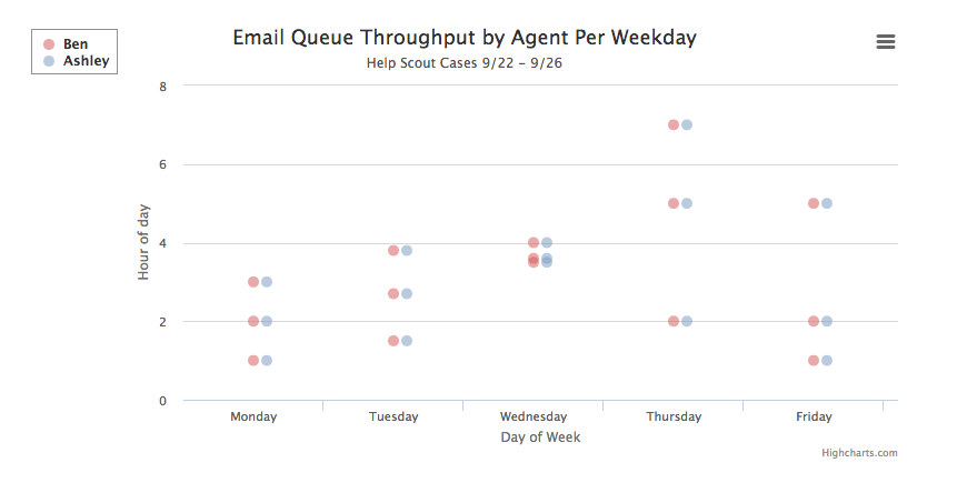
Here's a screenshot of a demo I came up by modifying Highchart's Scatter plot demo:
The code for that is:
<script src="//code.jquery.com/jquery-1.11.3.min.js"></script>
<script src="http://code.highcharts.com/highcharts.js"></script>
<script src="http://code.highcharts.com/modules/exporting.js"></script>

<div id="container" style="min-width: 310px; height: 400px; max-width: 800px; margin: 0 auto"></div>

<script type="text/javascript">
$(function () {
    $('#container').highcharts({
        chart: {
            type: 'scatter',
            zoomType: 'xy'
        },
        title: {
            text: 'Email Queue Throughput by Agent Per Weekday'
        },
        subtitle: {
            text: 'Help Scout Cases 9/22 - 9/26'
        },
        xAxis: {
            title: {
                enabled: true,
                text: 'Day of Week'
            },
            startOnTick: true,
            endOnTick: false,
            showLastLabel: true,
            allowDecimals: false,
            categories: ['Sunday','Monday', 'Tuesday', 'Wednesday', 'Thursday', 'Friday', 'Saturday']
        },
        yAxis: {
            title: {
                text: 'Hour of day'
            }
        },
        legend: {
            layout: 'vertical',
            align: 'left',
            verticalAlign: 'top',
            floating: false,
            backgroundColor: (Highcharts.theme && Highcharts.theme.legendBackgroundColor) || '#FFFFFF',
            borderWidth: 1
        },
        plotOptions: {
            scatter: {
                marker: {
                    radius: 5,
                    states: {
                        hover: {
                            enabled: true,
                            lineColor: 'rgb(100,100,100)'
                        }
                    },
                    symbol: "circle"
                },
                states: {
                    hover: {
                        marker: {
                            enabled: false
                        }
                    }
                },
                tooltip: {
                    headerFormat: '<b>{series.name}</b><br>',
                    pointFormat: 'hour: {point.y}'
                }
            }
        },
        series: [{
            name: 'Ben',
            color: 'rgba(223, 83, 83, .5)',
            data: [[1,1], [1,2], [1,3],
                   [2,1.5], [2,2.7], [2,3.8],
                   [3,4], [3,3.5], [3,3.6],
                   [4,2], [4,5], [4,7],
                   [5,1], [5,2], [5,5]]

        }, {
            name: 'Ashley',
            color: 'rgba(119, 152, 191, .5)',
            data: [[1.1,1],   [1.1,2],   [1.1,3],
                   [2.1,1.5], [2.1,2.7], [2.1,3.8],
                   [3.1,4],   [3.1,3.5], [3.1,3.6],
                   [4.1,2],   [4.1,5],   [4.1,7],
                   [5.1,1],   [5.1,2],   [5.1,5]]
        }]
    });
});

