Question 2: What would be the best way to interpret this observation? For example does such a shape indicates that a few major/dominant language will eventually cannibalize the numerous minor languages?
How many subdistricts are there? It looks like in most districts (about 2 or 3 thousand?) one language is dominant with 80% or more of the people that have this as their native language (and high dominance seems to be more likely than little dominance)
As a consequence, this leaves only 20% for the other languages in a district, and that creates this mirrored image. A language is spoken either by many (scoring >80%) or (as a consequence) on the other side only by a few (scoring <20%).
(Possibly there might be some bilingual speakers, but I assume that in most cases the native speakers of languages should add up to more or less 100% in a single subdistrict.)
In short:
You don't see many languages in the middle around 50% because there is often a dominant language in a district, which causes bumps at the high end (representing the percentage of native speakers of the dominant language) but also a bump at the low end (representing the percentage of native speakers of the non-dominant languages).
A nice way to add information to that graph would be to make a stacked graph where you sub divide the bars and give different colours to the 1st most spoken language, the 2nd most spoken language, and the other languages. In that way you can see how the mirror image is created from on the right the dominant (most spoken) language. And on the left the rest.
Question 1: Why do we have this distribution that roughly resembles an arcsine like distribution. Note that I am not saying that it is necessarily a perfect arcsine in the theoretical sense but rather in an engineering application sense where it is good enough to assume the nearest matching distribution in order get the job done. I know that random Brownian motion results in an arcsine distribution but I am not sure if that is the underlying reason here.
I don't believe that it is so simple as 1d Brownian motion. But maybe it could be insightful to make some maps and see how the languages distribute.
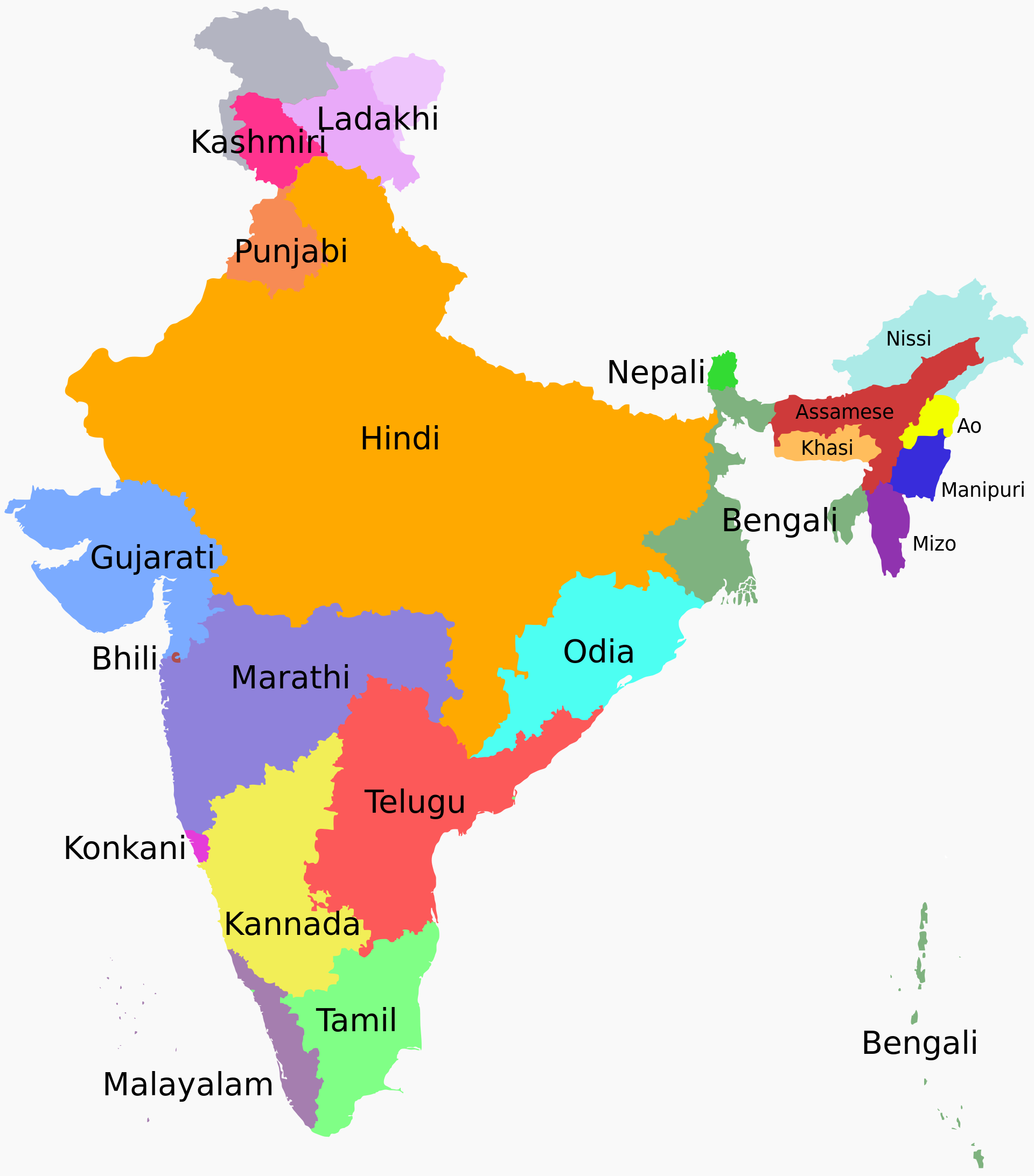
What I imagine is that the majority of the curve is dominated by the mayor languages which are concentrated in regions where they are the 1st language spoken:
From https://commons.m.wikimedia.org/wiki/File:Language_region_maps_of_India.svg#mw-jump-to-license

and on top of that you can imagine some mixing of those languages at the borders which causes the distribution to deviate from a perfect 0/100% split.
You might see this spread as some sort of Brownian motion process (but possibly with some attractive forces). And the probability for languages to reach further from their origin reduces and in that way you get some distribution that might be simular to the arcsine distribution, but probably it will be more complex, maybe you could model(approximate) it more generally as a beta distribution, but possibly it is a mixture of something more complex, that happens to look like an arcsine.
