Why not a line plot? A line plot seems pretty fitting if you'd like to a general trend in mean and SD if individual species is not the focal point.
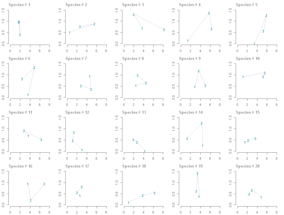
Anyway, here is an alternative, which strictly speaking is still a line plot but time is not one of the axes. It is also good for discussing individual species. x-axis is your variable 1 (I guessed that's mean), y-axis is the variable 2 (SD).

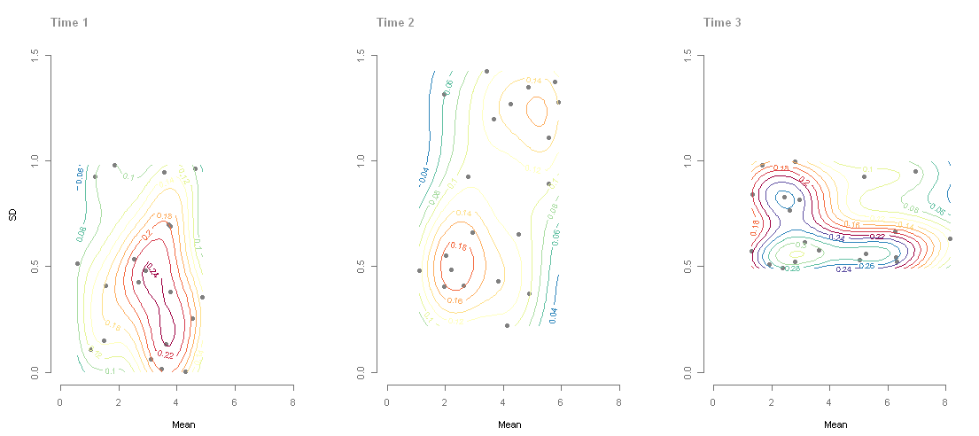
And yes, heat map maybe too much, but I think it's worth a try to show 3D kernel density if you can provide the actual data as well. Codes are taken from this thread.

Another possibility is to make three plots:
- t1 SD vs. mean, use black symbol
- t1 SD vs. mean, but this time the symbol turned to light grey; overlay t2 SD vs. mean, use black symbol. Connect each species pair with an arrow.
- t2 SD vs. mean, but this time the symbol turned to light grey; overlay t3 SD vs. mean, use symbol. Connect each species pair with an arrow.
