38
$\begingroup$

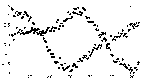
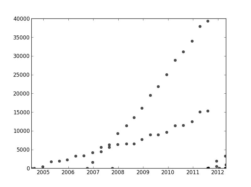
I have a set of data that is not ordered in any particular way but when plotted clearly has two distinct trends. A simple linear regression would not really be adequate here because of the clear distinction between the two series. Is there a simple way to get the two independent linear trendlines?

For the record I'm using Python and I am reasonably comfortable with programming and data analysis , including machine learning but am willing to jump over to R if absolutely necessary.

enter image description here

$\endgroup$
8
  • 6
    $\begingroup$ Best answer I have so far is to print this on graph paper and use a pencil and ruler and calculator ... $\endgroup$ Commented Jul 19, 2012 at 4:15
  • $\begingroup$ Maybe you can compute pair-wise slopes and group them to two "slope-clusters". However this will fail if you have two parallel trends. $\endgroup$ Commented Jul 19, 2012 at 14:34
  • 1
    $\begingroup$ I don't have any personal experience with it, but I think statsmodels would be worth checking out. Statistically, a linear regression with an interaction for group would be adequate (unless you're saying you have ungrouped data, in which case that's a bit hairier...) $\endgroup$ Commented Jul 19, 2012 at 23:45
  • 1
    $\begingroup$ Unfortunately this isn't effect data but usage data, and clearly usage from two separate systems mixed up into the same data set. I want to be able to describe the two usage patterns, but I can't go back and recollect data as this represents about 6 years worth of information collected by a client. $\endgroup$ Commented Jul 20, 2012 at 1:55
  • 2
    $\begingroup$ Just to make sure: your client doesn't have any additional data that would indicate which measurements come from which population? This is 100% of the data that you or your client have or can find. Also, 2012 looks like either your data collection fell apart or one or both of your systems fell through the floor. Makes me wonder if trend lines up to that point matter much. $\endgroup$
    – Wayne
    Commented Jul 26, 2012 at 15:00

4 Answers 4

31
$\begingroup$

To solve your problem, a good approach is to define a probabilistic model that matches the assumptions about your dataset. In your case, you probably want a mixture of linear regression models. You can create a "mixture of regressors" model similar to a gaussian mixture model by associating different data points with different mixture components.

I have included some code to get you started. The code implements an EM algorithm for a mixture of two regressors (it should be relatively easy to extend to larger mixtures). The code seems to be fairly robust for random datasets. However, unlike linear regression, mixture models have non-convex objectives, so for a real dataset, you may need to run a few trials with different random starting points.

import numpy as np
import matplotlib.pyplot as plt 
import scipy.linalg as lin

#generate some random data
N=100
x=np.random.rand(N,2)
x[:,1]=1

w=np.random.rand(2,2)
y=np.zeros(N)

n=int(np.random.rand()*N)
y[:n]=np.dot(x[:n,:],w[0,:])+np.random.normal(size=n)*.01
y[n:]=np.dot(x[n:,:],w[1,:])+np.random.normal(size=N-n)*.01


rx=np.ones( (100,2) )
r=np.arange(0,1,.01)
rx[:,0]=r

#plot the random dataset
plt.plot(x[:,0],y,'.b')
plt.plot(r,np.dot(rx,w[0,:]),':k',linewidth=2)
plt.plot(r,np.dot(rx,w[1,:]),':k',linewidth=2)

# regularization parameter for the regression weights
lam=.01

def em():
    # mixture weights
    rpi=np.zeros( (2) )+.5

    # expected mixture weights for each data point
    pi=np.zeros( (len(x),2) )+.5

    #the regression weights
    w1=np.random.rand(2)
    w2=np.random.rand(2)

    #precision term for the probability of the data under the regression function 
    eta=100

    for _ in xrange(100):
        if 0:
            plt.plot(r,np.dot(rx,w1),'-r',alpha=.5)
            plt.plot(r,np.dot(rx,w2),'-g',alpha=.5)

        #compute lhood for each data point
        err1=y-np.dot(x,w1)
        err2=y-np.dot(x,w2)
        prbs=np.zeros( (len(y),2) )
        prbs[:,0]=-.5*eta*err1**2
        prbs[:,1]=-.5*eta*err2**2

        #compute expected mixture weights
        pi=np.tile(rpi,(len(x),1))*np.exp(prbs)
        pi/=np.tile(np.sum(pi,1),(2,1)).T

        #max with respect to the mixture probabilities
        rpi=np.sum(pi,0)
        rpi/=np.sum(rpi)

        #max with respect to the regression weights
        pi1x=np.tile(pi[:,0],(2,1)).T*x
        xp1=np.dot(pi1x.T,x)+np.eye(2)*lam/eta
        yp1=np.dot(pi1x.T,y)
        w1=lin.solve(xp1,yp1)

        pi2x=np.tile(pi[:,1],(2,1)).T*x
        xp2=np.dot(pi2x.T,x)+np.eye(2)*lam/eta
        yp2=np.dot(pi[:,1]*y,x)
        w2=lin.solve(xp2,yp2)

        #max wrt the precision term
        eta=np.sum(pi)/np.sum(-prbs/eta*pi)

        #objective function - unstable as the pi's become concentrated on a single component
        obj=np.sum(prbs*pi)-np.sum(pi[pi>1e-50]*np.log(pi[pi>1e-50]))+np.sum(pi*np.log(np.tile(rpi,(len(x),1))))+np.log(eta)*np.sum(pi)
        print obj,eta,rpi,w1,w2

        try:
            if np.isnan(obj): break
            if np.abs(obj-oldobj)<1e-2: break
        except:
            pass

        oldobj=obj

    return w1,w2


#run the em algorithm and plot the solution
rw1,rw2=em()
plt.plot(r,np.dot(rx,rw1),'-r')
plt.plot(r,np.dot(rx,rw2),'-g')

plt.show()
$\endgroup$
0
30
$\begingroup$

Elsewhere in this thread, user1149913 provides great advice (define a probabilistic model) and code for a powerful approach (EM estimation). Two issues remain to be addressed:

  1. How to cope with departures from the probabilistic model (which are very evident in the 2011-2012 data and somewhat evident in the undulations of the less-sloped points).

  2. How to identify good starting values for the EM algorithm (or any other algorithm).

To address #2, consider using a Hough transform. This is a feature-detection algorithm which, for finding linear stretches of features, can efficiently be computed as a Radon transform.

Conceptually, the Hough transform depicts sets of lines. A line in the plane can be parameterized by its slope, $x$, and its distance, $y$, from a fixed origin. A point in this $x,y$ coordinate system thereby designates a single line. Each point in the original plot determines a pencil of lines passing through that point: this pencil appears as a curve in the Hough transform. When features in the original plot fall along a common line, or near enough to one, then the collections of curves they produce in the Hough transform tend to have a common intersection corresponding to that common line. By finding these points of greatest intensity in the Hough transform, we can read off good solutions to the original problem.

To get started with these data, I first cropped out the auxiliary stuff (axes, tick marks, and labels) and for good measure cropped out the obviously outlying points at the bottom right and sprinkled along the bottom axis. (When that stuff is not cropped out, the procedure still works well, but it also detects the axes, the frames, the linear sequences of ticks, the linear sequences of labels, and even the points lying sporadically on the bottom axis!)

img = Import["https://i.sstatic.net/SkEm3.png"]
i = ColorNegate[Binarize[img]]
crop2 = ImageCrop[ImageCrop[i, {694, 531}, {Left, Bottom}], {565, 467}, {Right, Top}]

(This and the rest of the code are in Mathematica.)
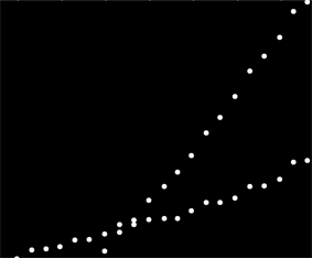
Cropped image

To each dot in this image corresponds a narrow range of curves in the Hough transform, visible here. They are sine waves:

hough2 = Radon[crop2, Method -> "Hough"]  // ImageAdjust

Hough transform

This makes visually manifest the sense in which the question is a line clustering problem: the Hough transform reduces it to a point clustering problem, to which we can apply any clustering method we like.

In this case, the clustering is so clear that simple post-processing of the Hough transform sufficed. To identify locations of greatest intensity in the transform, I increased the contrast and blurred the transform over a radius of about 1%: that's comparable to the diameters of the plot points in the original image.

blur = ImageAdjust[Blur[ImageAdjust[hough2, {1, 0}], 8]]
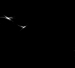
Blurred transform

Thresholding the result narrowed it to two tiny blobs whose centroids reasonably identify the points of greatest intensity: these estimate the fitted lines.

comp = MorphologicalComponents[blur, 0.777]) // Colorize

(The threshold of $0.777$ was found empirically: it produces only two regions and the smaller of the two is almost as small as possible.)
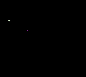
Thresholded binarized transform

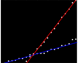
The left side of the image corresponds to a direction of 0 degrees (horizontal) and, as we look from left to right, that angle increases linearly to 180 degrees. Interpolating, I compute that the two blobs are centered at 19 and 57.1 degrees, respectively. We can also read off the intercepts from the vertical positions of the blobs. This information yields the initial fits:

width = ImageDimensions[blur][[1]];
slopes =  Module[{x, y, z}, ComponentMeasurements[comp, "Centroid"] /. 
          Rule[x_, {y_, z_}] :>  Round[((y - 1/2)/(width - 1))  180., 0.1]
  ]

{19., 57.1}

In a similar fashion one can compute the intercepts corresponding to these slopes, giving these fits:
Fitted lines

(The red line corresponds to the tiny pink dot in the previous picture and the blue line corresponds to the larger aqua blob.)

To a great extent, this approach has automatically dealt with the first issue: deviations from linearity smear out the points of greatest intensity, but typically do not shift them much. Frankly outlying points will contribute low-level noise throughout the Hough transform, which will disappear during the post-processing procedures.

At this point one can provide these estimates as starting values for the EM algorithm or for a likelihood minimizer (which, given good estimates, will converge quickly). Better, though, would be to use a robust regression estimator such as iteratively reweighted least squares. It is able to provide a regression weight to every point. Low weights indicate a point does not "belong" to a line. Exploit these weights, if desired, to assign each point to its proper line. Then, having classified the points, you can use ordinary least squares (or any other regression procedure) separately on the two groups of points.
$\endgroup$
6
  • 1
    $\begingroup$ Pictures tell a thousand words and you have 5. This is incredible work from a quick graph i made just for the purpose of this question! Kudos! $\endgroup$ Commented Jul 31, 2012 at 11:16
  • 2
    $\begingroup$ Hough transform is widely used in the Computer Vision field to identify straight lines in an image. Why shouldn't it be used in statistics also? ;) $\endgroup$
    – Lucas Reis
    Commented Jul 31, 2012 at 15:19
  • $\begingroup$ That's an interesting question, @Lucas. In many statistical applications, though, there is an asymmetry between the $x$ and $y$ variables: one is viewed as accurately measured and the other is viewed as subject to random variation. For such applications, the image-processing methods will not give quite the right results (and in many applications, they will fail to give useful results at all). But from time to time there may be some fruitful overlap between the two fields: which I believe is the point you intended to make. $\endgroup$
    – whuber
    Commented Jul 31, 2012 at 15:23
  • $\begingroup$ Yes. Imagine, for example, the amount of outliers involved in comparing two images to detect if they are from the same subject. And, most of all, imagine having to do it in real time. "Speed" is a very important factor in Computer Vision, and not so important in Statistics. $\endgroup$
    – Lucas Reis
    Commented Jul 31, 2012 at 15:36
  • $\begingroup$ @RoyalTS Thank you for pointing out the need for a fix to one of the code snippets. By the time I found your suggested change it had been rejected (correctly, because it wasn't quite right, but never mind that: I am grateful you noticed there was an error). I fixed it by removing the reference to rotation, which was set to zero originally and therefore made no difference. $\endgroup$
    – whuber
    Commented Aug 18, 2014 at 21:35
17
$\begingroup$

I found this question linked on another question. I actually did academic research on this kind of problem. Please check my answer "Least square root" fitting? A fitting method with multiple minima for more details.

whuber's Hough transform based approach is a very good solution for simple scenarios as the one you gave. I worked on scenarios with more complex data, such as this:

data association problem - candy data set

My co-authors and I denoted this a "data association" problem. When you try to solve it, the main problem is typically combinatorial due to the exponential amount of possible data combinations.

We have a publication "Overlapping Mixtures of Gaussian Processes for the data association problem" where we approached the general problem of N curves with an iterative technique, giving very good results. You can find Matlab code linked in the paper.

[Update] A Python implementation of the OMGP technique can be found in the GPClust library.

I have another paper where we relaxed the problem to obtain a convex optimization problem, but it has not been accepted for publication yet. It is specific for 2 curves, so it would work perfectly on your data. Let me know if you are interested.

$\endgroup$
2
  • 1
    $\begingroup$ I am sad to see that over two years nobody else has upvoted this original and valuable reply. In the meantime, has the last paper you mentioned been accepted? $\endgroup$
    – whuber
    Commented May 16, 2014 at 14:49
  • 1
    $\begingroup$ The paper has indeed been accepted, just a few months ago. You can download it here gtas.unican.es/pub/378. This is actually a quite rare problem (which may explain its lack of popularity), but we still managed to find some interesting applications. Have a look at the experiments at the end of the paper if you like. $\endgroup$
    – Steven
    Commented May 17, 2014 at 20:25
2
$\begingroup$

user1149913 has an excellent answer (+1), but it looks to me that your data collection fell apart in late 2011, so you'd have to cut that part of your data off, and then still run things a few times with different random starting coefficients to see what you get.

One straightforward way to do things would be to separate your data into two sets by eye, then use whatever linear model technique you're used to. In R, it would be the lm function.

Or fit two lines by eye. In R you would use abline to do this.

The data's jumbled, has outliers, and falls apart at the end, yet by-eye has two fairly obvious lines, so I'm not sure a fancy method is worth it.

$\endgroup$

Your Answer

By clicking “Post Your Answer”, you agree to our terms of service and acknowledge you have read our privacy policy.

Not the answer you're looking for? Browse other questions tagged or ask your own question.