17
$\begingroup$

This wikipedia link lists a number of techniques to detect OLS residuals heteroscedasticity. I would like to learn which hands-on technique is more efficient in detecting regions affected by heteroscedasticity.

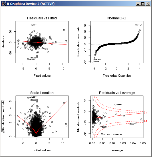
For example, here the central region in the OLS 'Residuals vs Fitted' plot seen to have higher variance than the sides of the plot (I am not entirely sure in facts, but let's assume it's the case for the sake of the question). To confirm, looking at the error labels in the QQ plot we can see that they match the error labels in the center of the Residuals plot.

But how can we quantify the residuals region that has significantly higher variance?

heteroscedasticity

$\endgroup$
4
  • 2
    $\begingroup$ I'm not sure you're right that there is higher variance in the middle. The fact that the outliers are in the central region looks to me likely to be a result of the fact that that is where most of the data is. Of course, this doesn't invalidate your question. $\endgroup$ Commented Jul 25, 2012 at 19:56
  • 1
    $\begingroup$ The qqplot is intended to identify nonnormality of the distribution and not inhomogeneous variances directly. $\endgroup$ Commented Jul 25, 2012 at 20:22
  • $\begingroup$ @PeterEllis Yes, I specified in the question that I'm not sure the variance is different, but I had this diagnostics picture handy and there might actually be some heteroscedasticity in the example. $\endgroup$ Commented Jul 25, 2012 at 20:25
  • $\begingroup$ @MichaelChernick I only mentioned the qqplot to illustrate how the highest errors seem to concentrate in the middle of the residuals plot, hence potentially indicating higher variance in that area. $\endgroup$ Commented Jul 25, 2012 at 20:26

2 Answers 2

17
$\begingroup$

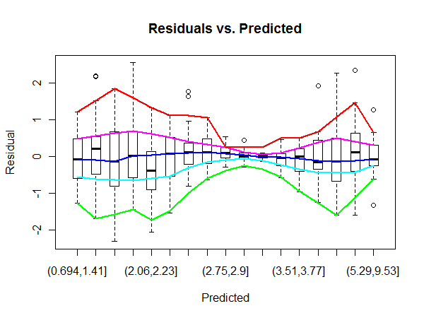
This problem has an exploratory feel to it. John Tukey describes many procedures for exploring heteroscedasticity in his classic, Exploratory Data Analysis (Addison-Wesley 1977). Perhaps the most directly useful is a variant of his "wandering schematic plot." This slices one variable (such as the predicted value) into bins and uses m-letter summaries (generalizations of boxplots) to show the location, spread, and shape of the other variable for each bin. The m-letter statistics are further smoothed in order to emphasize overall patterns rather than chance deviations.

A quick version can be cooked up by exploiting the boxplot procedure in R. We illustrate with simulated strongly heteroscedastic data:

    set.seed(17)
    n <- 500
    x <- rgamma(n, shape=6, scale=1/2)
    e <- rnorm(length(x), sd=abs(sin(x)))
    y <- x + e
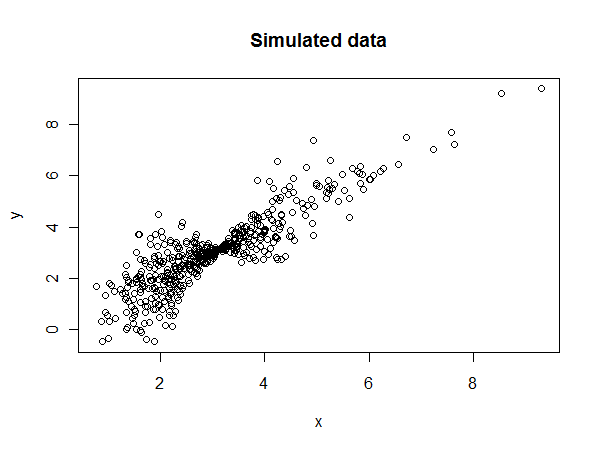
Data

Let's obtain the predicted values and residuals from the OLS regression:

    fit <- lm(y ~ x)
    res <- residuals(fit)
    pred <- predict(fit)

Here, then, is the wandering schematic plot using equal-count bins for the predicted values. I use lowess for a quick-and-dirty smooth.

    n.bins <- 17
    bins <- cut(pred, quantile(pred, 
                      probs = seq(0, 1, 1/n.bins)))
    b <- boxplot(res ~ bins, boxwex=1/2, 
                 main="Residuals vs. Predicted",
                 xlab="Predicted", ylab="Residual")
    colors <- hsv(seq(2/6, 1, 1/6))
    temp <- sapply(1:5, function(i) lines(lowess(1:n.bins, 
                         b$stats[i,], f=.25), 
            col=colors[i], lwd=2))
Wandering schematic plot

The blue curve smooths the medians. Its horizontal tendency indicates the regression is generally a good fit. The other curves smooth the box ends (quartiles) and fences (which are typically extreme values). Their strong convergence and subsequent separation testify to the heteroscedasticity--and help us characterize and quantify it.

(Notice the nonlinear scale on the horizontal axis, reflecting the distribution of predicted values. With a bit more work this axis could be linearized, which sometimes is useful.)
$\endgroup$
1
  • 6
    $\begingroup$ Nice example, I would have thought some implementation of running quantiles was available in R (to avoid the problem with bins alltogether). Kind of reminds me of bag-plots. Also see Rob Hyndman's extension in his Rainbow package. $\endgroup$
    – Andy W
    Commented Jul 25, 2012 at 23:55
9
$\begingroup$

Typically, heteroskedasticity is modeled using a Breusch-Pagan approach. The residuals from your linear regression are then squared and regressed onto the variables in your original linear model. The latter regression is called an auxiliary regression.

$nR^2_a$, where $n$ is the number of observations and $R^2_a$ is the $R^2$ from the auxiliary regression serves as a test statistic for the null hypothesis of homoskedasticity.

For your purposes, you could focus on the individual coefficients from this model to see which variables are most predictive of high or low variance outcomes.

$\endgroup$
1
  • 1
    $\begingroup$ +1 But please notice that such tests are limited in the forms of heteroscedasticity they can detect. Examples like the one shown in my answer can slip right through, even though the heteroscedasticity is extremely strong. $\endgroup$
    – whuber
    Commented Jul 25, 2012 at 20:43

Your Answer

By clicking “Post Your Answer”, you agree to our terms of service and acknowledge you have read our privacy policy.

Not the answer you're looking for? Browse other questions tagged or ask your own question.