2
$\begingroup$

I am working on a binary classification problem using random forests, neural networks etc with dataset size of 977 records (class proportion of 77:23)

I used balancedbaggingclassifier with random forest to obtain the predictions.

My model gave an AUC of 81% (and f1-score of minority class is 60% only but biz is okay with it). So, I consider that my model has good/decent discriminative ability (to distinguish the classes).based on auc score.

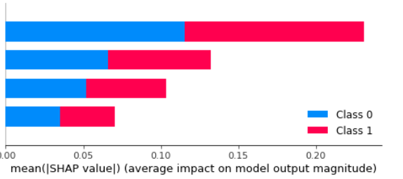
However, when I look at my features (only 4 features in the dataset), I don't see much discrimination. aren't they? refer below

enter image description here

Based on the above graph, I feel like all the 4 features (and their values) have more or less equal bin width. Bars are arranged from top as F1,F2,F3 and F4

So, does this mean these features are not helpful? Or am I interpreting it incorrectly? Does it mean high values of all these 4 features is leading to class 1? low values of these 4 features is leading to class 0? is that the right way to interpret?

Can help me correct my understanding if I am wrong?

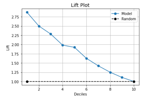
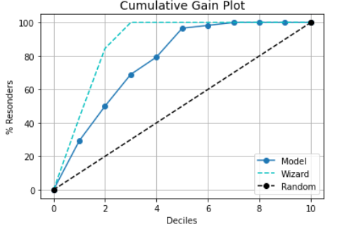
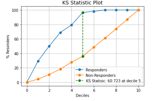
Due to imbalance, if you wish to see my lift, gain and KS chart, you can find them below

enter image description here

enter image description here

enter image description here

$\endgroup$
2
  • $\begingroup$ Is it fair to summarize your question as “how do I interpret the mean absolute Shapley value plot?” $\endgroup$
    – Sycorax
    Commented Mar 16, 2022 at 11:42
  • $\begingroup$ But the discussion should be in relation with AUC score. If my understanding of shap plot is correct. $\endgroup$
    – The Great
    Commented Mar 16, 2022 at 11:47

2 Answers 2

4
$\begingroup$

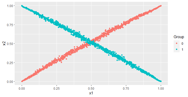
Your random forest and neural network models consider all sorts of (nonlinear) interactions between the raw features. For instance, a neural network can score extremely high on data like the following, with a $25$-node MLP scoring an AUC of $0.9997$.

Joint scatterplot: X marks the spot!

library(ggplot2)
library(nnet)
library(MASS)
library(pROC)
set.seed(2023)

N <- 1000

X0 <- MASS::mvrnorm(
  N,
  c(0, 0),
  matrix(
    c(
      1, 0.999, 
      0.999, 1
    ), 2, 2
  )
)
X1 <- MASS::mvrnorm(
  N,
  c(0, 0),
  matrix(
    c(
      1, -0.999, 
      -0.999, 1
    ), 2, 2
  )
)
X <- rbind(X0, X1)
x1 <- ecdf(X[, 1])(X[, 1])
x2 <- ecdf(X[, 2])(X[, 2])
y <- rep(c(0, 1), c(N, N))
df_plot <- data.frame(
  x1 = x1,
  x2 = x2,
  Group = as.factor(y)
)
p1 <- ggplot(df_plot, aes(x = x1, y = x2, col = Group)) +
  geom_point()

net <- nnet::nnet(y ~ x1 + x2, size = 25)
preds <- predict(net)
r <- pROC::roc(y, c(preds))
p1
r$auc

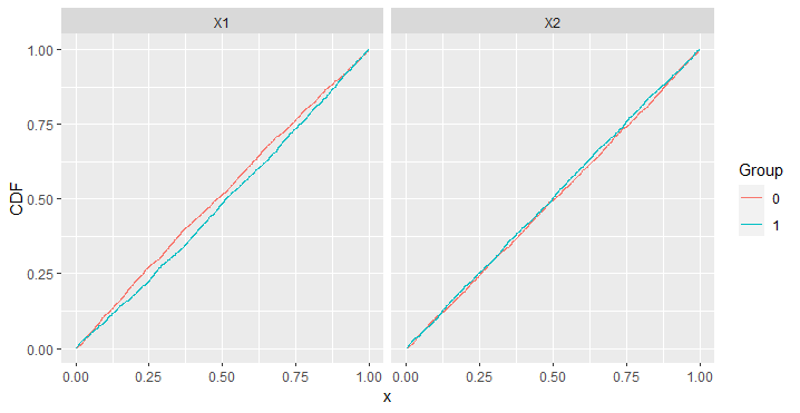
However, the x1 and x2 features on their own have no ability to distinguish between red and blue. The marginal distribution of x1 is $U(0, 1)$ for both red and blue, and the marginal distribution of x2 is $U(0, 1)$ for both red and blue. It is only when you consider the joint distribution through an interaction between the features, which your SHAP plot appears not to show.

Marginal CDFs

I think this is what has happened, that no one feature is important, but some combination of features winds up being quite important and is discovered by the machine learning model that is meant to learn such relationships without being explicitly programmed.

d10 <- data.frame(
  x = x1[y == 0],
  CDF = ecdf(x1[y == 0])(x1[y == 0]),
  Group = 0,
  Feature = "X1"
)
d20 <- data.frame(
  x = x2[y == 0],
  CDF = ecdf(x2[y == 0])(x2[y == 0]),
  Group = 0,
  Feature = "X2"
)

d11 <- data.frame(
  x = x1[y == 1],
  CDF = ecdf(x1[y == 1])(x1[y == 1]),
  Group = 1,
  Feature = "X1"
)
d21 <- data.frame(
  x = x2[y == 1],
  CDF = ecdf(x2[y == 1])(x2[y == 1]),
  Group = 1,
  Feature = "X2"
)
new_df <- rbind(d10, d11, d20, d21)
new_df$Group <- as.factor(new_df$Group)
p2 <- ggplot(new_df, aes(x = x, y = CDF, col = Group)) +
  geom_line() +
  facet_grid(~Feature)
p2 # bump N up to 10000 or higher if the CDFs don't overlap enough for you
$\endgroup$
1
  • $\begingroup$ But the SHAP values will include attribution of the interaction effect(s) to the component features. The plot given in the question doesn't show that each feature is useless, either in isolation or in conjunction. So, while I agree that this answer discusses an effect that might arise, the premise of the question is flawed and doesn't necessarily suggest this as a cause. $\endgroup$ Commented Aug 27 at 22:07
1
$\begingroup$

It's unusual to see both classes in this plot, and I suspect the two colors are exactly equal in each bar: the effect "toward" class 1 is the same effect "against" class 0.

See https://christophm.github.io/interpretable-ml-book/shap.html#shap-feature-importance and https://shap.readthedocs.io/en/latest/example_notebooks/api_examples/plots/bar.html

These four features all have discriminative power according to their shap values (which are in turn based on your model), apparently in decreasing order by name. (I'm not familiar enough to know whether 0.1 average shap value is "good" or not.)

$\endgroup$
3
  • $\begingroup$ Thanks, upvoted. So, then these featires are not useful? Them, am wondering why do I get 81 auc? $\endgroup$
    – The Great
    Commented Mar 25, 2022 at 0:57
  • $\begingroup$ auc indicating discriminative ability between 2 classes $\endgroup$
    – The Great
    Commented Mar 25, 2022 at 0:58
  • $\begingroup$ (I edited an answer to that question into my answer: they are important, you're just misreading the plot.) $\endgroup$ Commented Aug 27 at 22:18

Your Answer

By clicking “Post Your Answer”, you agree to our terms of service and acknowledge you have read our privacy policy.

Not the answer you're looking for? Browse other questions tagged or ask your own question.