Does a boxplot assume interval data? If not, is it then fine to use a box plot to represent Likert-scale (ordinal) data?
-
4$\begingroup$ See stats.stackexchange.com/questions/658744/… for a concurrent thread in which the main issues are aired for data that are small counts but pose essentially the same challenges. My short answer: Box plots are defensible for this kind of data, but never ideal. $\endgroup$– Nick CoxCommented 23 hours ago
-
$\begingroup$ stats.stackexchange.com/questions/323908/… is one of several relevant threads. $\endgroup$– Nick CoxCommented 23 hours ago
-
$\begingroup$ Boxplots display sets of numbers. They don't care how you intend to interpret them. $\endgroup$– whuber ♦Commented 22 hours ago
4 Answers
Boxplots don't really "assume" anything. You can certainly use them with Likert scale data; the question is whether that visualization helps you see things about the data, or whether some other graphic would do a better job.
This depends on your particular data and on what you want to visualize about it.
They wouldn't make much sense with data that wasn't at least ordinal.
-
3$\begingroup$ Agreed, but they don't make any sense whatsoever for nominal data. $\endgroup$– Nick CoxCommented 23 hours ago
A boxplot does not strictly assume interval data, but it is typically used for continuous (interval or ratio) data. Boxplots are designed to display the distribution of numerical data through their quartiles, highlighting the median, interquartile range, and potential outliers. While boxplots can be used for Likert-scale data, it's important to be cautious about the interpretation and consider alternative visualizations that might better represent the ordinal nature of the data.
A boxplot may hide more than it reveals, especially for discrete distributions as equal medians and quartiles may mask substantial differences. If it is misleading, it might be better to use something else.
As an example, using R, take a set of frequencies summing to $1000$ cases:
# Likertscale 1    2    3   4    5
freqA <- c(499, 250, 249,  1,   1)
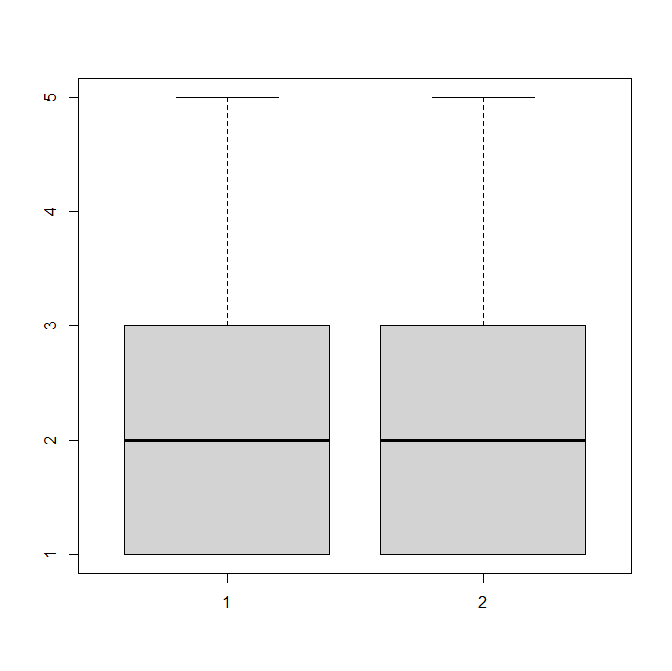
Now move $247$ cases (almost a quarter of the total) from $1$ to $5$. This is not quite enough to change the median or quartiles
freqB <- c(252, 250, 249, 1, 248)
The boxplots are identical
boxplot(cbind(rep(1:5, times=freqA), rep(1:5,
          times=freqB)))
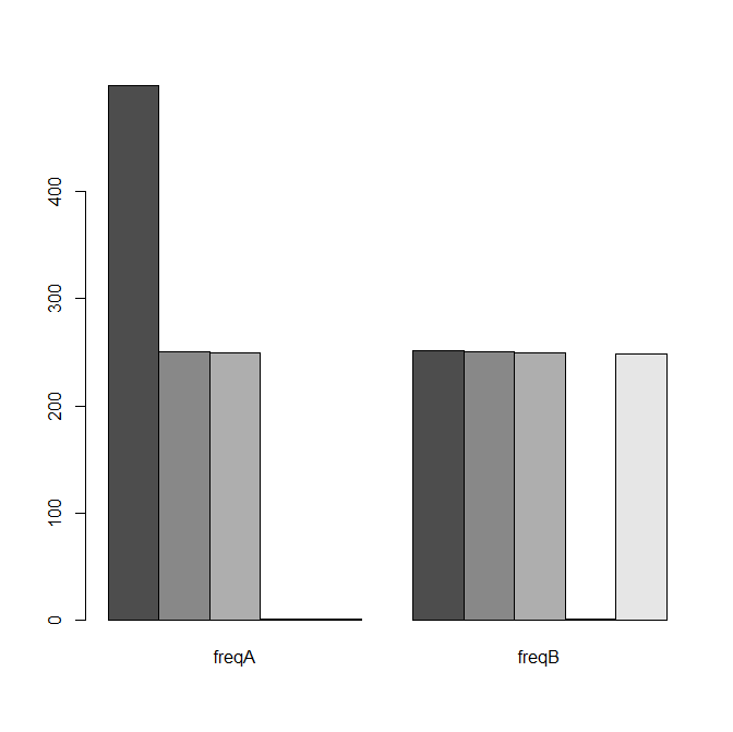
while barcharts of the same data would look substantially different
barplot(cbind(freqA,freqB), beside=TRUE)
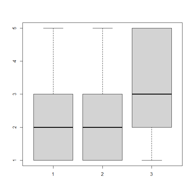
Now make a further minor change moving another $3$ cases from $1$ to $5$. The third boxplot now looks completely different despite the small change
freqC <- c(249, 250, 249,  1, 251)
boxplot(cbind(rep(1:5, times=freqA),
              rep(1:5, times=freqB),
              rep(1:5, times=freqC)))
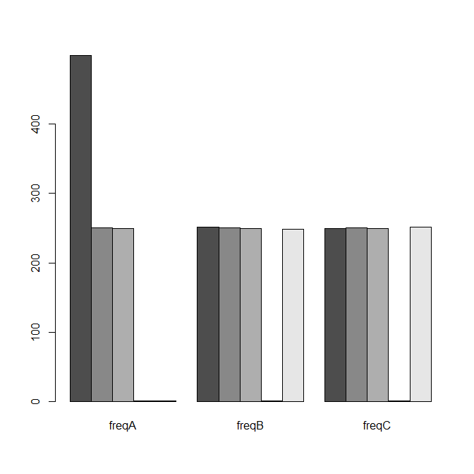
while the second and third barcharts are almost identical as the change was small
barplot(cbind(freqA,freqB, freqC), beside=TRUE)
A boxplot could be used for any type of data, as long as it is numerical in nature. Now Likert-scale data is most often expressed as a number (1,2,3...), but honestly could just as well be expressed as letters (A,B,C...) or as words (nominal) (Agree, Partially agree, Neutral...).
Likert data also has only a few possible values (5 typically, or 7); this leads to artifacts in quartiles, where 2 quartiles could easily coincide, and will, for most plots, be only 1 level apart.
Therefore, box plots are not really the most informational plots for such data.
Instead, you could start with simple bar charts, with the counts (and maybe proportions) for each level. You could add mean and medians to it, but means are of debatable merit for ordinal scale data, and the median will also be the 40th percentile, and the 60th, and many other percentile (because of the limited number of possible values).
A pie chart would also carry more information than a box plot.
-
$\begingroup$ This doesn't seem to add much to previous answers, especially the well developed answer by @Henry. $\endgroup$– Nick CoxCommented 1 hour ago


