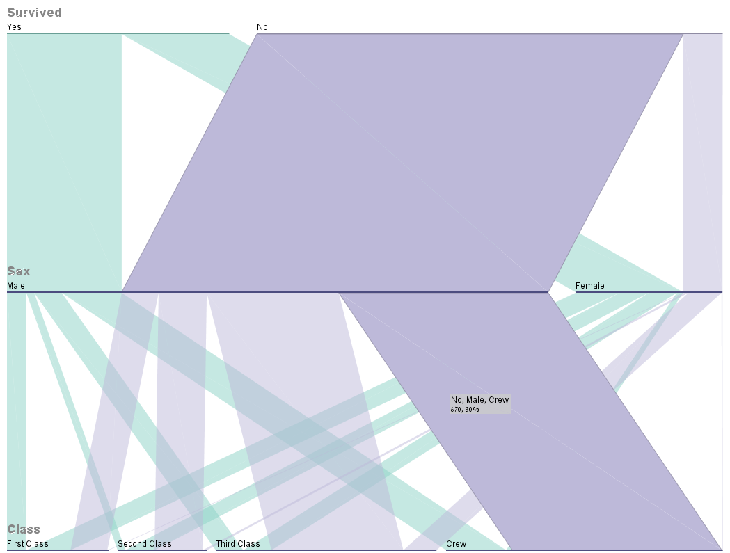
Thanks to Tormod question (posted herehere) I came across the Parallel Sets plot. Here is an example for how it looks:
 (It is a visualization of the Titanic dataset. Showing, for example, how most of the women that didn't survive belonged to the third class...)
I would love to be able to reproduce such a plot with R. Is that possible to do?
Thanks, Tal
