added 8 characters in body
Source Link

Plots are mostly a good way to get a better idea of what your data looks like. In your case I would recommend plotting the empirical cumulative distribution functionempirical cumulative distribution function (ecdf) against the theoretical cdfs with the parameters you got from fitdistr().

I did that once for my data and also included the confidence intervals. Here is the picture I got using ggplot2().
enter image description here

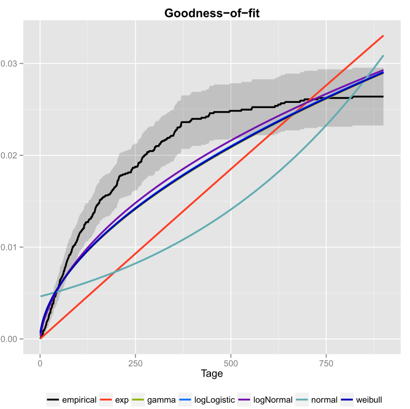
The black line is the empirical cumulative distribution function and the colored lines are cdfs from different distributions using parameters I got using the Maximum Likelihood method. One can easily see that the exponential and normal distribution are not a good fit to the data, because the lines have a different form than the ecdf and lines are quite far away from the ecdf. Unfortunately the other distribtions are quite close. But I would say that the logNormal line is the closest to the black line. Using a measure of distance (for example MSE) one could validate the assumption.

If you only have two competing distributions (for example picking the ones that seem to fit best in the plot) you could use a Likelihood-Ratio-TestLikelihood-Ratio-Test to test which distributions fits better.

Plots are mostly a good way to get a better idea of what your data looks like. In your case I would recommend plotting the empirical cumulative distribution function (ecdf) against the theoretical cdfs with the parameters you got from fitdistr().

I did that once for my data and also included the confidence intervals. Here is the picture I got using ggplot2().

enter image description here

The black line is the empirical cumulative distribution function and the colored lines are cdfs from different distributions using parameters I got using the Maximum Likelihood method. One can easily see that the exponential and normal distribution are not a good fit to the data, because the lines have a different form than the ecdf and lines are quite far away from the ecdf. Unfortunately the other distribtions are quite close. But I would say that the logNormal line is the closest to the black line. Using a measure of distance (for example MSE) one could validate the assumption.

If you only have two competing distributions (for example picking the ones that seem to fit best in the plot) you could use a Likelihood-Ratio-Test to test which distributions fits better.

more information
Source Link

Plots are mostly a good way to get a better idea of what your data looks like. In your case I would recommend plotting the empirical cumulative distribution function (ecdf) against the theoretical cdfs with the parameters you got from fitdistr().

I did that once for my data and also included the confidence intervals. Here is the picture I got using ggplot2().

enter image description here

The black line is the empirical cumulative distribution function and the colored lines are cdfs from different distributions using parameters I got using the Maximum Likelihood method. One can easily see that the exponential and normal distribution are not a good fit to the data, because the lines have a different form than the ecdf and lines are quite far away from the ecdf. Unfortunately the other distribtions are quite close. But I would say that the logNormal line is the closest to the black line. Using a measure of distance (for example MSE) one could validate the assumption.

If you only have two competing distributions (for example picking the ones that seem to fit best in the plot) you could use a Likelihood-Ratio-Test to test which distributions fits better.

Plots are mostly a good way to get a better idea of what your data looks like. In your case I would recommend plotting the empirical cumulative distribution function (ecdf) against the theoretical cdfs with the parameters you got from fitdistr().

I did that once for my data and also included the confidence intervals. Here is the picture I got using ggplot2().

enter image description here

The black line is the empirical cumulative distribution function and the colored lines are cdfs from different distributions using parameters I got using the Maximum Likelihood method. One can easily see that the exponential and normal distribution are not a good fit to the data, because the lines have a different form than the ecdf and lines are quite far away from the ecdf. Unfortunately the other distribtions are quite close. But I would say that the logNormal line is the closest to the black line. Using a measure of distance (for example MSE) one could validate the assumption.

If you only have two competing distributions (for example picking the ones that seem to fit best in the plot) you could use a Likelihood-Ratio-Test to test which distributions fits better.

Source Link

Plots are mostly a good way to get a better idea of what your data looks like. In your case I would recommend plotting the empirical cumulative distribution function (ecdf) against the theoretical cdfs with the parameters you got from fitdistr().

I did that once for my data and also included the confidence intervals. Here is the picture I got using ggplot2().

enter image description here