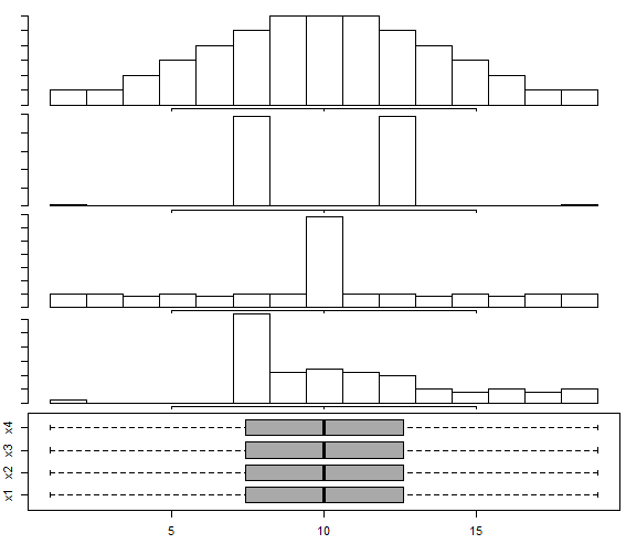
There's a somewhat similar set of displays in Matejka & Fitzmaurice (2017)[2], though they don't seem to have a very skewed example like x4 (they do have some mildly skewed examples) - and they do have some trimodal examples not in [1]; the basic point of the examples is the same.
Beware, however -- histograms can have problems, too; indeed, we see one of its problems here, because the distribution in the third "peaked" histogram is actually distinctly bimodal; the histogram bin width is simply too wide to show it. Further, as Nick Cox points out in comments, kernel density estimates may also affect the impression of the number of modes (sometimes smearing out modes ... or sometimes suggesting small modes where none exist in the original distribution). One must take care with interpretation of many common displays.
[1]: Choonpradub, C., & McNeil, D. (2005),
"Can the boxplot be improved?"
Songklanakarin J. Sci. Technol., 27:3, pp. 649-657.
http://www.jourlib.org/paper/2081800
pdf
[2]: Justin Matejka and George Fitzmaurice, (2017),
"Same Stats, Different Graphs: Generating Datasets with Varied Appearance and Identical Statistics through Simulated Annealing".
In Proceedings of the 2017 CHI Conference on Human Factors in Computing Systems (CHI '17). Association for Computing Machinery, New York, NY, USA, 1290–1294. DOI:https://doi.org/10.1145/3025453.3025912
(See the pdf here)

